We had a thread to vote on potential improvements, but it became a bit nebulous and was closed:
So I thought it would be useful to have a place to bring together the various issues - and to point to specific topics to vote on potential improvements.
So what’s wrong?
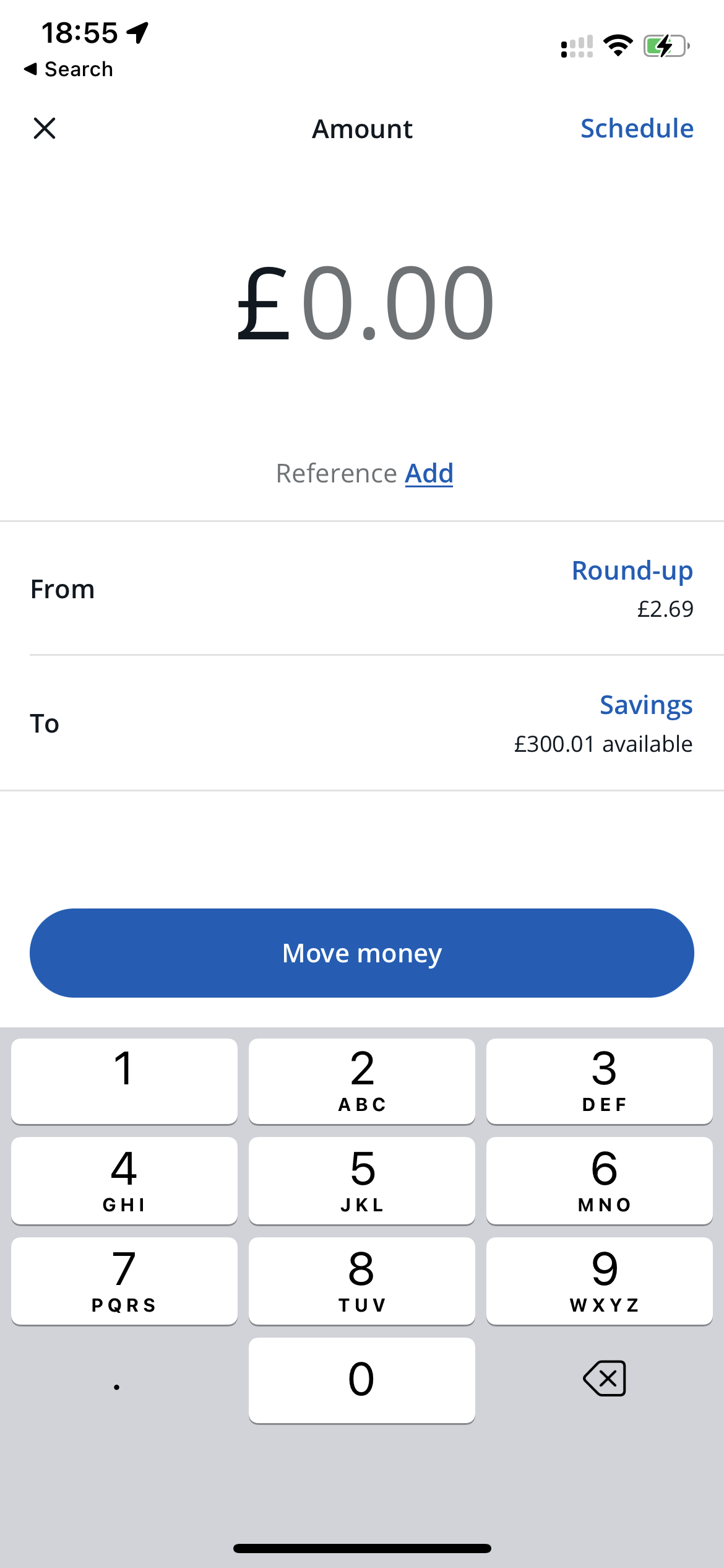
I’m not convinced that a tab is the right approach. The tab is only for money going in and out of the main account. Pot transfers are under the cards on the carousel and you can move money from (but not too) connected accounts from their cards, too. It’s a bit of a mess.
The difference between frequent, recent and all payees is confusing. There are four ways of paying someone: tapping Pay Someone, tapping Payees, and then via the Frequent and Recent sections. The interface is confusing and could do with a tidy up.
The scheduled tab isn’t clear, isn’t well ordered and doesn’t show references. Goodness me, where to start? 1) The Scheduled payments and standing orders section is in alphabetical not chronological order - it’d be super helpful to be able to sort them to see when they’re up next (or were last out); 2) It doesn’t show references and (as I have a bunch of payments to other accounts) I just see my name, the amount and the date - that’s not helpful - I need to see the reference, and maybe the account details; 3) the Subscriptions and direct debits section doesn’t show what are direct debits and what are card payments - I want to easily see which one is which.
“Add Scheduled Payment” doesn’t let you choose an existing payee or pot. This one frequently catches me out. Instead of letting you add a new scheduled payment to an existing contact (or even to/from a pot) you have to enter bank details from scratch. Or go back to the payments tab and make it scheduled from there. Basic but very annoying.
The Shared tab is just dialled in, isn’t it? For a ‘social’ feature, a blank white screen seems a bit like doing the absolute basics. How about sprucing it up a bit? And perhaps initiate a payment request from here, rather than (or in addition to) the main payments screen?
The design isn’t consistent with the rest of the app. The top of the screen gives the impression that you’d be able to select an account/pot to transfer from, but when I tap it I only get the main current account. Disappointing. But more importantly, it looks a bit like an alpha version of the Trends tab. If we have to keep the payments tab, can it look consistent, please?
We’re still not quite there on contacts. We can now (just about) combine contacts. But it’s painful (it’s still not clear to me which one gets nuked).
Favourite contact names aren’t used on the feed. Imagine your name for a contact is like the merchant name. You can update merchant names and data, but can’t do that for contacts. It seems a bit silly that this doesn’t propagate to the feed (you’d need to see the original name too, though, a bit like you can with the original merchant/card data).
Favourites don’t do anything. We can tick a box to say a payee is a favourite. It doesn’t seem to change anything. What am I missing?
Contacts can’t be given a picture. The signs are that this is coming but it ain’t there yet.
We should be able to remove contacts from recents / frequents. A friend was complaining that his ex is still displayed in both of them - he really doesn’t need to be reminded.
I’m sure there are things I’ve missed. Basically, I think the whole thing just needs a huge overhaul.
Who’s with me?
Yes! We demand change.
No! Leave it alone, it’s all okay.
0voters
Thoughts and comments below please! And I’ll make the post below a wiki to link to specific payments related improvement ideas in the Feedback & Ideas category to vote on - do add your own!
If you’ve seen or started a voting topic for anything relevant, whack it below (this is a wiki so should be editable if your trust level is high enough):
Same I would far rather they worked on trends tbh.
Summary used to be the main reason I loved Monzo, now they’ve gotten rid of everything it did from the free account and the page is just a load of advert links for Monzo premium. It doesn’t even need a tab in its current state it’s so unhelpful.
Dunno if they will ever fix this for non-premium users though.
I think that Starling’s is quite a bit better, to be honest. But I know that that’s personal taste.
I get the preference on where to allocate effort, I really do.
Two thoughts on that:
a) I don’t know what’s happened to Monzo. Are they unable or unwilling to improve things? Do they think the app is done? What’s happened to their development velocity? Why are we in a situation where we’re unwilling as a community to think about wider improvement because we’re worrying about the paucity of resources for customer focused changes?
b) by highlighting this stuff, I’m not trying to take away from anyone else’s priority. Transparency being the best disinfectant and all that, I just wanted to highlight where things could do better.
Someone’s grumpy because they’ve had their RSPCA subscription cancelled!
One thing that would be a massively useful feature for me would be a way to move money in/out of/between pots from the payments tab instead of having to do it pot by pot. Chase do a good job with a) a page for moving between accounts, and b) letting you pick an source for bank transfers instead of having to move money into the main account
One thing I’ve done a few times is transfer money from my joint account to whoever I’m paying, rather than my personal account.
Maybe it’s just me not paying attention, but payments tab top left shows my card, so I know which is which, but once I’ve tapped someone to pay, it’s not so clear. Only showing my balance at the top, which sometimes is enough to know, but not always.
This really surprised me when I started entering scheduled payments. For such a well -designed app, how on earth can the devs think that it’s ok not to have references there?
I have monthly scheduled payments into pots and other people, and completely forgot what each one is for as there is no way to enter a reference or even a note for each one. As the Monzo system certainly allows for this functionality, this is a glaring omission.
From the inside, I don’t think anything has changed with our velocity. However, as we have grown we have pivoted from shipping a half-finished product and letting our users tell us what they think and fix everything that breaks and improving in small increments.
Instead, we focus on delivering a slick experience, like Flex where we can release it and have it be a 99% polished product (just missing changing your payment date)
I am a little biased as internally we get to see these updates as they go from idea to being in our hands (and testing them before they go out to all our lovely customers)
although in all seriousness yes I have seen that Monzo have moved away from ‘move fast and break things’ and it’s great. That was never how I wanted my bank to operate! Far fewer huge problems with releases and it’s appreciated