Since we rolled out the new navigation we’ve received a lot of feedback from you on what to improve. We’ve been focused on ironing the kinks of the new app structure, and making the overall experience feel more natural. A few weeks ago we shared a blog post about what we were doing about it and today I want to share an update on our progress.
Here’s the list of things we promised to deliver, and what we done for each of them:
Accessibility
We didn’t want to release new nav to customers that were using screen readers for accessibility reasons (blind or partially blind customers). At a bare minimum we didn’t want to make the experience worse than what it used to be, so we tried to understand what the major pain points were. We did this by running a day of user testing in our office with visually impaired customers and saw them using the app with their own devices (usually already optimised with their preferred tools/settings), we also called visually impaired customers to get their feedback, and we acted on all the proactive feedback messages we receive through customer support.
In this process we fixed some issues with the new navigation, but also found a lot more things that were already broken from before. As we went along we fixed a ton of “micro bugs” like unlabelled buttons.
This is the difference between a screen reader saying “button” instead of “PIN”, so you can imagine the impact it has on customers that can’t see.
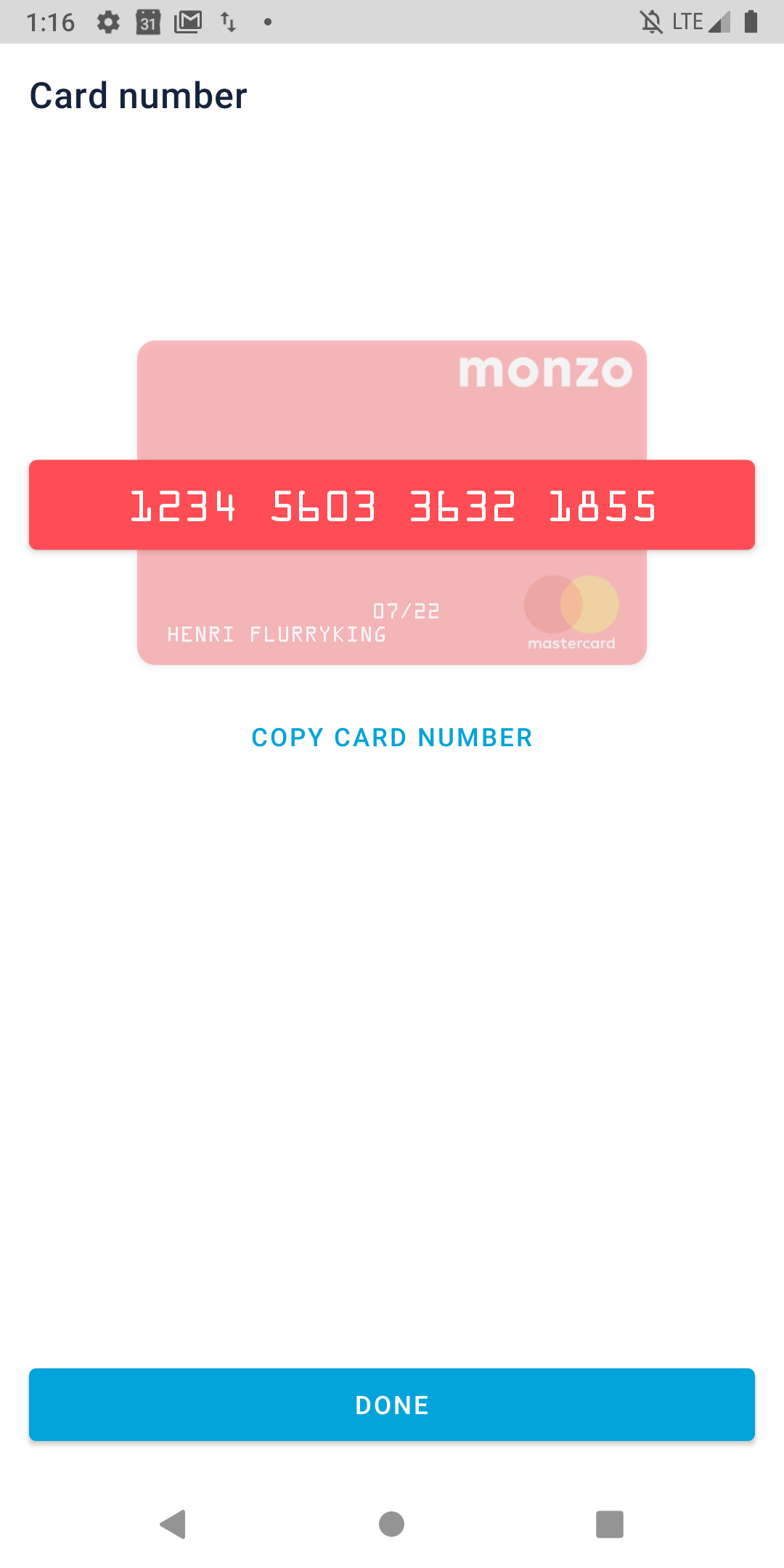
One notable example of something that dramatically improved is the card number for screen readers. Because of the way it was implemented it meant a screen reader couldn’t pick up the numbers, and there was very poor feedback to customers on what was happening. Now you can clearly see/hear the card number, and copy it too.
Performance
We invested a considerable amount of time in improving the overall performance of the product. This is a rough breakdown of the problem space:
Making sure the app updates the balance and transactions at the right time
When you switch tabs in the app we always update your balance and transactions. In the old nav some core user journeys relied on you switching tabs to have an up to date balance. For example, changing a Pot would happen in the Account tab, so the app would update when you switched to the Home tab. In the new nav Pots exist in the Home tab, so the balance wouldn’t refresh automatically. There were a lot of flows affected by some form of this issue.
We audited these core flows and added a lot more requests to update the balance and transactions to make sure the app is always up to date.
Reducing the time it takes to update the balance and transactions
Making more requests to update the app is one thing, making those requests complete as quickly as possible is a much harder task. This is where we spent the most time when working on performance, and we implemented a lot of fixes on the apps (iOS + Android) and also on the backend.
On the backend we managed to reduce the latency of the accounts aggregator API by 80%, making it 5X faster. This is the API serving the aggregated accounts on the home screen, and is called every time you open the app or switch tabs.
On iOS and Android we shipped a few fixes that reduced the number of API calls needed to updated information, as well as reducing the data we need to fetch. For example, one particular speed boost to the iOS app was reducing the number of transactions we fetch every time. We used to fetch 85 days, and now we only fetch 7 days of transactions. This was actually a bug that would only happen 7 days after you installed the app. It’s now fixed on iOS version 3.10 (out this week).
General speed navigating around the app
We also worked on shaving as much as possible when navigating the app. This is mostly down to optimising iOS and Android code to simplify some of the transitions, looking at how many frames each animation was dropping.
A lot of the performance work we did started with investigating the root causes and what we could do to fix them. In some cases we found small tweaks that could shave off a few milliseconds of latency, which when compounded makes a huge difference. But some things require re-engineering entire parts of the app, and it’s not always obvious from the start what the potential performance benefits of each approach will be.
In the process we surfaced a lot of insights about how our app is performing, we also added a lot more analytics to make it easier to find where the issues are, potential benefits, etc. It’s something we’re committed to improve throughout the company and we’ll continue to work on it - in Product Platform and in other teams.
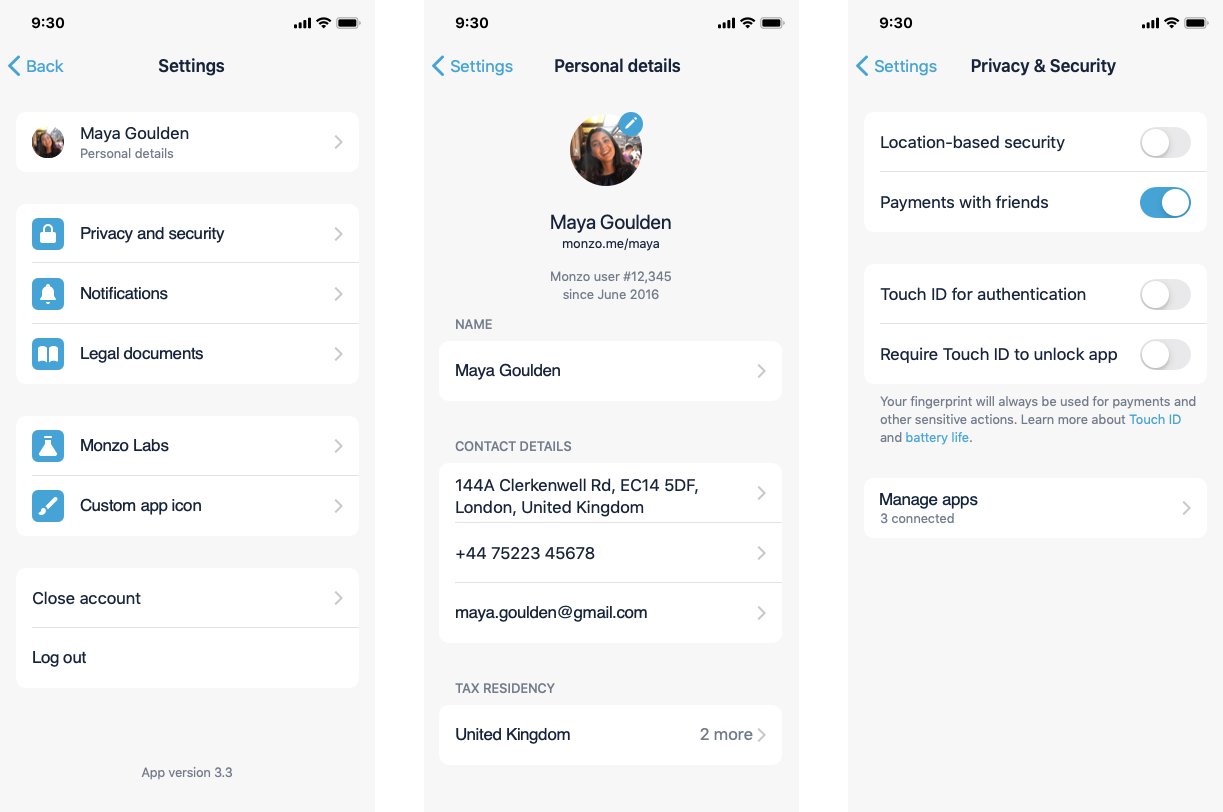
Profile/Settings
This part of the product had been neglected for some time, and when we built the new nav we knew we wanted to improve it. But it was not deemed a blocker for rolling out new nav.
Good news is we now have a new version of Profile and Settings, and it’s going to be rolled out with iOS/Android 3.11 (next week)  It’s feature flagged, so don’t panic if you don’t see it immediately after updating the app next week.
Pot hiding and Pot sorting
You’ve been commenting how cumbersome it is to navigate your Pots, especially if you have a Joint Account. This was worse if you had a lot of Pots. Also some times you just want to set some money aside in a Pot and forget about it on your day to day (out of sight out of mind), that is after all the purpose of Pots 
You’ll now be able to hide Pots from the home screen and the accounts list. There’s a new Edit button on the accounts list that allows you to toggle your Pots.
We’re also introducing the ability to sort your Pots  This way you can put your most used Pots right after your Monzo card, keeping that holiday fund further away (or potentially hidden).
This is coming to Monzo Labs on Android first, with version 3.11 next week. Sadly we couldn’t build it in parallel for iOS at the same time. We’re still committed to build it for iOS too but there’s no ETA for now. We’ll keep this in Android Labs until iOS is at feature parity, at which point we’ll release it out of Labs to all customers. fyi sorting Pots (just sorting) on Android would also have effect on iOS 

Bonus 
Weekly budgeting in Summary! It’s now live for everyone
Just head over to your Summary and tap “This Period” at the top, then “Change”, “Custom”, and then choose the period to be Week instead of Month. There are still some minor things to fix around the app, mostly with copy that will still say “month” when in fact it’s “week”, but functionality wise should work as expected.
Budgeting
What about budgeting? I hear you ask. We didn’t want to re-work Summary when building new nav because it’s a complex problem space and we didn’t want to start working on it without dedicating the attention it deserves.
In our last update we said we’d start working on a better budgeting solution. In the short term, hopefully the weekly budgeting in Summary will ease the pain for some, and the ability to hide and sort Pots will also make it easier to create better separation of money.
Longer term, we now started working on proper budgeting and will have things to share early next year, so don’t expect it arriving to your apps anytime soon. This isn’t a generic “soon” update: we are now working on budgeting in Product Platform as our main priority, just that we don’t have specific details to update you on.
We’ll keep you updated as we go along. Enjoy your holidays!