After a closer look yes it does seem more grey. Maybe premium needs to be a little more whiter ![]()
Premium looks a type of grey in your pic.
After a closer look yes it does seem more grey. Maybe premium needs to be a little more whiter ![]()
Premium looks a type of grey in your pic.
Yeah I think business lite is medium grey (pro is dark grey?), Premium is off white and the mock of a US joint account card is white with hot coral text (which might just be an abandoned design concept or something to start the conversation).
Feels weird it doesn’t say “business” under yours. Assuming that it’s a business card, right?
Yeah my business account I never used ![]()
It’s a nice card tbf, and I seen the US JA card ![]()
If they resolved the JA issue here I’d probably move ours after Starling locking me out tonight ![]()
Green for the win ![]()
No big thoughts yet, and most of them have been beautifully covered by @Peter_G, but my god what a day!!
I have not been blessed by Targets yet but I am loving the new Home Screen and very excited to get back to budgeting in Monzo (my YNAB free trial ends tomorrow and it wasn’t really working for me so hoping I get Targets soon as a perfectly timed Christmas present!) !
The tea leaves are over-egging it. We just know that the US is getting a different joint account design. Nothing final yet.
@davidwalton burner account confirmed ![]()
Seriously, though, I think the US is an excellent addition. They’ve got some really experienced folk working for them and are still in start-up mode so they have the bandwidth to do extra stuff we no longer get in the UK.
This is a long way of saying that maybe the UK will get new designs too?
Also, I wonder if there are any US users around to feed back on the new home screen?
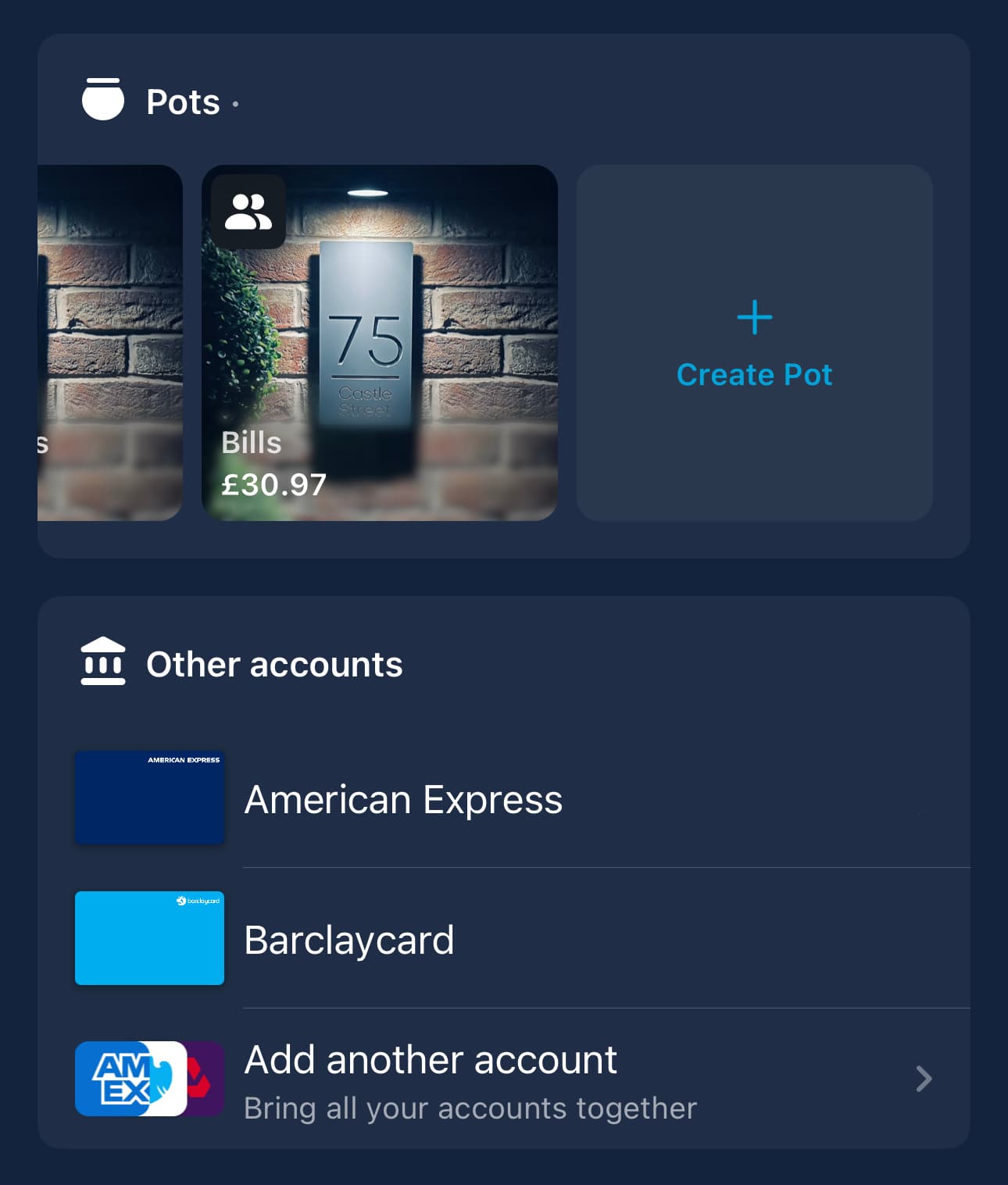
With the add button on top you are able to create pots, add connected accounts etc, maybe also have the option to create virtual cards?
& since you have the add button at the top, the additional create pot and add another account options become redundant.
This would be excellent. +1 from me! Or if “card details” merged virtual and physical cards and you could create virtual cards from in there?
I’m not sure about that. It’s good to have redundancy in the design - although the connected accounts view is still the old one bolted on so that’s gotta change, surely?
What a lot of lovely feedback to come into this morning, thank you all!
Super interesting to hear all your thoughts, keep it coming ![]() .
.
Another minor annoyance, not sure if it’s mentioned within this topic but I’ve only skim read the latest posts
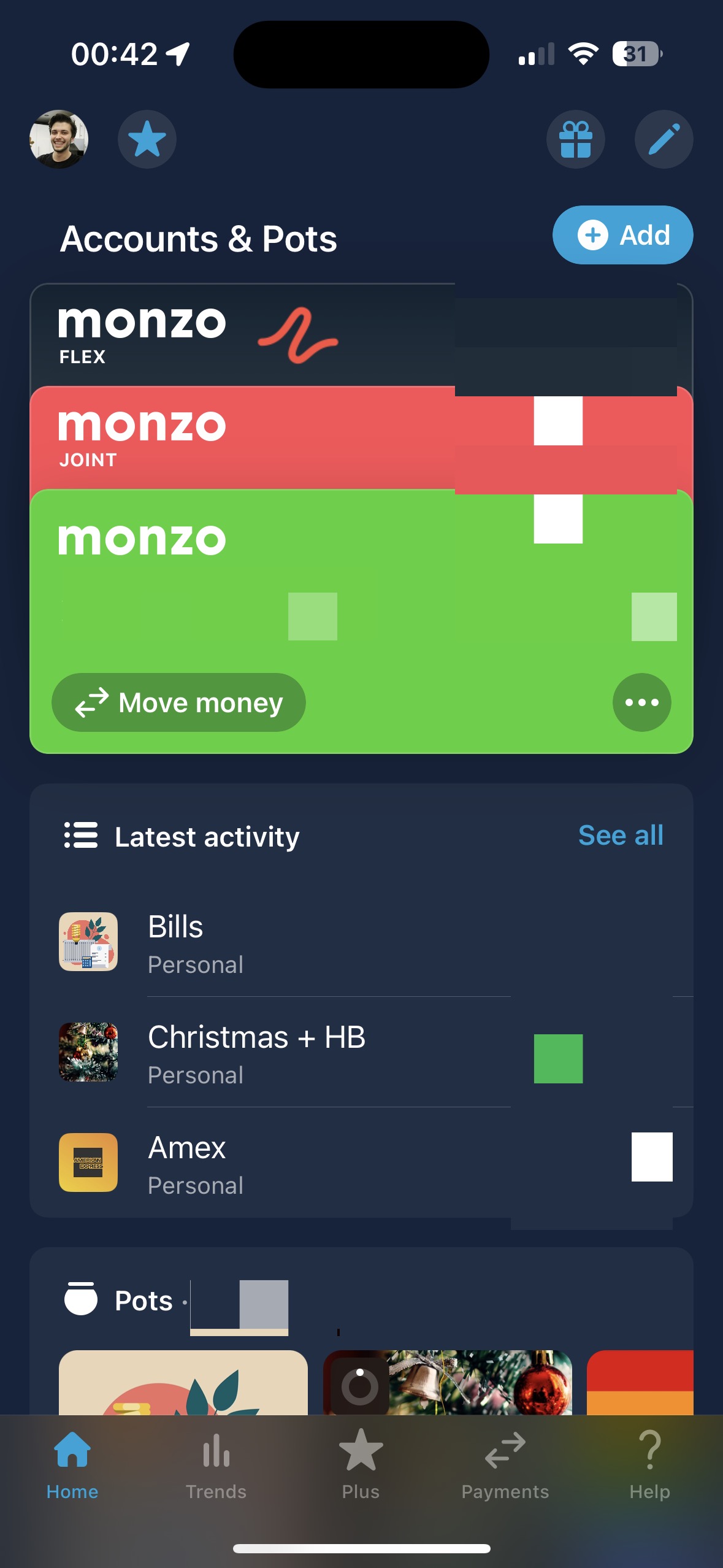
So I start off with this view, of the cards / accounts all collapsed
I then expand that selection to view them all
To collapse that view back down, I have to scroll down the view until they’re out of sight and then scroll back up for it to collapse. Ideally would like it up collapse just by clicking on it.
No ……… I love my left to spend!
The Latest Activity feed shown after selecting “See All” is crying out for ![]()
I really don’t like this. Accidentally stumbled across it yesterday just as it went live.
I’m all for change, but I live off the main pot list screen and it’s gone completely. Big thumbs down.
And I don’t see the benefit of having the joint and personal transactions merged.
This is awful.
It’s not awful. You just don’t like it.
Is Add Money and Move Money an AB test? Seems some have different options.
Feeling like it might be those with joint accounts have move and those without have add?
ah fair enough, the more I’ve used it in the past 24 hours, the more pointless ‘Add Money’ feels, and a quicker and easier way to initiate a payment would feel a better use of that button space, otherwise I like a lot of it, and that @Peter_G post is a thing of beauty with his list of things that could be revised.
Another bit of feedback. The double use of “do more with Monzo” seems overkill. Could they just not be one section?
As a general thought it’s too much and too messy for me, personally. I loved on the old screen how you could “at a glance” see your total across pots and in each account.
That seems hard to do here, I have to scroll and look.
Looking forward to the second iteration
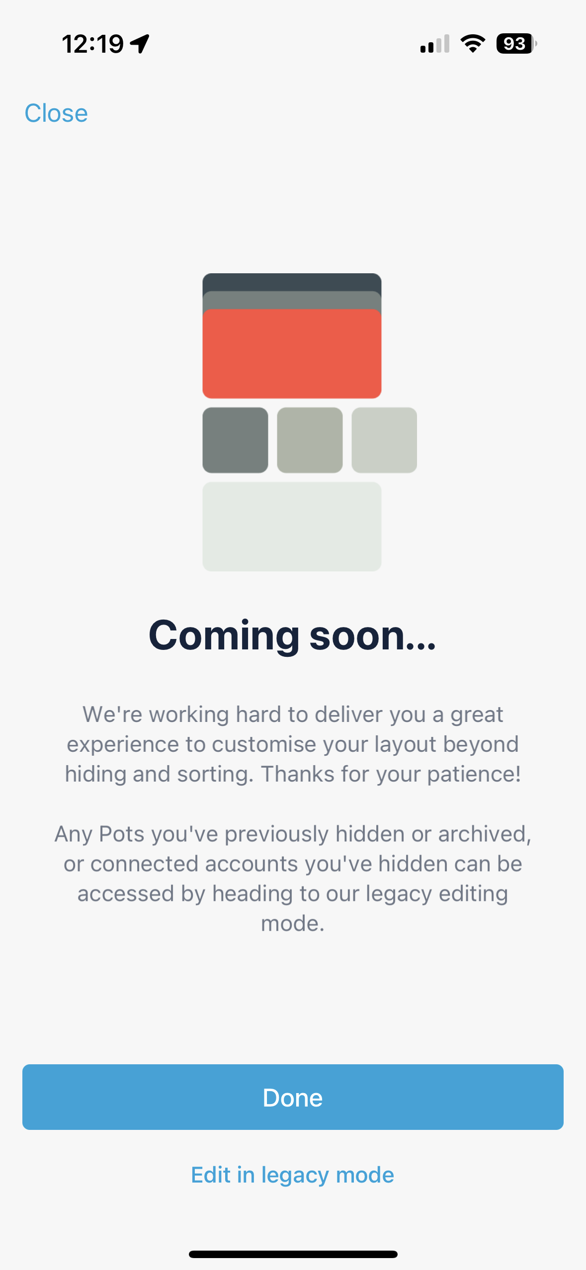
This is already recorded in the parity wiki (I think by me) but this splash screen on iOS references hiding connected accounts in legacy view, which is something you can’t do on iOS!
Blimey!
The future really is now, but are we ready for it? ![]()