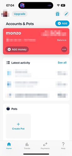
App Evolution (new look Monzo app): Feedback Megathread šŸ“£

Whereas I do, so there is at least a difference of opinions

Most of my active spending (shopping, travel, cheeky pint) is on the joint account and things like direct debits come from my personal account. They both reduce my balance, but it results in me shuttling (or most of the time not) between the two

Hi @emmag
I don’t think there is anything new here as I’ve made some of these points already, and some have been made by others, so it’s just a summary of my current musings. I must say though, this is sterling work and just needs a little tweaking and the ability to customise / order widgets for it to be perfect for me!

Summary

Accounts & Pots (+Add)

I like that this section contains only my Monzo accounts.

The mini cards show ā€œMove Moneyā€ as an option, but ā€œPaymentsā€ is probably my most used option.I hardly move money between my joint and personal accounts, but make payments regularly.

The vertical dot menu should really have the option to create pots/saving pots for personal/joint accounts.

The (+Add) button is misleading. I thought it was to add an account to the widget. but contains create pot/saving pot options that IMO should be located in the pots section and in the vertical dot menu on each account. The other option to add connected account seems misplaced too as connected accounts are much lower down on the overview screen. There is no context here…

Do we need an Accounts & Pots section heading at all ? just a small Monzo Accounts heading would suffice for me…

Last Activity

I like that this is a global feed!
I would like to be able to customise the number of items shown, up to 10 items perhaps.
Maybe there should be a settings cog for configurable widgets?

The See All feed page needs a search function; ideally encompassing accounts / dates / payees / references / notes / text / tags / amounts. something simple but powerful!

Maybe consider turning accounts on/off at the top of the feed. micro-micro cards that can be toggled on/off… I don’t really like the account selection lists used in trends :expressionless:

Pots

I like the horizontal scroll here, which says a lot as I am not keen on HZ scrolling usually!
The order of the pots is odd? based on date created maybe? with no segregation of personal and join pots. From my personal perspective I’d be happy to have personal pots first, followed by joint pots, but there is also case for having separate personal pots and joint post widgets. This would also provide totals for personal and joint pots separately which I think is a must; even if its a one liner on top of existing widget… Pots - Personal Ā£9,999.99 Joint Ā£9,999.99

The option to create a pot at the end of the horizontal carousel is okay but not consistent with other widgets (maybe as its a horizontal list?) which seem to use an always visible ā€œAddā€ option at the bottom of a horizontal list.

Other Accounts

Largely ok, although this section doesn’t have the visual flair of the Monzo account section. After selecting an account, the HOME button should return to the overview. At the moment it drops into the old account card carousel.

The ā€œAdd another Accountā€ option at the bottom of the list looks nice with the card stack on the left hand side; but all these options to add stuff should be consistent. Do we use the title bars to add ? or the last item on a carousel? or the last item in a list? or an option in a vertical dot menu? It’s not always clear… My preference would be to have highly visible actions that are used consistently across each section.

Virtual Cards

Seems a bit lost here… The title has no icon, there is no option to Add a new one.
Do we need virtual cards grouped at all? as they are related directly to accounts or pots and could be accessed from there. If we do need them here, maybe the horizontal carousel used for pots may be suitable to display them in a consistent manner. Maybe all cards (physical / virtual ) could be grouped and managed from this location?

Borrowing

Is this title needed? We don’t have one for savings for instance…

Loans

I don’t have one, so really do not need to see anything here. It is taking space, pushing my mortgage details further down…
I feel that the options shown ā€œGet a long with Monzoā€ and ā€œSee if you can save on borrowingā€ should be under ā€œDo more with Monzoā€ and the loan section should only be shown if I have loans with Monzo or someone else … I say someone else as it would be superb if Monzo could incorporate loan details from TransUnion in the same way that mortgage details have been added.

Mortgages

This is likely to be a persons largest borrowing and should maybe come before loans?
The ā€œAdd another mortgageā€ option is similar to the ā€œAdd another accountā€ option under connected accounts but the plus icon does not have the same flair…

Do more with Monzo

The two do more with monzo sections should be merged.
Maybe it should be a condensed list which expands when selected as it largely contains options that I do not need to access on a daily basis… This would reduce the amount of visual clutter on the overview screen.

Trends

Is noticeably absent from the overview. this is not something I use daily, but it is a big part of Monzo so should really be present and visible. I feel that the front page should include global trends for selected accounts and pots. I’d be happy to see micro graphs for balance, spending by category and targets which lead to the full screen trend view when clicked.

7 Likes

Ah, the perils of picking the wrong colour. I’m still loving my disco pink card


3 Likes

Definitely agree with this, especially if it is going to become a master feed and therefore where I imagine I would spend most of my time as there would no longer be a reason to check current account feed then various credit card feeds individually.

And just on this, I am sure it’s been considered given the many references to allowing customisation, but will definitely want the ability to choose accounts for this feed!

And does this mean we would get (at least) notes/tags for connected account transactions @emmag (and hopefully bill splitting etc too)? Would be sad to have transactions all together but some still less featured.

For me (iOS testflight 5.5.0), this seems to be the same order as on the carousel / the old home screen list view.

4 Likes

Another small point about the quick access menu.

On the current account, there’s an option for Statements, which takes you straight to the monthly statements screen.

But there are other statements: Statement of Fees and Interest Statements. It would be good to have access to all three of those from one page (maybe by tweaking the existing monthly statement page?)

While I’m on statements, it’d be great to have a similar shortcut for the Flex card (and other relevant options like Manage Accounts, shortcut to card details etc).

3 Likes

Ok, I’ve used this for a day and I’m afraid to say that I don’t really like it :disappointed:

First, it’s just not that useful. The screen shows my balance, which is useful, but that’s about it. I don’t need a picture of my face, an upgrade offer, a refer a friend icon, constant reminders of my sort code and account number, or a third of the screen given over to creating a new pot.

The recent transactions could be useful but isn’t. This morning it showed 2 upcoming direct debits and an Amazon purchase from last night. Now it shows the same 2 upcoming DDs but also my lunch purchase - though not the coffee I bought this morning.

I really like the Left to Spend graphic showing my spending vs how far through the month we are, and it’s a shame that this isn’t visible on the new screen.

The next point may be a bug, but my app keeps bringing me back to the new screen. Open app :arrow_right: see the new screen :arrow_right: click my account to get to the card carousel screen / the feed :arrow_right: view a transaction :arrow_right: click ā€œbackā€ and I end up back at the new screen. ā€œBackā€ should take me back to my feed, surely?

My ideal front screen is the feed, with all my recent transactions, my balance, and the Left to Spend graphic… This latest update feels a long way removed from that.

9 Likes

Can I ask how you use Monzo (no wrong answers here!)?

Am I right in saying that it’s either your main or spending account, no pots, no Flex or other Monzo products, no connected accounts and that you use Summary to tell you Left to Spend which then drives your spending?

It feels like that is a use case that isn’t particularly well served by this model. I love it because I’m a heavy pots, connected accounts and Flex user. Your screen, by comparison, looks a bit empty… And if you’re budgeting through Left to Spend I totally get the need to have that front and centre…

2 Likes

I don’t budget strictly but I do stop and think a bit when I see the balance dropping too fast vs the progress through the month. Equally, when Left to Spend is green and I can see I have a reasonable buffer, I’m more relaxed about spending. I can’t say that I ever actually click in to Summary.

7 Likes

I’m not Monzo (obvs) but this is excellent feedback. It’s easy to design for power users (and engaged folk like us) and sometimes forget the more straightforward use cases!

3 Likes

I am on an android pixel 6 pro - once I enabled this Monzo disappeared from app search. It is still there in full app list.

Also as others have said - seems to be UX designed for upselling not usability.

Overall as I will never pay I am less likely to make monzo my main account not more.

2 Likes

Currently… they have had product ads in that screen many times before and spliced throughout. I just ran my RBS to check and they are all off right now at least but they have had splash screen notices on launch with ads in the past.
RBS tried to get me a loan and mortgage with various messages and splash screens. Also they keep wanting me to get them to check my credit history regardless of how much I dismiss it.

It is very clean right now at least but I don’t run it a huge amount so not sure when the products messaging went away.

2 Likes

I had a big notice on the accounts page in the RBS app just a few days ago advertising the DRS account, even though I’d already got one.

2 Likes

I have to agree. The insights that NatWest give beat a number of the banks out there

1 Like

This may/may not be the place to mention it, but if you are revamping parts of the app - please get rid of the ā€œgetting paid earlyā€ animation

2 Likes

Do you mean the drag-down to the wallet (or pumpkin when it’s Halloween) to get the incoming BACS payment in advance?

Oh boy
Sharp_Intake_of_Breath

  • that’s one of the best parts of the entire Monzo banking experience
8 Likes

It is. But getting paid early without having to do it manually is God Tier.

Make it Happen, Monzo!

5 Likes

I like the manual option.

5 Likes

Me too.

There’s something about getting the notification on the day, waiting until 4pm, then opening the app and dragging down that sucka until :boom: - more money in the account.

It’s a very-positive mental elf ting.

Auto-payment? Seems a bit Faster payment with the usual no added character. I’m all for automation but this one thing is a beauty in engaged execution.

PS> MrsW & me have a comp to see who can claim payments into our Joint account quicker. It’s 50/50 at this stage which in itself exemplifies a Joint account!

4pm always tense. Followed by an equally tense Salary Sort :thinking:

13 Likes

Surely it isn’t too difficult for them to leave the manual option there (for those who want it), but have something underneath where you can toggle for it to do it automatically moving forward?

3 Likes

Revolut so this automatically at 5pm, which is preferred.

2 Likes