As promised, I’m back!
This time around I wanted to give a sneak peak into the App Evolution project through visuals.
As mentioned in my last post, this project kicked off with a phase of discovery. As a part of this, @leepethers took the research we’d done and incorporated it into some sketches of what the app could look like:

The thinking that went into this was:
- A combined feed helps show you what’s changed on opening Monzo, and makes your latest transactions discoverable across accounts
- Contextual trends give you meaningful, actionable insights
- It enhances how easily you can discover core products and features
- It scales up and down well, and lets customers see the value of having more in Monzo
- Quick actions let you access core behaviours like adding money, separating money, creating an account, etc
- Monzo Plus and Premium are more naturally baked into the experience
- Showing you the full scope of what Monzo has to offer — beyond being a current account
From here, I built the technical demo you accidentally saw previously to understand some of the technical complexities, and @leepethers took some of his designs and made some tappable prototypes for user testing.
We had two prototypes for this first round of research — with quite different visuals! They were intentionally polarising to try and get more reaction from the customers we spoke to.
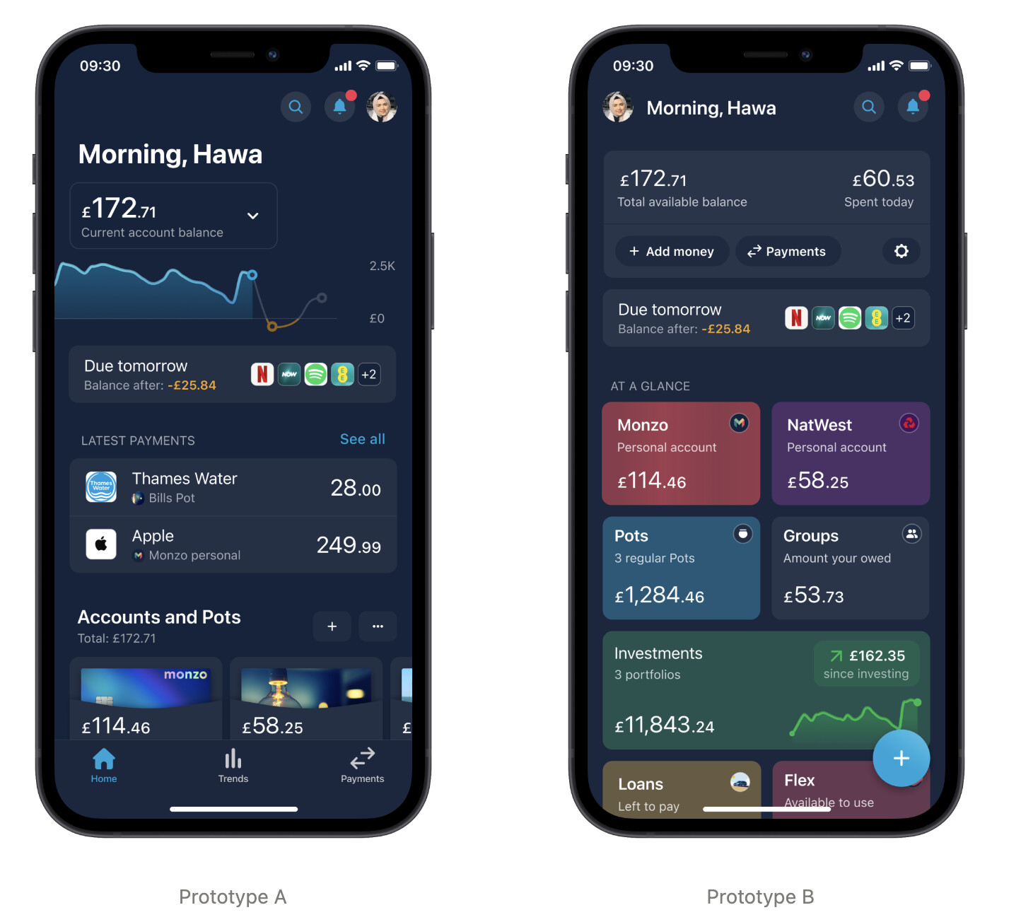
Prototype A was a data-centred financial overview. Built to pass as much contextual, relevant data as possible — to create an engaging, dynamic feed of content. To give customers a concise overview with enough data to make key decisions and know what area of their finances to focus on.
Prototype B was the opposite — limited data, requiring a tap to reveal more. A much higher level grouping of finances.
We set out to:
- Get a good understanding of how the concepts performed against our assumptions, and build confidence when focusing on a refined direction
- Make sure we considered as much as possible, and understood the impact of potential changes with a range of customers
On the whole, customers liked Prototype A better. There was some divide, with some finding all the data on A to be overwhelming — and things like the balance graph confusing. Prototype B for most felt a bit sparse, and not rich enough to provide value.
We took this onboard, and Lee build a Prototype C for a further round of testing:
As you can see, it’s a combination of some of the visual elements (we’re calling them widgets) from A and B plus the overall data richness of A — though paired back slightly to try to not overwhelm!
We had some really positive feedback from the next round of research with it:
 Increased sense of visibility. Customers were excited to see their key financial information in one place and are able to articulate their financial position clearly from the overview
- Less (but still a bit) overwhelming. We’re moving in the right direction, there were fewer concerns about the overall level of information
- More complex jobs and actions were easy to perform. The new overview enhances the ability of customers with more complex needs to complete key jobs and tasks.
- Contextual actions were quickly and easily discovered and help keep navigation intuitive (even if it is complex now). They helped customers discover more things they can do with Monzo
- Spotlight insights were discovered by all without prompting, but not always understood or relevant. We should make them more contextual to their location and core jobs to be done
There remained (as always) opportunities to improve though. Mostly around continuing to balance the information — recognising that not everything can, nor should live on the overview! Plus, the ability to filter and group by accounts for foundational tasks (viewing you balance, recent spending etc) was really crucial for visibility, and any contextual actions really do need to be relevant to bring value.
Building v1 of Overview
At this point, you might be thinking — well that’s great, but… where are you now?
Alongside the various rounds of research, we formed the App Evolution team and started building out the technical foundations to power the Overview screen.
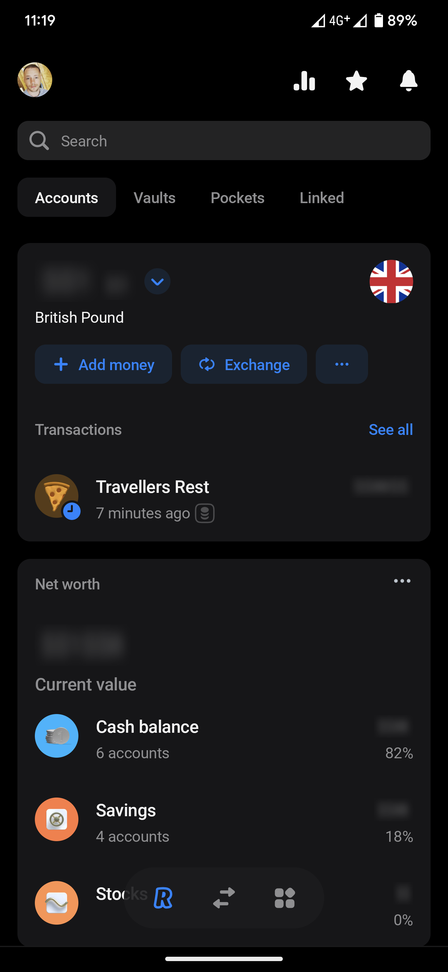
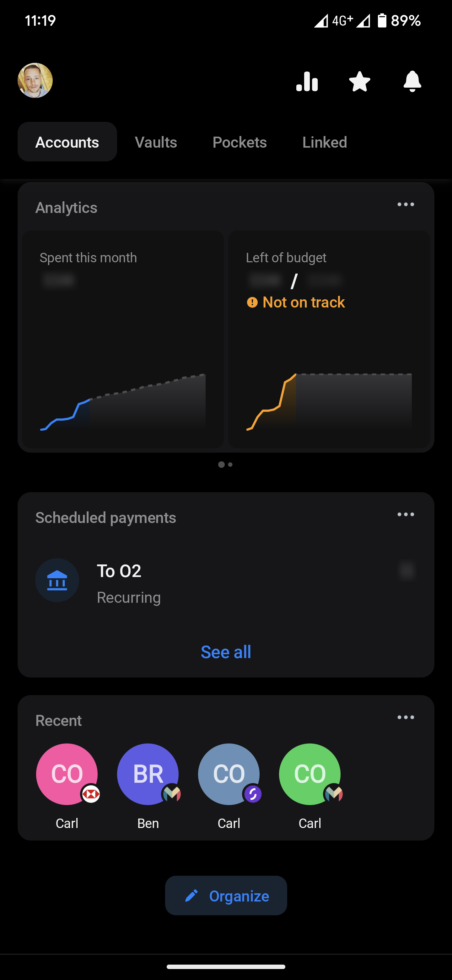
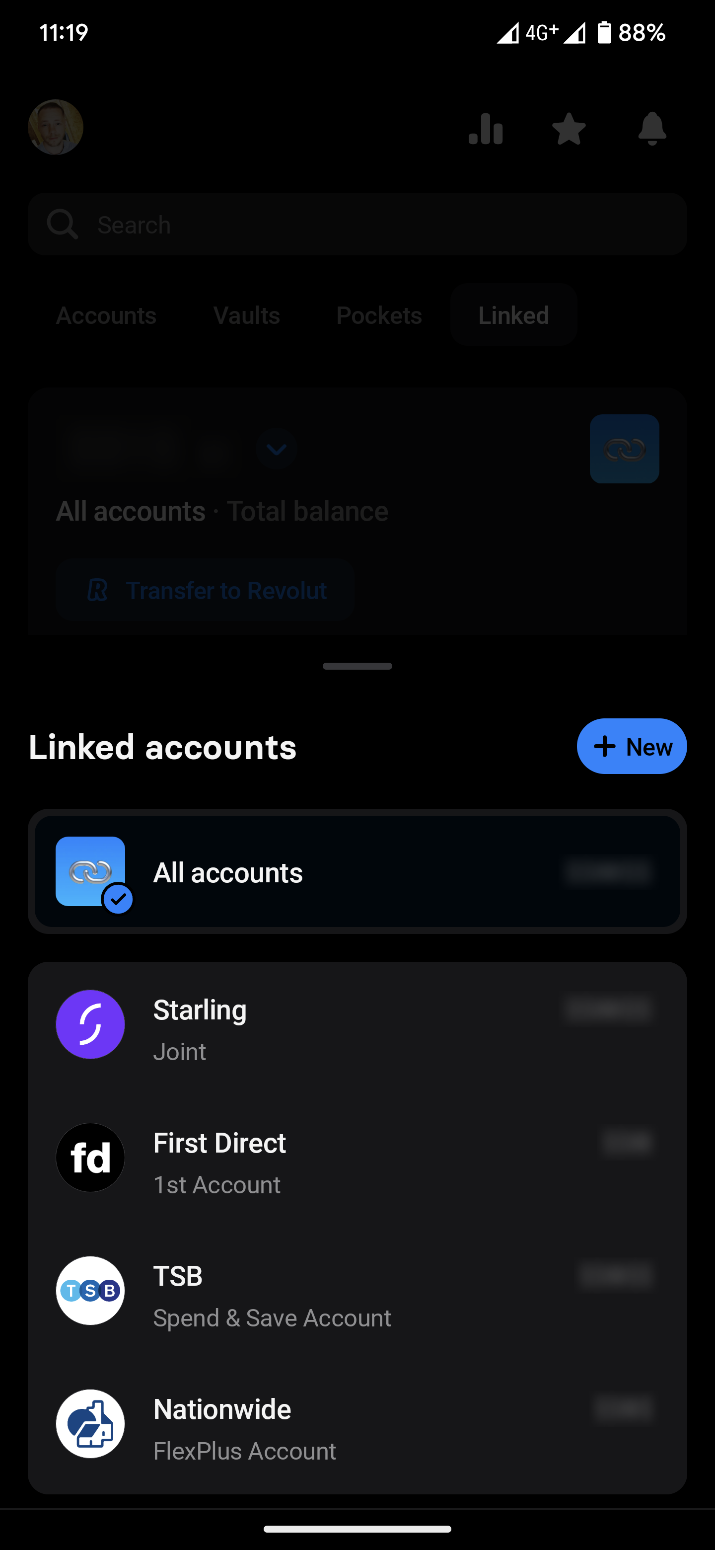
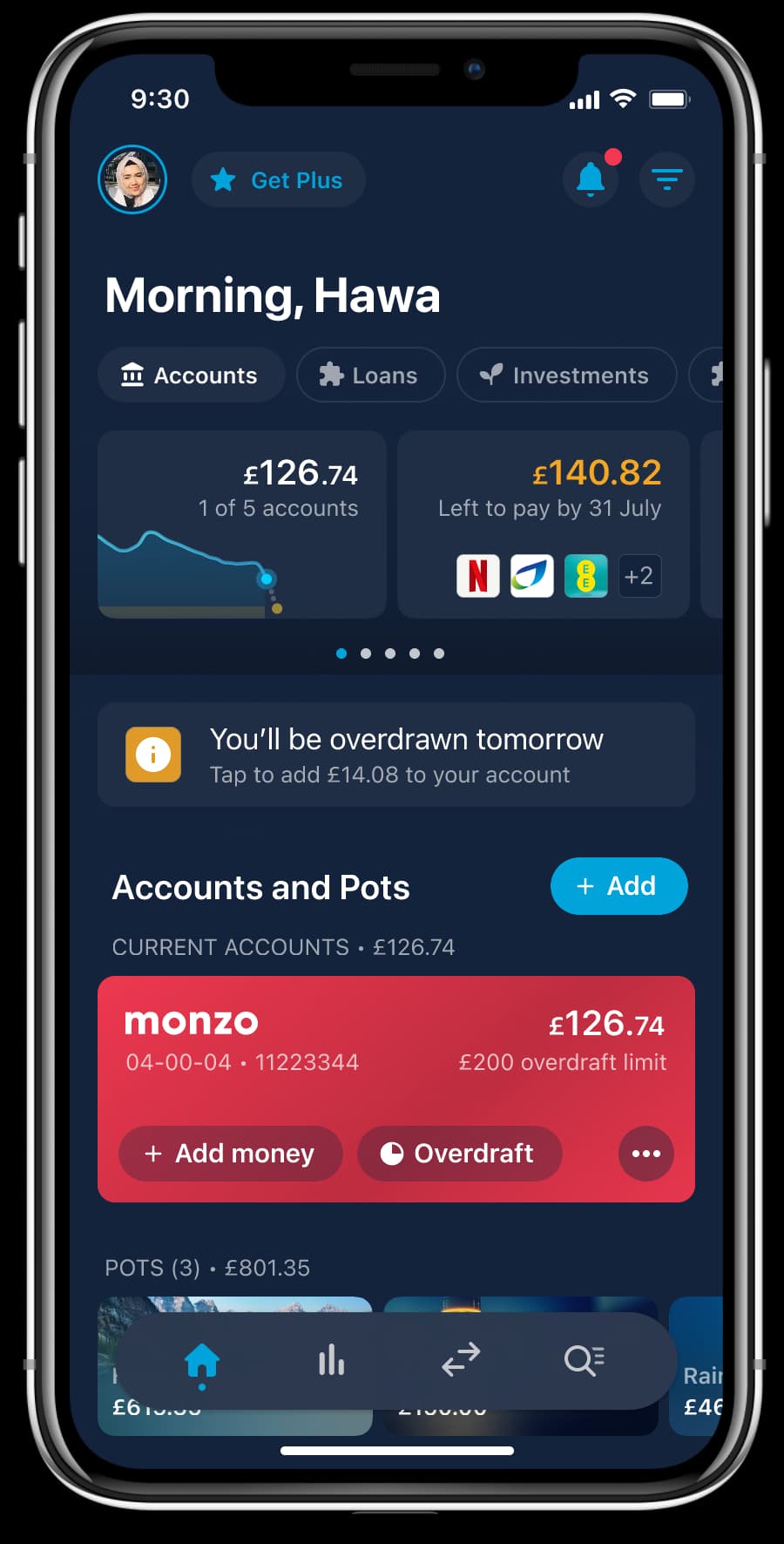
We’ve built towards a v1 that looks like this right now:

This is a very early iteration (and isn’t ready for customers yet!). Next we’re working on implementing some fundamentals and working to make the experience and content feel good enough to put in people’s hands.
We’ve released it internally to staff in the past week or so, and it’s been nice to see and get feedback on this early version. A lot of what we’ve heard so far has aligned quite well with the user research, which has felt quite comforting!
Our next goal is to have a v2 that we can put in public Labs for y’all to have a play with.