IF they made that part of the customisation then everyone could be happy!
1 Like
Forgive me if I’m missing something, but doesn’t the current Overview screen let you see all your accounts and transactions? We know the unified feed isn’t complete yet, but it’s definitely on our radar
I’m sad this effort seems to only address the home screen as that really limits options and makes it hard to holistically address concerns with the app.
App Evolution isn’t confined to Overview, it’s just the first part of the app we’re improving because we think it can have the highest impact. We’ve had lots of discussions internally about where else we might look to improve afterwards
9 Likes
Wait and see ![]()
9 Likes
I think it’s a good start.
Two main thoughts;
-
Not sure how I feel about my data being co-mingled with promoted features. It can lead to a bit of information overload and difficult in discerning between what is mine and relevant and what is not at a glance.
-
I’m wondering if it’s possible to turn the homepage into a slighty more customised version ala windows phone with the widgets being adjustable in size so as to better meet people’s individuals needs and preferences?
4 Likes
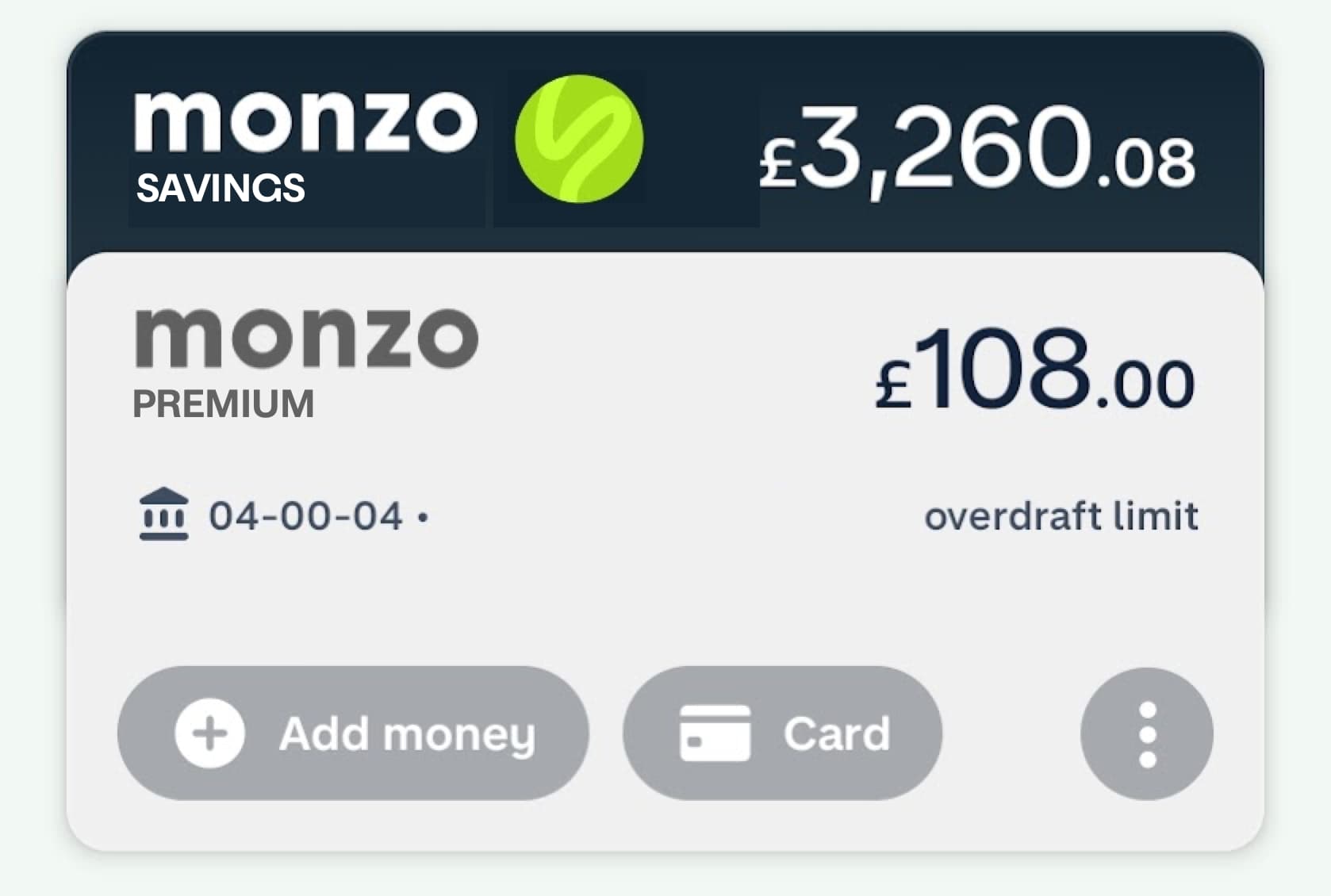
Another bit of feedback! Can we please ditch the “Add Money” button on the account cards? It doesn’t really seem necessary for a “real” bank account… Feels more like a top-up card.
12 Likes
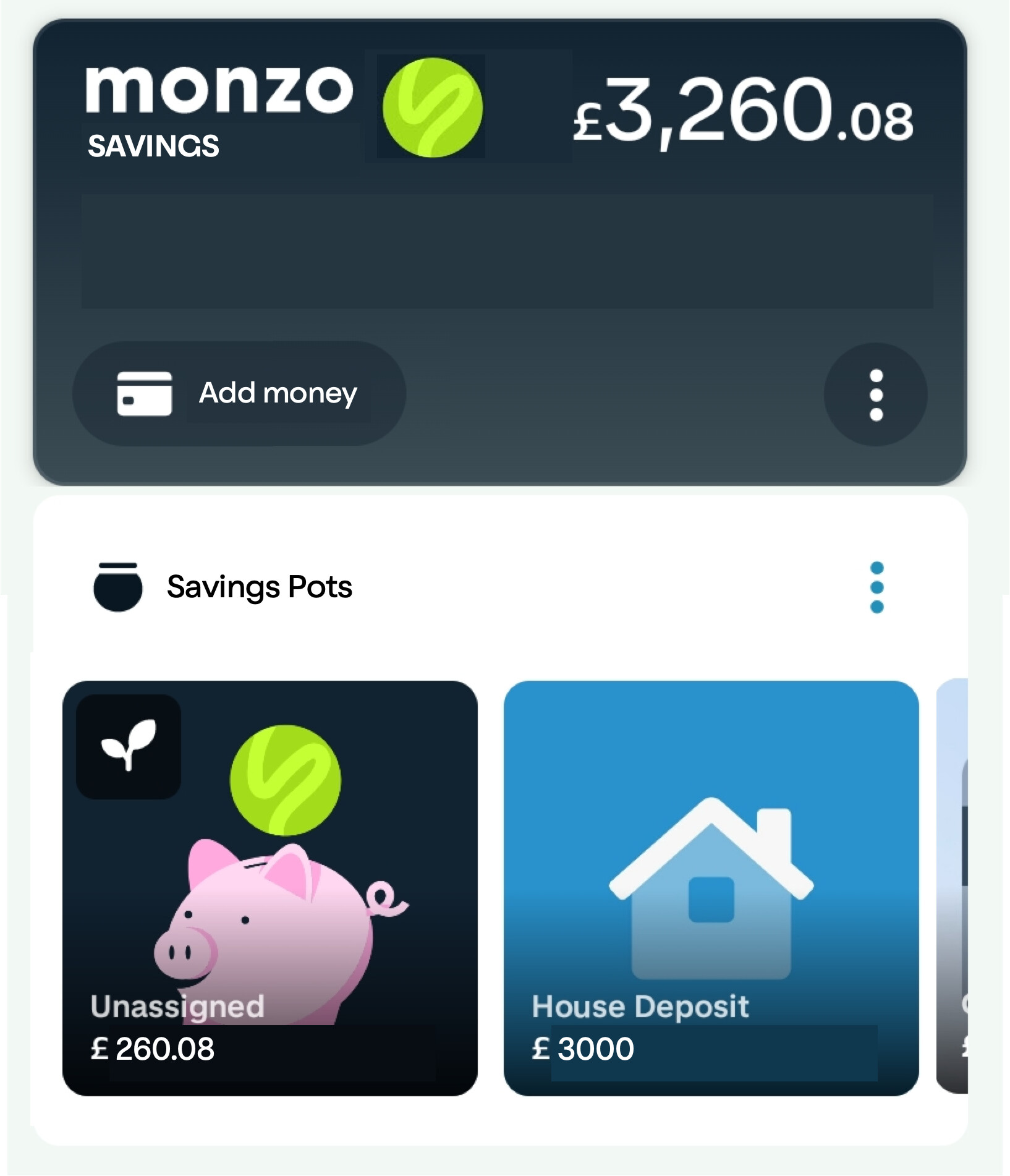
Now that Monzo has issued its own savings account and if you’re a Plus/Premium customer you get the % bonus on top of the 3%, I really would like to see a total of pots per account not just personal + joint total. There now probably needs to be a section that totals Monzo pots and third party pots separately due to the latter not going towards the £2K. I could work this out but it would be lovely if Monzo could do it for me.
2 Likes
Oh my, you’re asking for it now ![]()
![]()
(There are, erm, strong opinions from others about the horizonal scroll!)
1 Like
Yes please. It’s one of the main things keeping me away currently. I can’t stand how complicated it is.
So, personalisation would be ace. Show me my balance for any accounts, my savings balance and that’s it.
I know that what I want will be the same, and totally different, to other wants which is what makes this such a challenge!
1 Like
I’m not sure if it’s a bug or if I’m just doing it wrong, but I’m trying to add notes to my joint account transactions and every single time it deletes whatever I write the first time and I have to write it all over again. Minor minor bug, I’ve just started writing “a” then letting it delete that and write what I actually want
1 Like
To everyone’s horror, I’ve mocked up a better (?) approach to savings accounts and pots in Monzo over here:
Spoilers:
And pots for savings, current and connected accounts!
9 Likes
In my mind, you’d be able to promote connected accounts to the top section.
Say you have a Santander savings account, I’d see you being able to create ‘pots’ within that account. You can only see them in Monzo, obvs, but it would be a way of saying what goals you’re saving for within that account.
A better example might be third-party pots. Instead of , or as well as, Monzo Savings up top, I’d see that as Oaknorth and their logo, with the same ability to create pots below it. Basically, anything up top is an account, and every account can have pots assigned.
As for the non-interest bearing pots, they are just subdivisions (aka pots) of the main Monzo current account.
That way every account can have sub-accounts (pots) and it’s very clear about what interest is payable, what their total balances are, and what goals/bills you’re saving for.
In fact, I think there are probably three types of sub-account / pot: bills (where you put fund a pot then pay from it), goals (where you’re working towards £x), and set-aside (where you just want to separate the money for whatever reason).
It all seems clear in my head - does my explanation make sense?
2 Likes
Optionally I hope, but yes. Savings “above” pots from a hierarchy point of view.
Forgive my design sins, this is tough on a phone!

3 Likes
I see the hierarchy like this:
Monzo App
- Monzo Current Account
-- Current Account Pot 1
-- Current Account Pot 2
- Monzo Savings Account
-- Savings Account Pot 1
-- Savings Account Pot 2
- Oaknorth Savings Account (formerly Pot)
-- Oaknorth Pot 1
-- Oaknorth Pot 2
- Connected Santander Current Account
-- Santander Pot 1
- Connected HSBC Savings Account
-- HSBC Savings Pot 1
-- HSBC Savings Pot 2
In terms of the app, I’d hope for a fully customisable vertical list of pots/accounts where you’ve got them on your screenshot. Then the horizontal view if (and only if) you tap the account card up top. But that would be immediately below the card, to show they’re part of the same thing.
3 Likes
Dare I say it but this but with the account tab swipeable left to right.
Looks too cluttered for me otherwise. Personal opinion of course, nice job mocking it up!
1 Like
What do you mean here? What are we swiping to and from?
1 Like
Well in my mind the “card” that holds the account details on etc would swipe left to right (like it does now) and the details below would update e.g. if you’re on flex you see the flex transactions etc.
Sort of like a nice mix of the old and new.
Ah right!
I think the plan is for it to be a megafeed showing all accounts by default.
How would the sideways swipe motion work if the cards are stacked? Would you change them to be a carousel like the old view?
3 Likes
Well that’s my thinking - the cards move left to right through swiping and the detail below adjusts below/there’s a unified feed. I personally (and I fully realise that others will!) don’t like the way the cards stack at all.
3 Likes
Ah I get you!
I think I disagree though, with a few tweaks I’m #TeamStack (probably).
1 Like
Have been using the new home tab for a couple of weeks. Here’s my feedback…
I do like the idea of the Home Tab containing widgets that provide at-a-glance high-level information about some aspect of your account (and I think this is done well for the full/main account widget at the top of the home tab).
However, I don’t like the “Pots” or the “Other accounts” widgets/sections. I think both are trying to cram too much content onto the Home tab leading to a cluttered feel. I also dislike the horizontal scrolling for pots. For both these sections I’d like to see something more akin to the main account widget - i.e. high level summary info available on a more constrained widget. Then to get more complete/granular detail (such as list of all accounts and transactions) you would need to tap on the widget to launch into another screen/view dedicated to that content.
What high-level info do I envisage for a Pots widget? Things like total balance in each category of pot would be useful. e.g total regular pots balance, total instant access pots balance etc.
What high-level info do I envisage for a “Other Accounts” widget? Again, total balances grouped by account type (total current accounts balance, total savings accounts balance, total credit cards balance) instead of a list of all connected accounts.
Whilst I do like the idea of widgets with at-a-glance info, I would like to be able to enable/disable this functionality on a per-widget basis. For example, I like having this for the main account but might not want it for the Pots widget. So it would be useful if I could choose to disable it for the Pots widget. I’m thinking here along the lines of Windows 8 Live Tiles, where users could choose, on a per-tile basis, whether or not to have summary/live info from the app displayed on the home screen app tile.
Also, with the current approach it seems there is potential for some widgets to provide duplicate/alternative views of (and/or access points to) the same content. e.g. the latest activity widget duplicates information that is accessible from tapping into the main/current account widget. I’m not against providing multiple ways to view/access the same content, but where this is happing I would like the option to disable/hide the widget that is providing a secondary/alternative view or access point.
Finally, although the action/product menus on the main account widget seems to work well I do wonder if that approach might be problematic when implemented across multiple widgets (I assume that’s the ambition). I worry it might lead to unnecessary complexity and/or a degree of incoherence on the home tab. Personally, I’d be more than happy for those content/section-specific menus to only be accessible once you have tapped on a widget to launch into a full screen experience for that content/section.
3 Likes