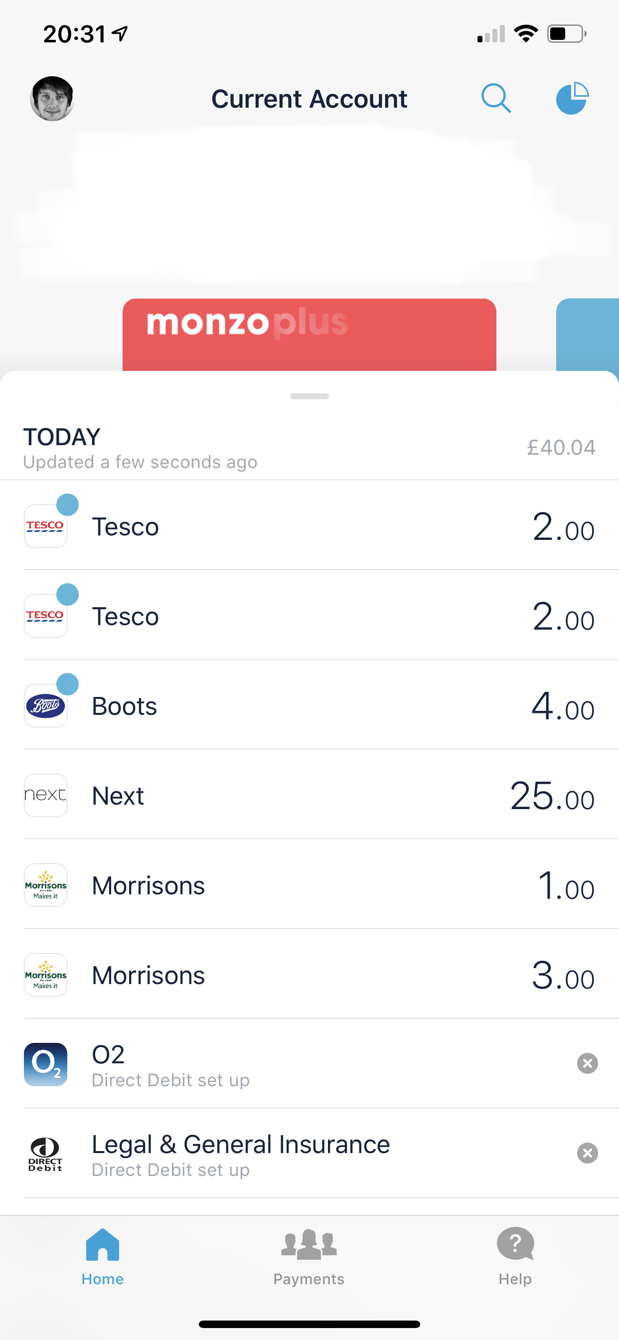
Can you please do something about the spent today figure/notifications so that committed spend isn’t included? To be reminded I’ve spent 40 odd quid when I’ve actually only spent about a tenner and the rest was direct debits I have no choice but to pay.
4 Likes
I cant be the only one that thinks round ups to pots should be included in summary and left to spend.
Figures made up for ease. But if I have £1500 paid in on payday (Account balance), £500 for direct debits / committed spend. That would leave £1000 “left to spend”.
Having round up enabled to save pennies here and there would decrease the account balance and not the left to spend as it currently is. Which means towards the end of the month means a direct debit could fail. The only way to stop this is to have a buffer in the account balance or disable rounds up so account balance and left to spend decrease together. Both of which defeats the purpose of round ups.
1 Like
Sure you’re not the only one but I’d add my vote for keeping roundups (all pot transfers) out of Summary and Left to Spend. Ideally you’d get the choice.
1 Like
Yes it’s not the Monzo app issue though it’s Apple disabling the functionality randomly
There’s a few comments here about how Spent Today, Round Ups, and Left to Spend should behave. You’re all right that it would make sense to the patterns you’re describing. The challenge here is that different people have different mental models about how they want to work with their money. There’s lots of other people that would say “I want spent today to only show how much I spent, not how much I saved, because I still have that money”. Which would also be a fair comment.
In this project we’re trying to maintain the same patters that we had before. These 3 figures are calculated exactly the same way as before (we’re using the same backend endpoints as the old nav). Which I think is the right thing to do at this stage. Later on we can revisit some of these concepts if we think there’s a better way to represent them.
11 Likes
I mean I’ve disabled round ups to stop the possibility of being over drawn. I just really like seeing my account and pots being rounded up to the nearest £ 
A toggle somewhere in settings to enable / disable what you’d like left to spend to display would be awesome.
It would be very helpful if you created a thread for this, or maybe one already exists. As this would allow other people to share their thoughts about this.
I’m really liking the new update on IOS 2.57. I’m loving spent today is back.
One minor thing I’ve noticed about this. On the iOS widget, if you’ve spent £0.00, it shows as such. On this update, if you’ve spent £0.00 it’s blank. Could we add some consistency and have £0.00 on spent today if you’ve spent nothing yet? It would also help to see on what days per month you’ve spent nothing, if you’re doing the no spend challenge which Monzo wrote a blog about.
A few questions about this, is there a plan to introduce the progress bar for pot goals? I mentioned this last time, but this would fit with the UI of the progress bar on left to spend and would look nicer.
Are there any plans for transaction history for pots? Just like Android has. I know you can get to it via summary, but that is a long way around for it.
Any update on dark mode before September 2019 when iOS 13 is released? I know in another thread @bruno mentioned he wants dark mode  .
.
Problem is they replaced it with something even less intuitive so you have to go through several screens to find some of the options, then took away half the tabs…
Hamburger was always a compromise, but it was one that most apps used therefore less to learn. Still, we’ve had this discussion and they aren’t budging, so we have what we have.
1 Like
Out of curiosity, how do you know that for certain? Not something I’ve come across elsewhere, in nearly 2 years now of having Face ID.
1 Like
Long pressing the icons at the bottom and switching between accounts doesn’t work.
1 Like
I have had it quite a few times on other FaceID access apps, generally after an app update as well as iOS update, after a reboot of device and it says need to enter pin to enable faceid.
I think you’re misunderstanding my issue. I get that after app updates etc it sometimes prompts to use Face ID again. The Monzo app isn’t letting me use Face ID for payments, hence the fingerprint in the corner. That leads me to think it’s something broken in the Monzo app. Maybe @bruno can confirm if it’s a known bug?
2 Likes
Am I mistaken in thinking that swiping the card to access the “view all accounts” screen was coming to iOS in 2.57, or is that still to come in 2.58? 
I’m really looking forward to having that interaction as opposed to reaching for the profile icon in the top corner. 
On a side note, I wonder if there’s any space left for another gesture to access summary, as that’s still pretty far out of reach at the moment. Perhaps, as others have mentioned, tapping the summary bar on the home screen would help to make it more reachable (even if only a little).
5 Likes
Personally I’m mostly liking the new redesign, but one thing I find really jarring is the way the panel slides up and down on the home screen, especially as it keeps snapping to this in-between state:
I think the way the panel feels to use could be improved by only snapping between fully open and closed states
3 Likes
I think the new look is a step in the right direction towards making the app simpler. I have a couple of ideas which might help:
1/ Main navigation where you slide across to view each pot is a nightmare when you have a joint account. It takes ages to get to pots. Its frustrating when you need to move money out of a pot quickly and you’re swiping. It’s easier to go to the other menu, buts it’s not an intuitive choice. Especially if you have a big phone and have to reach up to the top left.
2/ when I am scrolling through pots and I want to go back to the main account (red card) I intuitively keep pushing the card at the back expecting to go back, but that doesn’t happen.
3/ when I push the menu in the top left, there’s no back button, I know you can go into a card, but I keep looking for a back button in the top left. It sometimes feels like you’re a bit stuck in that menu.
4/ The card on the main screen is way too big, I rarely use those features and it seems like it takes up a huge amount of space.
6 Likes
Think Help and Spending should swap places. Spending should have it’s own tab, how often to we use help?
3 Likes
I miss “spent today” and a feeling of how much I’ve “spent this week”
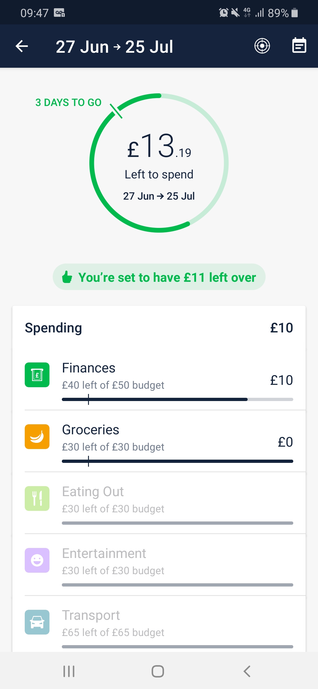
Morning, I’ve updated to 2.57 on Android yesterday, and I just wanted to check something with you.
Using the new NAV. When you click on the Piechart/Left to Spend comes up with the amount of days you have left.
Underneath the Piechart, it tells me for example that ‘You’re set to have £11 left over’.
In the chart above it’s got £13.19 left to spend with 3 days to go. I know tomorrow I have £11.99 due out, so the £11 that it actually says it probably working as designed. However as of today, I would expect that to actually say £13 (rounded down to the nearest pound). So why is to taking off the £2 today?
It wasn’t planned for this release.
We have a working version of this interaction on a separate iOS branch for some time, but still needs some work.
However we learned from user testing that we need something a bit more robust. Customers aren’t using that interaction, and when they do they feel lost. I personally love it, and use it everyday. But you’d have to be a power user to really understand what’s happening.
So the plan is to build a new interaction. On iOS I think we’ll skip straight to the new gesture. It’s going to be much better ![]()
8 Likes