Without scrolling through the enormous thread to see what else has been fed back, my thoughts are:
The ordering is frustrating, I want rapid switching between my Personal and Joint accounts, so they should be first in the list, followed by Personal and Joint pots.
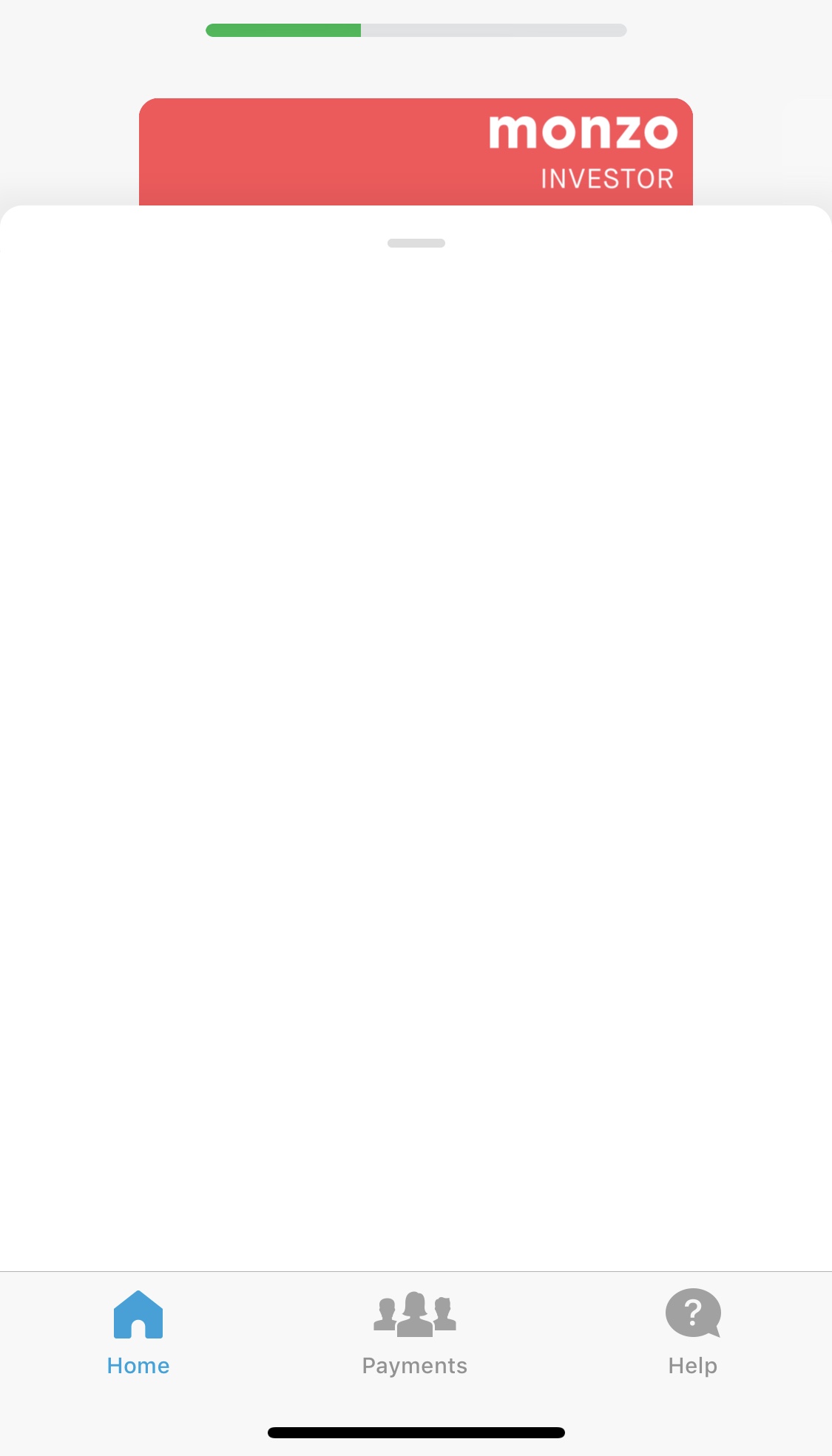
I notice that the latest update puts the name of the account at the top when you begin to scroll and cover the card/image, this is a big improvement but it’s still easy to get disoriented, and this has been an issue since the introduction of the Joint account. I like how this looks on the Payments tab with the button to switch accounts, I’d prefer this on the Home tab, too.
I understand that the objective is to simplify the app, but moving Summary from the bottom tab bar to be a cryptic button at the top seems to demote and hide one of the most valuable parts of the Monzo experience, it’d be interesting to know how much usage of this feature drops if it is moved there for everyone.
So using the new nav on and off for a bit now for me the swiping across just doesn’t feel great and can be a bit sluggish at times also I feel a lot of space is taken up with that style it should be a way to adjust if isn’t working out.
Another thing the transaction list I hope we will see more than just two transactions at times as it feels wasted just having two when we can see more rather having to collapse the whole card section.
One thing that’s nice is having more detail on the card with the chip being there would nice to have the name there just for aesthetics I know it might not be for everyone but would like that. Also when adding money to pots on android the card has a lot of detail like the chip but on iOS it’s just got the card and the numbers stared out.
I do feel there should be some form of back button in place as at the moment it’s taking a lot of effort just to get back home when it shouldn’t be that hard so at the moment for me I still feel that I’ll keep using old nav and dip in and out again with the new nav.
Keep up the great work @bruno and team will look forward to seeing what else is in store up with the future updates.
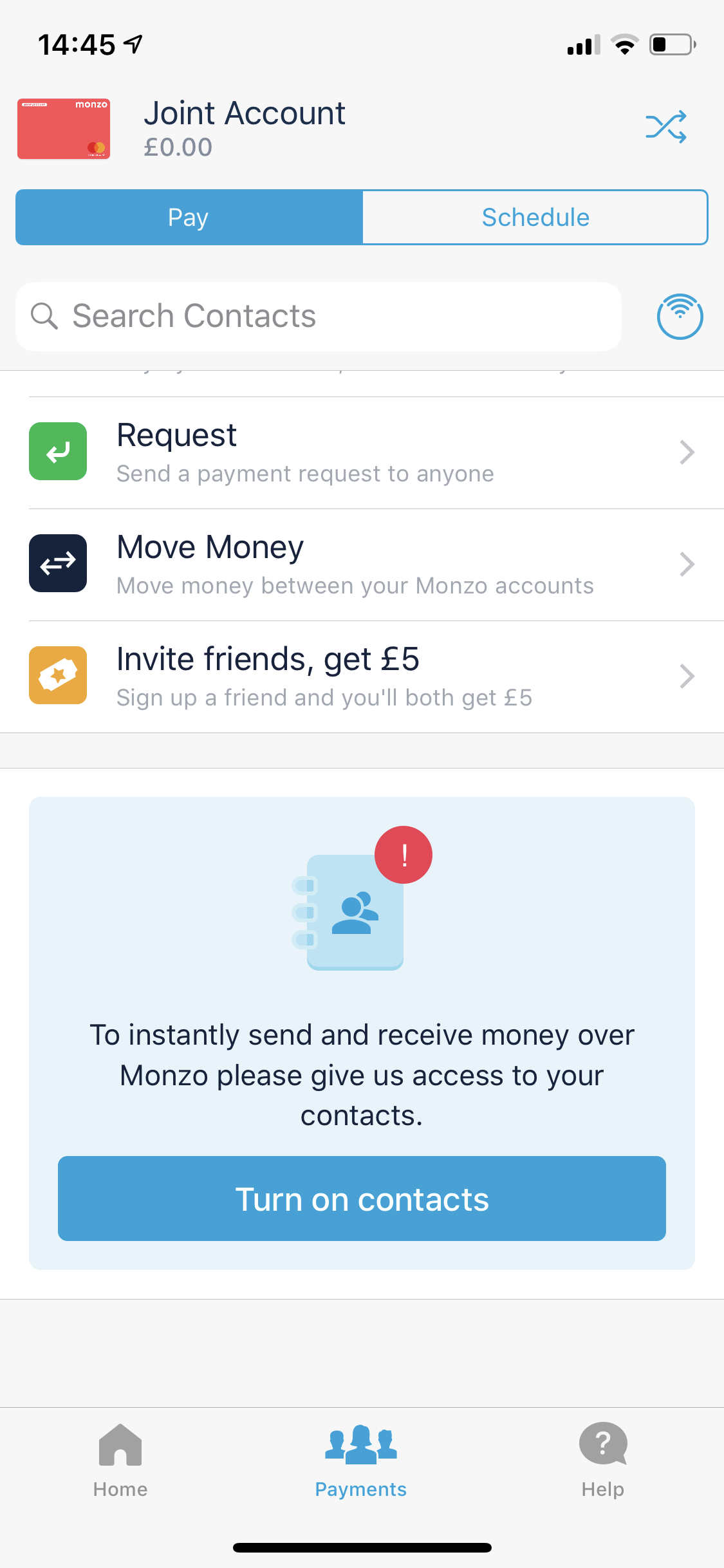
Another thing I’d love in the new nav, is a way to remove that massive ‘Turn on contacts’ box in the Payments screen. I don’t use it, I’m not ever going to use it, it’s just wasting half my screen space. @bruno, any plans to make this removable?
Another thought, totally agree with those saying we need an option to ‘close’ the accounts view. It’s not intuitive that you have to tap on an account/pot to leave that screen. That particular screen feels like it should be more of an overlay, rather than it’s own page, if that makes sense? An ‘at-a-glance’ thing.
EDIT: Another thought on this - I can tap on my name/profile pic, or the Cog icon, and both take me to the same screen. Cog feels like it should go direct to Settings.
2.57 looking good with the condensing. Only thing really irritating me on it is the sort code and account number are not centred when at the top of screen it’s pushed off centre my search and pie graphic. OCD rearing it’s head there.
This is intentional to draw attention to the search area. The height is variable based on device height, and the first suggested article is always at the bottom which gives a visual cue to the user that there’s more on that page than just the search box.
Sadly no. If you enable contacts on Monzo your entire app experience improves dramatically. So it’s natural for us to push customers to enable this setting. Without it your friends can’t easily send you money without asking for your bank account details. If you haven’t tried this yet, once you give contact permissions you can just tap on a friend’s name (from your phone book) and just send/request them money. It’s also what powers Bill Splitting, and Shared Tabs, both amazing features too.
If you’re worried about privacy, we don’t actually know who’s in your phone book and we don’t upload the numbers to our backend. I’m not the best person to explain it (since I’m not an engineer) but we do some clever matching of partial hashes between the client and the backend so that the app knows which contacts on your phone are on Monzo, but Monzo doesn’t know the details of people on your phone.
The only time we keep these in our backend is when you actually make a payment to them, as then obviously there’s a transaction between both of you. We still don’t upload that person’s details to our server, but we know their details from their Monzo account.
This has been part of the app for a long time btw.
I’m on an iPhone X and it’s exactly the same as your screenshot. I know they want the search bar to be very visible, but I feel the “suggested for you” should at least be moved up a bit.
Thanks for the reply I know it’s been a part of the app for a while. It’s just I’m never going to pay any of my friends that way. Most won’t be on Monzo, and it’s literally zero effort to ask for their bank details. I imagine I’m not the only one in this situation. I have a whole bunch of random people in my contacts - “Dave from up the road”, “the guy at work who opens the car park” type people - who I’ll never need to have a financial interaction with, so don’t need or want to see that they use Monzo.
An option to “x” the box away, maybe with a disclaimer about the other things not working, would be really handy.
Yeah I appreciate you might have a lot of people in your phone book you don’t want to see in your banking app.
Keep in mind that the Payments screen has a section with “most frequently paid” and you see your friends profile pictures, which makes it quite personal. And just below there’s a “recently paid”. So you don’t actually see “random” people unless you really scroll through the list.
Fun fact: the majority of our customers have at least 10 friends on Monzo! So you’d be surprised many of them might actually have it already
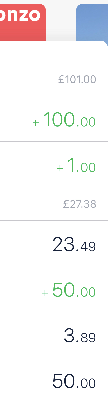
I know there’s been previous reports of this but just noting that in 2.57 there is still an issue with the transaction feed updating after transfers into pots. I’ve just been playing around with it and the app has hanged a bit when adding to a pot, and the transaction feed hasn’t updated immediately with all the transfers.
I also got a blank home feed on one occasion as well after adding to a pot (screenshot below).
I’m sure all of this is known, just adding feedback in case it’s needed
Yeah I kinda agree with this. I know it’s not part of the new nav project so I won’t say too much, but I don’t have any friends with Monzo (I have tried to convert them!), but ended up turning on contacts just so I could get rid of this box and get the screen real estate back.
I would like to be able to delete the individual contacts that it has added as it’s people I will never be sending money to.
Maybe I’m not the target Monzo user, I’ve always been more than happy to give out my account details, or ask for other people’s, so never had any interest in Split the Bill/Shared Tabs/monzo.me/etc. A lot of that is solving a problem I’ve never had.
That spent today value is actually a positive value in the example you sent (though you can’t tell the difference). It’s not meant to be
It’s already fixed in the next version
I’m on the Labs version on the live app and I’ve got to say I absolutely love it. Having the left-to-spend on the homepage of the app will be massively beneficial for me. Stops me seeing the entire balance and having to go to summary to find what I’ve really got to play with.

 I know it’s been a part of the app for a while. It’s just I’m never going to pay any of my friends that way. Most won’t be on Monzo, and it’s literally zero effort to ask for their bank details. I imagine I’m not the only one in this situation. I have a whole bunch of random people in my contacts - “Dave from up the road”, “the guy at work who opens the car park” type people - who I’ll never need to have a financial interaction with, so don’t need or want to see that they use Monzo.

 2.57 - Bug