That is the old home view which I expect they plan to remove soon, and only accessible for the two blessed account types of current and flex, not all accounts.
What do you call somewhere at a bank you keep money with a balance and a list of transactions? Most places call them accounts, monzo has a cute name for some of them but they are accounts with a hidden account number and very few other differences. Also pots encompass external savings accounts which definitely are accounts in every sense!
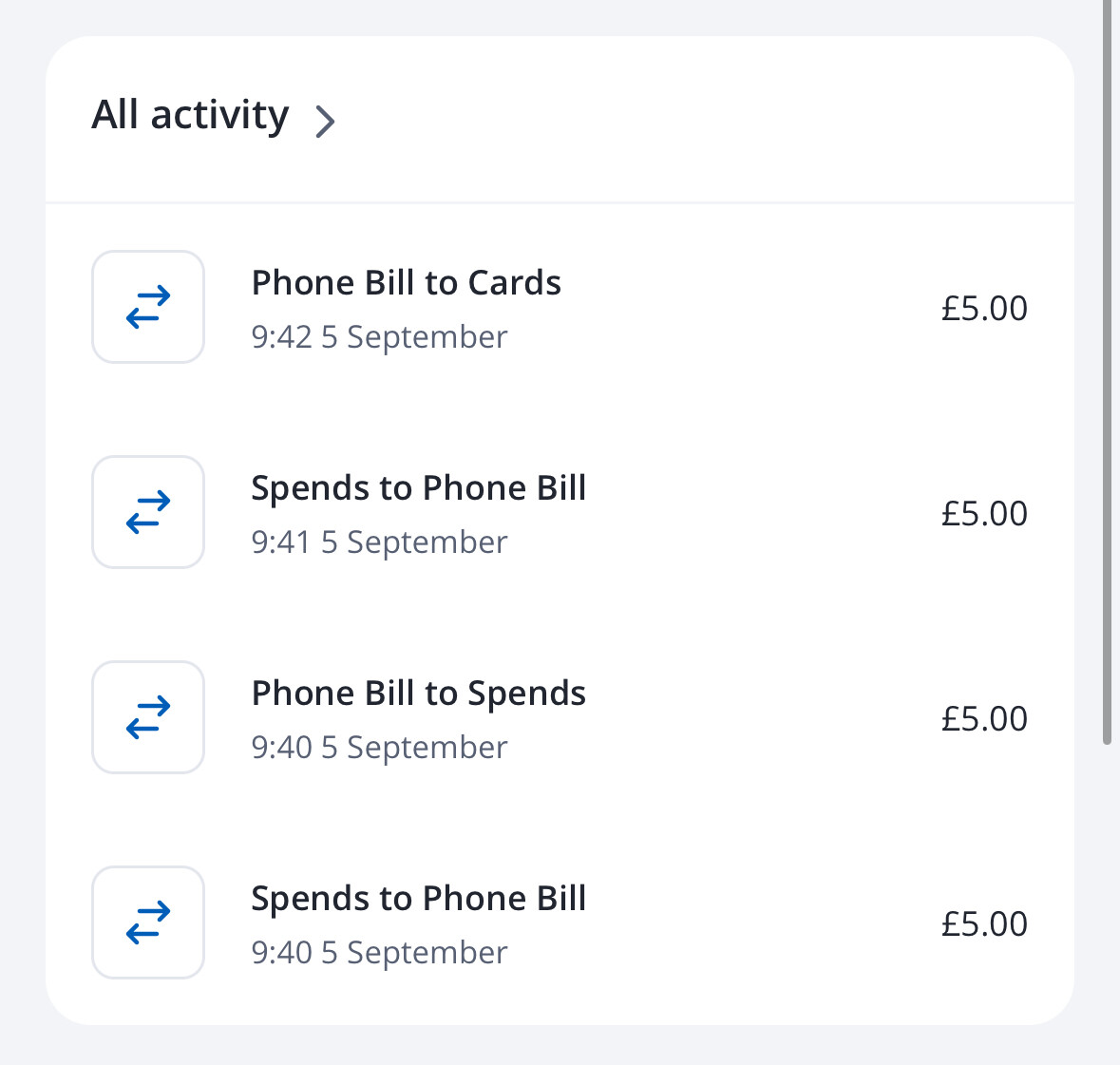
Not sure if this is new or if it’s just the first time I’ve noticed it;
I’ve paid two bills from pots this morning, but the unified feed is just showing the bill and then underneath it says which pot the bill was paid from, not the usual double entry of the money in from the pot and then back out. If I go into the feed for just my account, the double entry is there is expected.
As noted in my first comment, I find a transaction feed without context and which I can’t scroll not very useful, and don’t appreciate having to click ‘view all’ every time I wish to review the account. It’s also below a pinned account card full of buttons I’ll never use which cannot be removed. I don’t think your assertions about ‘most people’ are backed by any firm evidence one way or another, but accept different people will have different views on this. Maybe some love all these widgets and screen furniture.
I’m also unsettled by the presentation of pots with very little useful info on them and hope this isn’t what they think will be appropriate for main accounts, but we don’t know at this point as main accounts still lead to the old home view, which is where I live most of the time now. We’ll see when we roll it out I guess what plans they have for the main account. I find it unconvincing to say they’re somewhere to park your money out of sight, that’s reductive and is not an excuse for the information-poor account page for them.
Not sure why you’re so invested in answering all criticism here given you don’t even use the app! Thoughtful criticism should be welcomed, not dismissed, and if it is repeated by multiple people, all the more reason to listen to it.
I disagree more information is shown here, for me it is far less useful information at a glance. I visit the banking app to check on upcoming and recent transactions, make payments etc. So overdraft limit, add money, savings pots, mortgages etc are less important than that and don’t deserve screen real estate on home IMO.
So that is why I made the first comment - I feel we’ve lost useful information, not gained it and on balance am not particularly happy with this new home, seeing 3 transactions is nowhere near enough. Not sure customisation is a good idea either, it’s an abdication of decision making and will lead to significant support load which monzo could do without (now impossible to know what a user’s home screen looks like).
What context is missing? It tells you how much, who you paid and from which account. The only extra you get from clicking into your account is the date.
Upcoming and recent are now front and centre.
Make payments is still on another tab and hasn’t moved
Name of the pot, the icon and balance. The same as it’s always been.
There currently isn’t a unified home screen, which is even more confusing, as you’ve proved by talking about a different home screen to many other people. So this is a big step forwards for support load.
I tried the new homescreen when it was in Labs but switched back after a few days as I just couldn’t get used to it. 99% of the time I want to check or categorise a transaction and now I have to click ‘view all’ to see more than the first 3 every time.
In addition, the one thing I would quite like: a unified transaction view across all my cards is still not available.
[ Slightly related request: please please let me categorise credit card payments before they settle- just hold the classification and ‘fake’ it until it goes through if you must ! ]
It is possible, but Monzo choose not to do it (which is valid). A lot don’t for the reasons given, the transaction is often deleted and replaced with the settled details (at least with Natwest Group it is).
That said, Lumio and others do it and it seems to work fine without issue, I’ve never had it yet where a transaction has fundamentally changed causing issues.
Yes I feel the same about it. Transactions have been given less importance/emphasis and are now hidden behind a button, and that feels like a step backward for a few of us at least.
This is how all other banks do it, there must be a reason for that.
Definitely the latter.
How much is in my account? How much is in my pots? I just spent money in McDonalds, the amount and merchant is front and centre. So are the transactions before that. It’s all there. If you wanted to edit that for the category or something, you still needed to tap on the previous view.
Regardless either of our views, Monzo have this data on which views/pages/interactions are happening most often.
I love Monzo! I have a personal and joint account with my partner. These are used for different things. Unfortunately I really struggle with both account types being mixed in with each other in the new home page. This is why I previously turned it off (twice) after testing it in Labs. Sorry! Being a product designer myself, I appreciate how hard it is to design an information architecture that works for everyone. Very very tricky! I hope this feedback is helpful for optimising further.
Cards overview
It shows my personal flex, then the joint, then my personal account. Could you order them so both the personal accounts sit together, please?
Activities overview
As a daily routine, I used to open the app, check if there are any new transactions and then double tap the home icon to switch to my other account to do the same. This allows me to stay on top of my finances and have peace of mind - arguably the biggest superpower of Monzo! Unfortunately, the combined activity view removed my ability to do this job and even creates anxiety for me. I freaked out several times about a transaction, thinking it was a unfamiliar charge on my personal, but it was something on my joint. I now ignore the home page card entirely and double tap on my account cards instead to get the old view. A lot more taps to do the same workflow. Have you thought about splitting it out into 2 different tabs or cards?
Pots list
We have a lot of pots, 23 in fact! We use it for budgeting and saving for different things. It’s awesome! Pulling down to see all my pots was a great way to get an overview and quickly navigate from pot to pot to make transfers. I’m glad you added the option to see them as a list on the homepage! Thank you!! I had to reorder the pods because my personal ones were also mixed in with joint ones. Thanks for adding the reorder feature. Again, I struggle with them being combined. Interestingly, you do show the sums of personal and joint separate, but then list all of them underneath as a single list. I have to move from skimming to reading to notice the little Joint / Personal labels. In general it feels like you are optimising for saving vertical space, but there doesn’t seem to be anything critical to get to below my pots. People don’t mind scrolling. Have you tried adding tabs (all, personal, joint) or making them separate cards instead?
Couldn’t agree more with these comments my partner and I hate the new Home Screen. The transaction summary view is confusing. I don’t want to see all my transactions combined and should have the choice. I much prefer the old view where I could select the account and view the transactions related.
This has just created an extra click/step in my customer journey when trying to view transactions and accounts. Bring back the old view but allow users the ability to select a primary account to display first and order accounts/ pigs in priority order - much more useful than the summary view
I’m an infrequent visitor to the forums - but came here to say just this. I loathe the new Home Screen - I hate that pots from our joint account and my personal accounts are mixed.
They are two separate things - and should be treated as such. It annoys me that much, I might go full Chase…
Genuine question : Does the chase app have a combined activity feed on the overview page? The images I have seen seem to have a list of accounts and balances followed by an all activity feed, which I guess combines transactions from all of your accounts?