Without scrolling through all the previous entries, can anyone say whether the following anomaly has been reported please?
New app design. Labs activated.
Opening overview home screen.
Activity
Top entry tells me how many payments coming out in next 3 days and gives me an aggregate total.
Tap on that entry, I can see all the greyed out upcoming entries, however, while it provides a sub total alongside each day, ie tomorrow and 3 days, the two sub totals do not match the figure in the overview feed, rendering it useless/doubtful information.
Sorry for the lack of updates over the past few weeks, we’ve been super busy with experiment analysis and customer research
We’ve now got nearly 700k customers using the new layout, so we’ve got a lot of learnings to digest! Our main focus right now is is getting this version ready to roll out to all customers - that’s going to happen this summer!
He goes an attempt at answering some of the questions I’ve seen (where I’m able to ) Caveat: I’m sharing some future plans here, and plans can change!
Customisation
We’re investing in more customisation, including pinning connected accounts to the card stack, filtering the Activity feed and reordering sections on the Home screen. I don’t think any of these will be ready for the full launch but they’re on our list of fast followers
Bringing the rest of the app in line with the new Home
This is going to be a long process, but I’m expecting the other high traffic areas to get a visual and functional refresh pretty soon after the full launch (that means a refresh for personal, joint and flex accounts…plus some other products)
Other improvements
We’re also going to introduce some new, simpler Spotlights (the little insight widgets at the top of Home), and we’ll make Pots swipable in the new view, before culling them from the old navigation
Even when we’re not chipping in here, we’re always watching! The feedback and conversation is incredibly valuable so please do keep it coming. You’ve all helped shape the new app structure and we’re super grateful
One thing I’ve noticed is I have both a payment and a receipt due in two days. In the Activity Summary it shows the payment first, then receipt.
Upon clicking ‘see all’ it goes to the transaction list screen. Which shows the upcoming receipt first, then the payment. Shouldn’t the order of them be consistent in both the activity summary and the transaction listing?
I’m pretty intrigued about what bits you mean here.
In big bucket terms, I think the things that we know need to be done (that aren’t directly Overview) are:
Replacing the carousel / old feed view
Change the headings/theme on Trends to match Overview
Nuke (or, if you must, retheme) the Plus/Premium tab
Burn the Payments tab with fire and reinvent, Phoenix style
The first and the last seem to be the biggies. I think @giorgio and team are on the last one which leaves the first one - although that’s undeniably large.
Unless you’re also thinking of tackling the individual transactions screen? In which case open a new topic because @N26throwaway and I have notes!
I think part of the problem is that they directly relate to the filters you’ve got set up in Trends. I find myself wanting different things up top:
My left to spend (can we call it safe to spend now that Simple had gone bye bye?). Ideally I’d like to run my Target off that figure but as I can’t I’d like to track it up top. The current iteration doesn’t cut it because I’d like daily spend and the line back, please.
Total balance in my Monzo account. I want this to be the money in native Monzo pots and the current account. That’s because I want to see a) the amount I’m earning Premium interest on (or if I’m in excess of that amount) and b) how much I have covered by Monzo’s FSCS. That figure is impossible to find right now.
Total amount in third party pots, ideally a total figure and broken down by provider. Again, I’m trying to see at a glance my spread across providers.
Total interest received this financial year. This is super important to make sure I’m planning my finances wisely and don’t go over the tax free limit. (there’s actually a whole lot more Monzo could do on this, but a widget would suffice for now).
Next Flex payment date and amount.
A quick widget that shows when I spend on Flex what the first payment date is.
The total upcoming doesn’t really work for me. It doesn’t reconcile money I’ve already put away in pots for bills. I just want to know my future liabilities from the current account.
Here you can see the old Premium theme up top and the standard “public toilet wall green” below. It looks better when the thing is loaded but not perfect.
The more objective one is the heading. I think there’s an argument to make the top button row similar if not standard across the tabs. Especially for Trends and Payments which I think could be practically the same.
(I think we disagree on that, though - I was of the view that a help icon belongs up there in a standard place across all tabs with the help tab nuked).
Maybe in terms of UI. But in terms of colour and theme they’re still very different. At least as different as the two colour themes on the Trends screenshot above.
It’s Monzo’s writing again. They have a tendency to consistently use the wrong words.
I’m assuming it’s inadvertent, but phrases like “left to spend” and “target” nudge people to spend.
“Left to spend” suggests that you’ve got all that money and should be spending it. Whereas “safe to” or “free to” feel more neutral - as in you can spend it if you want but it’s not your goal.
Similarly, Targets is totally the wrong word for budgeting. It suggests that spending that amount is the goal, rather than nudging folk to come in under budget.
These are all super subtle points, but for a bank that talks about tone of voice, they really ought to be thinking about psychology, impact of words and nudge theory.
I’d also second a notification which shows your interest YTD, or maybe below the feed/connected balances. Maybe a 2-line summary; one with non-ISA interest earned YTD and the other with ISA interest. By clicking on one it can expand the interest by active pot and maybe indicate the interest received on now closed pots.
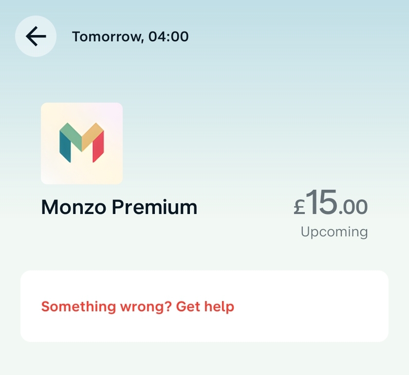
I have the same problem but the other way around - I’m on Monzo Plus.
The feed shows the correct icon for Monzo Plus, but the transaction detail screen has the Monzo Premium logo.
I will be nice to see if monzo do change the transactions, by this I mean when you click into an individual transaction,
It looks quite dated already with lots of unused space. I hope they incorporate Apple Maps for IOS, think this would give the iOS app a much cleaner feel maybe?
Payments screen and transactions are the two areas I’m most excited to be overhauled