@DaleBuckley thanks for all your work and engaging on here as things develop. I was wondering if either of these points I raised above are on your (team’s) radar? I realise they may have got lost in the mix. But the first one in particular is a regular pain point!
1 Like
We don’t have plans for this at the moment but I agree it would be useful for some customers. I’ve added it to our internal feedback tracker.
This is something we are aware of and I’ve personally been looking at it this past week. There are some basic improvements coming very soon (maintaining the scroll position so you don’t have to scroll back to where you were) with some more enhancements in the pipeline but with no date on them yet.
I’ll forward this feedback to our design team, thanks.
12 Likes
I’d like to reiterate what others have said in this post about the activity feed - it would be great if we had the option to hide it! I’m sure some like the idea of seeing all transactions, regardless of pot or account, in one location but I’d rather see the individual feeds when viewing the individual pot or account. It feels cluttered and confusing personally ![]()
Also, when clicking on the individual accounts, whether personal or joint, there’s a message to say pots have moved but doesn’t appear to have an option to be removed or hidden - is there a reason for this?
Lastly, could we please have the option to see both personal and joint accounts simultaneously in the iOS widget please? Other than the points above, the app has been great!
1 Like
We’ll soon be rolling out new account views to replace what you see when drilling into individual accounts - you can try it out in labs now!
Settings>Labs>New Personal Account Views
The info card isn’t dismissible because in testing we found that many customers would forget the new layout (even after seeing and interacting with the new way) and because they’d dismissed the card, they’d be worried and contact us.
I’ll take another look at whether we can add dismissal, now thats its been a little longer ![]()
6 Likes
That’s excellent, I’m so happy to hear this! Just maintaining the position will make a big difference.
This also makes me very happy ![]() Maintaining the scroll position is a good start and alleviates the worst of it. But I do think the end-to-end interaction could be slicker, so glad to hear further enhancements are still in the mix.
Maintaining the scroll position is a good start and alleviates the worst of it. But I do think the end-to-end interaction could be slicker, so glad to hear further enhancements are still in the mix.
When I have a lot of upcoming transactions (I have 11 for tomorrow as bill day), if I ‘view all’ on the activity feed, I still see some upcoming transactions disappear and re-appear. And when the do, the balance for that day keeps increasing by the amount that disappears and then re-appears.
Doesn’t seem to happen when I only have 2 or 3 transactions upcoming.
That’s great thank you I really appreciate the help ![]()
1 Like
We’ve added dismissal (more accurately, @jamesmcdonagh has) to the Pots have moved card - you should be able to get rid of it now, if you like
Thanks for the nudge, just don’t forget they’ve moved please ![]()
11 Likes
Sorry what does this mean? I’m new to forums in general ![]()
Also, I had a go at the new personal account views option but I wasn’t a massive fan. If it’s due to be implemented, could we have the option to have a ‘classic’ view - I quite like being able to swipe from left to right between accounts ![]()
1 Like
This is awesome news, thank you; a definite bugbear of mine! ![]()
1 Like
He means you can do what you wanted, but not to forget that the pots have indeed moved.
They’ve said a good few times in here that this won’t happen. I don’t blame them, trying to maintain old views alongside new will create technical debt over time. But you can keep feeding back here and via the app around how the new direction is going for you. Sometimes you might get lucky and they do it.
3 Likes
My apologies! I thought it was in reference to my post thanking him without adding any meaning to the forum ![]()
That’s fair enough I get that. It would be interesting to hear why they chose the new view!
1 Like
I’m finding the new UI for pots and feed confusing between what’s a personal expense/ pot and what is a joint one. It also makes my list of pots really long now they’re not separated.
I keep also sending money from the wrong account as it’s not super clear on the UI which pot you’re sending it from.
Is there anything you can do to make the transactions more distinct/ separate money management for different accounts a bit better?
2 Likes
My top tip is to have them different colours for each account.
https://potimages.rknight.me/?i=dragon&ip=fas&c=f7f7f7&bg=EC5B5C
2 Likes
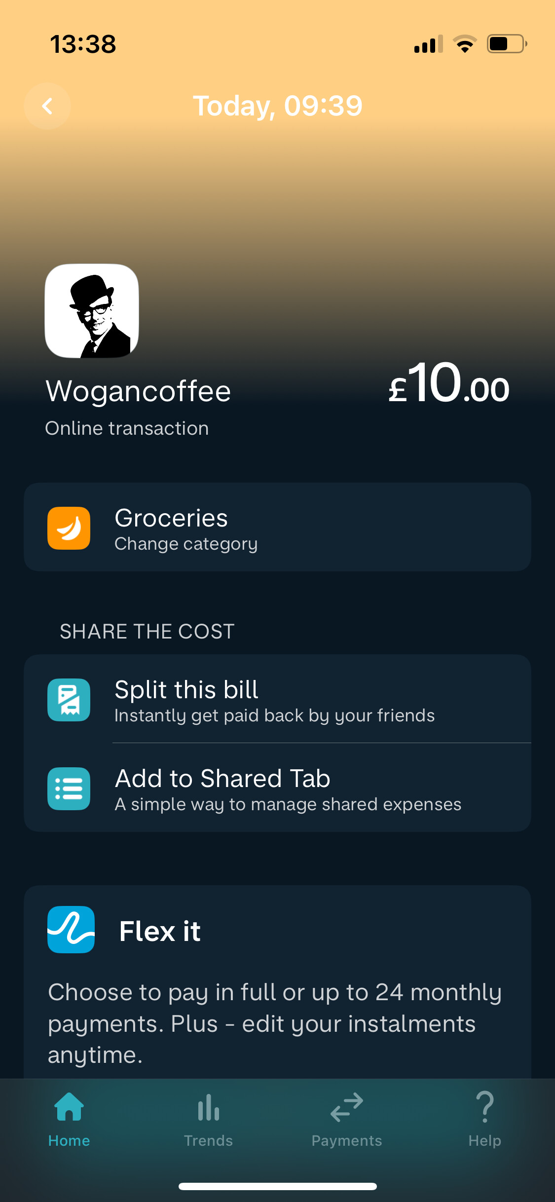
In the latest iOS TestFlight version (5.60.0) the notes & receipt fields in the transaction view have moved much further down, below Flex & “Share the cost” bill splitting.
I totally understand wanting to make these features more visible, but I use the notes field on nearly every transaction and really appreciated being able to get to it without swiping.
Screenshots: Before (v5.59) and after (v5.60).
5 Likes
I’m with you 100% … I’d love to hear Monzo’s rationale for changes like this as they appears to made on a whim… I’m sure they will have some data points to suggest that it’s the right thing to do, but even so it’s a retrograde step for those who use notes extensively…
3 Likes
It might feel like it, but if you’re in the minority for those presses, why should it remain for you?
2 Likes
Definitely minority.
They wouldn’t move most used options further down the list to make people’s lives harder.
I’ve rarely used it.
1 Like
I guess, @revels comment is addressed at me?
I’m not suggesting it should remain for me or anyone! just that it affects those who use notes a lot…
How do you get to this screen. I’ve never seen that before?