Having recently returned to “Full Monzo” I am very impressed with the new layout. I love having quick access to everything and having all my spending (including connected accounts) in the activity feed.
Thumbs up from me ![]()
Having recently returned to “Full Monzo” I am very impressed with the new layout. I love having quick access to everything and having all my spending (including connected accounts) in the activity feed.
Thumbs up from me ![]()
Hey ![]() I made this change and we don’t seem to receive the credit limit data from Amex so we can’t show anything
I made this change and we don’t seem to receive the credit limit data from Amex so we can’t show anything ![]()
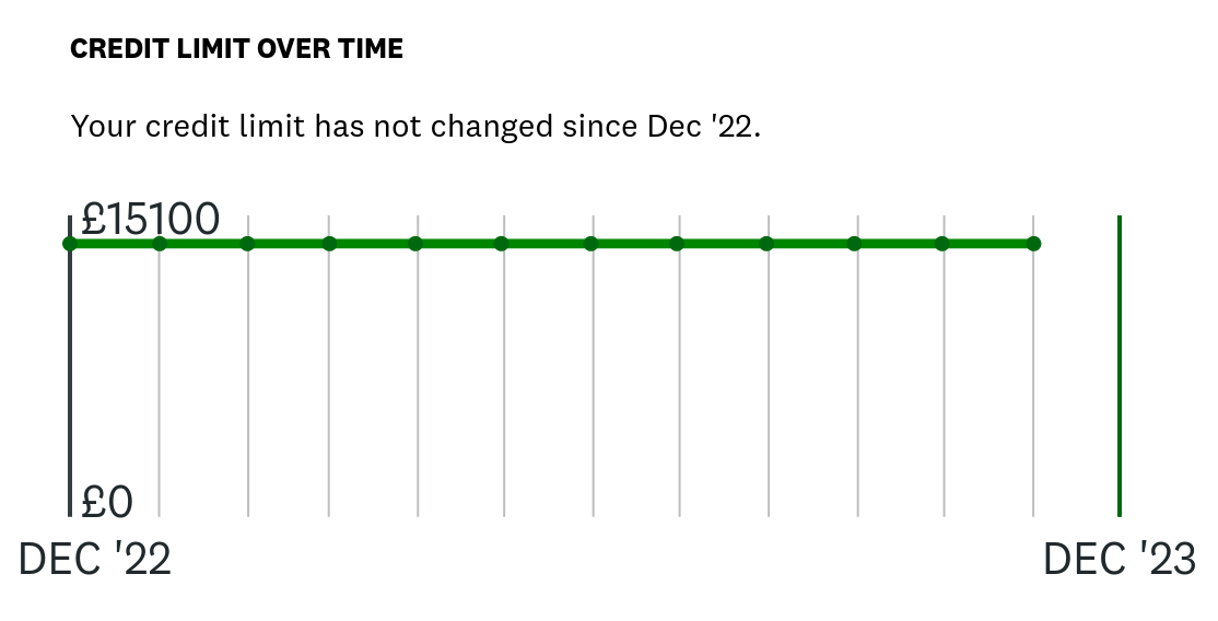
Can this be changed? As I can clearly see my Amex limit on Credit Karma …
edit
The Credit Karma screenshot below shows my Amex credit limit over time in the same way it does for my other credit cards…
Ah interesting - I’ll ask the open banking team to look at the response we get directly from them (I can’t see this myself). Thanks for raising!
What causes that childish drag money into wallet graphic and how do I disable it? (It pops up when you receive money).
How you do that - the notification it triggers takes you directly to it? Obviously I click on the notification to see what it is.
The notification that says your money is waiting?
You can just ignore it and get on with your day, you don’t need to open it, you know what it does and where it takes you, so just swipe it away and ignore it.
You can drag it, tap it, or wait for it.
Or use a different bank.
I’m more intrigued how an illustration of money and a wallet is deemed childish ![]() You’ve surely seen emojis from Monzo before?
You’ve surely seen emojis from Monzo before?
In the list of savings pots, there’s no quick way of seeing which pot has round ups turned on. Be good if that could be considered, by an icon for example.
Unsure if this already has been put on the thread but it would be good to see the separation of personal and joint amounts in the savings and investments section on the app - just like how the pots section is displayed…
Can we get a search button for the activity feeds? It’s a little bit odd that you can search when you are only on the main card but no where else.
I’d like to see the app main screen look better which shows all my accounts.
Savings. pots and investments would look nicer in the same format, under the flex and main account. I get it separates the investment and savings but it looks tacky in a little box at the bottom of the app. A good feature to ensure we’re not tempted to spend what we’ve saved would be a button to “hide balance” or hide investment balance. #JustSaying
Hey @NickyPreston
If you tap the ... button on the Savings and Investments section, you can choose to Hide your investment balance. You can also hide specific pots by tapping Edit layout in the same menu, and tapping the eye icon to toggle between visible and hidden
I use Monzo as my only main account with a couple of pots and a joint account. Is there anyway we can scroll sideways between pots that are linked to an account again?
I know this doesn’t work for everyone but it seems like a lot of people found this easier than going back to the home screen to look at pot details.
Personally I don’t really use the Home Screen
Also why are savings pots from a joint account and personal account now all in one place and not separate?
No, the carousel has gone and isn’t coming back.
You can swipe between pots once you’ve tapped into a pot.
I have the same issue with the normal pots section. I don’t use it at all and so there is a section that is permanently sat there that I have to scroll past to get to the sections I do want to see. I hope the customisation of the whole main screen is coming soon so that we can hide sections and move them around into a more useable order.
Strange, I don’t have any normal pots anymore and that whole section is gone now
You can tap the ... and dismiss this section if its not relevant for you ![]()