You gone all Rick Astley on us there?! ![]()
Clever ![]()
You gone all Rick Astley on us there?! ![]()
Clever ![]()
Hi, Im a user with only a couple of pots and i find the new layout so frustrating. I have a holiday money and personal saving pot, and trying to see how much i have in my account vs how much is in my pot is very annoying.
I appreciate though for users with many pots it might be better. But thats not me. It would be nice to be able to toggle a simplified view or a more advanced view because clearly one size won’t fit all based on the comments.
Definitely dont appreciate the layout change without any warning it was coming though. That really annoyed me. Literally was using the old layout, put my phone down, and then BAM new layout.
Pull down and you can add a spotlight to give you the totals that you’re looking for.
One size one fit all, but multiple versions is much much worse. This is a simple view, so not sure what a toggle would remove!
Well played, well played.
Since it’s the last week of the year and everyone’s a bit tired we’ve done something a little different: rather than spending time on the big features we’ve got coming next, we took some time to tidy up what we already have.
This was inspired by Linear’s polishing season from last year:
Every product has bugs. More than we can ever fix. Papercuts, usability issues, imperfections. We all have a long backlog of fixes and improvements we intend to get to someday.
Polishing season is about turning that “someday” into “today”. It’s about dedicating time to quality work. To replace flaws and friction with polish and delight.
Just to be clear we normally fix these issues alongside regular work, but this week was dedicated time just for polish and I’m pretty proud of what we’ve achieved in just 4 days…
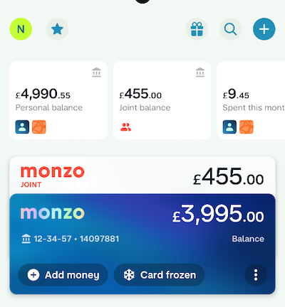
The state of frozen/blocked/expired cards is now reflected in the main account cards at the top of Overview
We’ve heard this mentioned a few times on here
You can now interactively filter your visible Pots by personal or joint
Just tap on the personal or joint balance, and there’s also an option in the … menu
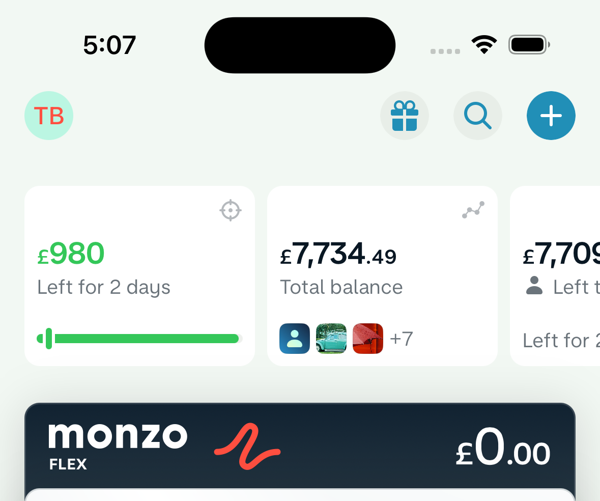
You can now move money and navigate to Pots directly from the total balance view
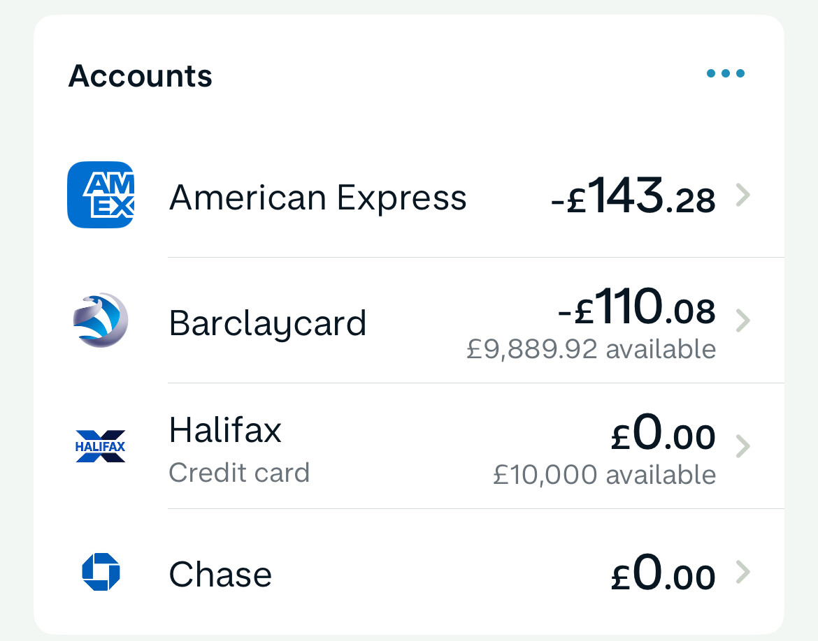
We now show “£X available” for credit cards on the right hand side
This post described the problem we had before really well!
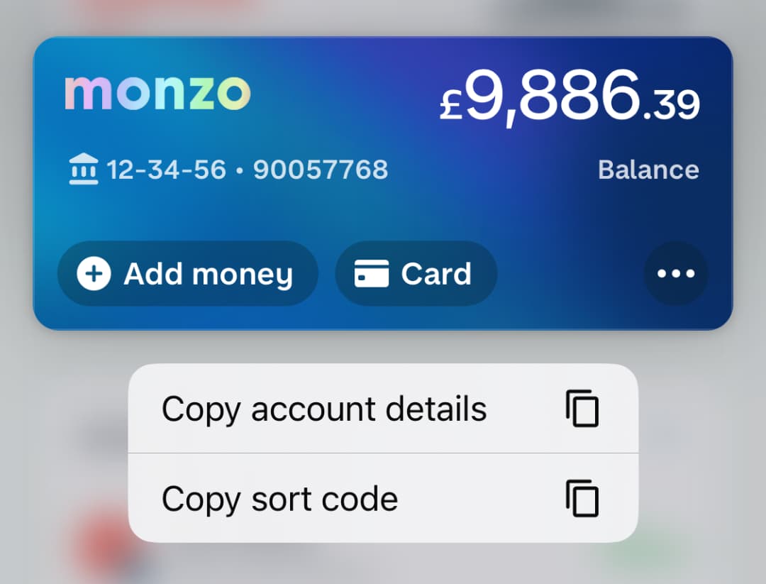
When you hold on an account you can now quickly copy the account details
Spotlights now use a staggered style which is a bit bigger and more visually appealing
Plus and premium account items now have proper highlight states (iOS)
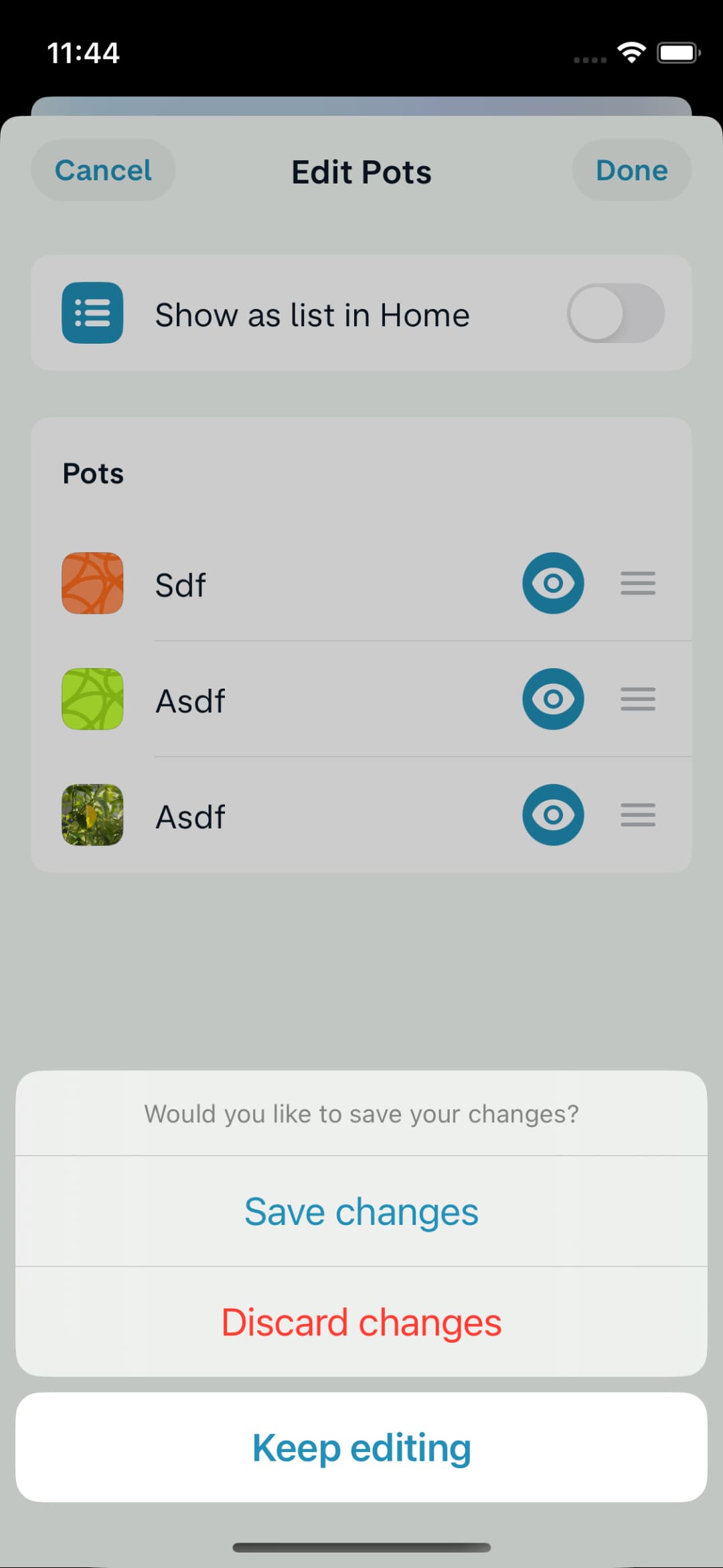
When swiping down to dismiss the customisation screen, you’re now given the option to save changes rather than just discard (iOS)
When you dismiss an edu-card it’ll disappear immediately rather than showing a full screen spinner
Fix flickering images which often showed on the feed or with external account logos (iOS)
This was actually a problem around the whole app and had been there since 2019!
Make sure menus don’t disappear when content updates (iOS)
This was super annoying, if you had tapped on “Search” and was looking at the “Personal” / “Joint” menu it would often disappear when the content on screen updated
When dragging an item beyond the last section of the customisation screen, it’ll now be inserted at the bottom of the last section (iOS)
Previously it would just not move it at all
When refreshing an external account we now show a less intense loading spinner in the top bar rather than a full screen spinner (iOS)
Feels much nicer!
The loading indicator doesn’t hide “Upgrade” button (Android)
Previously we swapped between “Upgrade” and the spinner which was just a bit too much movement, we’ve now aligned with iOS by just adding the spinner on the side
Some of it already is! The rest should be out in January ![]()
Thanks for all your feedback this year, although we don’t implement every change we do always listen and take your thoughts into consideration with what we build (a lot of it inspired what we worked on this week!) Please keep it coming in 2024 and beyond ![]()
Brilliant work. Sometimes cleaning things up is far better when the product works.
My only wish this/next year would be Target to be freshened up. Personally for me two things - the ability to just complete reset/wipe the Target, and then the ability to set a new Target mid-month. Right now if I do a quick audit of my available spending two weeks into the month it sets the daily spend across the whole month. I love daily budgets and wish Monzo did it well.
Hopefully this will satisfy the people who are upset about personal and joint pots being together.
The one question I have is whether this setting will be persisted? or will it be necessary to toggle it every time you load the app?
Edit: forgot to say, the changes to show personal and joint pots separately is genius! I really like the novel approach taken here and applaud the Monzo team for implementing this in such a neat way!
Is this live for you yet? I don’t have it.
nope not yet - I’m just going by the screen shot that was posted…
Same here… Can’t beat the original frozen card effect!
It took me so long. I genuinely thought there was an “after” image I was missing and this was the “before” image!
With respect, which table must one flip to reunite our cards with that sweet sweet frosted effect? We were not heard, we have been swindled! We don’t just deserve better…
We demand justice! ![]()

p.s. thanks for the update and happy holidays to those that celebrate
Fear not, we do plan to add the effect in some way! Just wasn’t something we were able to get to in polish week.
The frozen effect is visible today when on the card screen.
Love to see improvements like this.
Is there a reason why my Amex doesn’t have the “available” amount like the other cards?
I have Amex charge card and companion credit card. Would expect not to see the available to spend on the charge card, but it doesn’t show on the credit card either.
I can only assume that this change is not fully implemented yet. Hence why Halifax shows “credit card” yet Barclaycard and amex do not …
Personally I’d love to see credit cards separated out from accounts and an overall credit balance… the question is how to do this without adding maling the home screen more cluttered…
I’m late but I also agree it’d be nicer if the account transaction feed was endlessly scrollable. It feels a bit jarring and old fashioned to have to click to expand the list, and especially to then be booted back to the top and have to rescroll again - it should just load more transactions on the bottom if and when you get there and keep you at the same point when it does. Essentially it should work the same as it used to/as the all transactions feed on home does once you click into it. A short moment of loading with a spinning wheel would be absolutely fine.
Also more ++ for not having my savings pot separated.
Still really enjoying/preferring the new design overall!!
I’m usually one for new features and things but I just can’t get behind the pots being moved.
I have given up using them now as they just aren’t as smooth to use as when they were side by side with the account.
Not sure if this has been mentioned, but for a while now in a pot when you click the “Left to Pay” it no longer autofills the amount when you move money to it from an account - very small issue but was one of those things that made it that bit more efficient ![]()