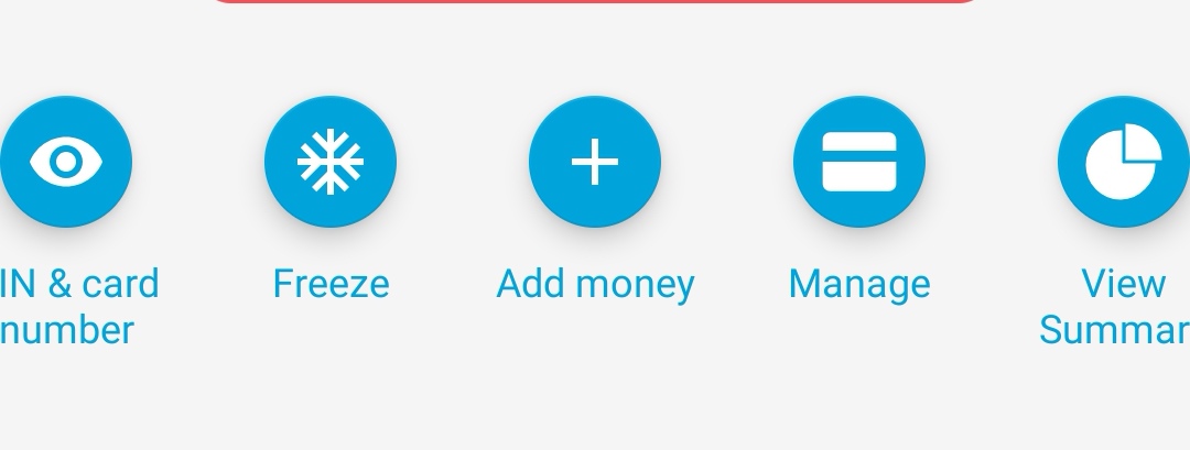
Couldn’t agree more with this statement!
agree with all of this sensible feedback
Its not changed on iOS ![]()
… yet
Mines actually cut off
(Not cropped at the sides that its how it appears on my phone)

This update is terrible. Feed should not be hidden, and neither should summary (the widget was good). Provide a way to turn off summary for those that complain about it instead of hiding it away!
Came here thinking it had bugged out but this is intentional? Hiding the feed?, no ‘left to spend’? Who thought that was a good idea
If the pulse graph worked by transaction rather than by day I think it would have been more useful. I was kind of hoping that was one of the things you had planned for it. If I wanted to know how much I had in my account at a particular transaction point rather than the end of a day it would have made tracking the expenses for a group I run easier.
What would be even better than that though is the ability to create virtual cards for pots. Then I could use a pot for my group and then I don’t have to track two lots of finances in one timeline.
Hiding the feed is not intentional. Pretty sure its a bug.
Hiding the summary is intentional.
We’re all asking the same question
Yep, it is. We’re fixing it as we speak ![]()
From Monzo the Product

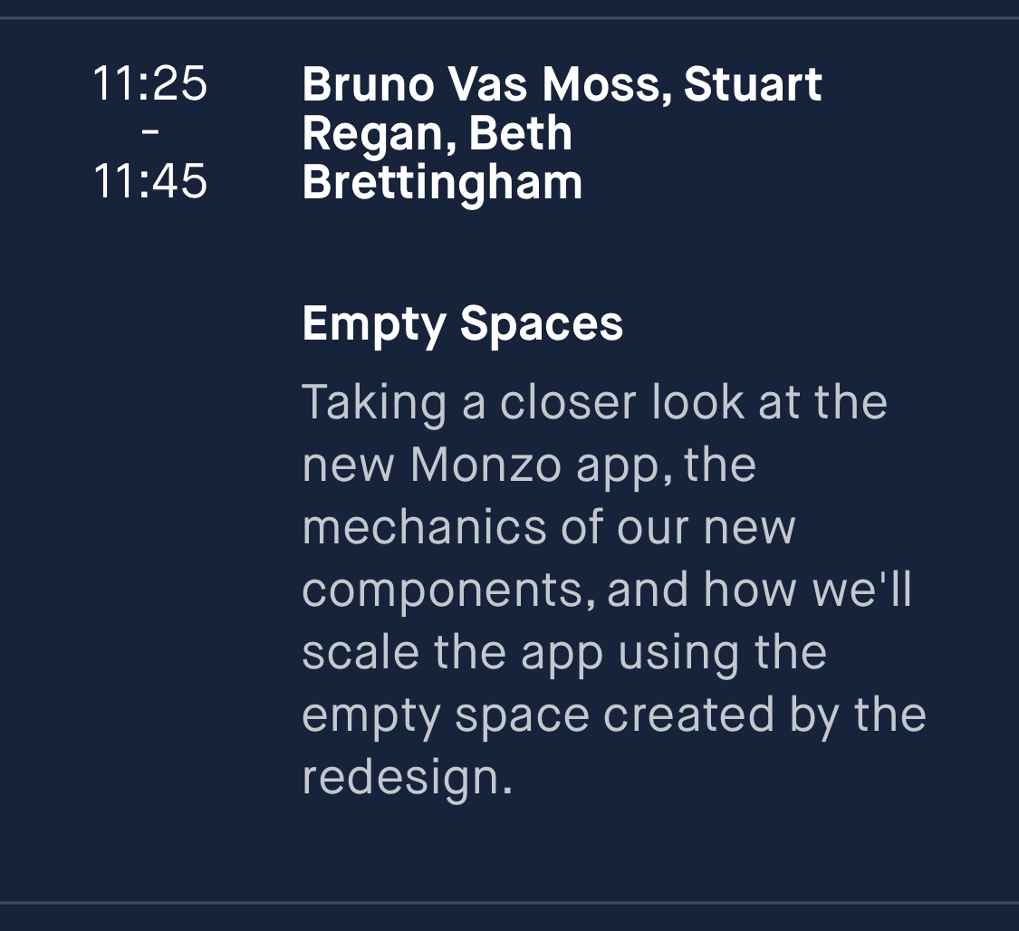
Monzo Investival schedule - wonder what’s going in that space?
What space do they mean ?
I feel the new layout is already fairly cuttered
As Hugo mentioned, this is a lil bug to do with the fact that it’s controlled by a new feature flag – which we’ve yet to roll out and turn on – so the drawer is a little wonky for now. The intention is for the drawer to be open when you start the app, so that you can still see your feed. A fix will be coming soon. My bad, sorry! 
Hello everybody 
I’d like to share with you a quick update and some visibility about what’s next (Bruno is away for a couple days, once he’s back he’ll give more detail).
I’ve seen a few comments about Summary and spent/balance per day “being hidden” and I’d like to reassure you that it’s not our intention. The same things you currently do with Summary (get a sense of your spending rate, know how much is left, budget and look at past aggregated spending) and with Pulse (navigate quickly from month to month and see how much you’ve spent per day) will 100% be available in the new structure. Actually, they’re gonna be more accessible and easier to use than ever before.
The question is that, to build the app in stages, we’re prioritising other bits first so right now you’re using a version of the app that still misses important parts but we’re giving you shortcuts here and there just so everything “kind of works” and you don’t have to turn on and off the new navigation constantly (if that makes sense).
I’m happy to answer any questions and listen to any concerns 
Many thanks!
There’s been a lot more of staff addressing concerns + mini updates on the forums very recently. A lot more than I’ve previously noticed. I like it. 
Thanks for the update. I appreciate the visibility and I’m personally looking forward to the future release if this is the case.
Thanks for the update. Look forward to seeing what’s next
Latest release looks terrible. Icons don’t fit on the screen. Why are useful links being hidden in submenus when the help tab is always accessible at the bottom?
Hugo just explained
I hope it’s not too long until the next update.
Hi Kavi,
I’ve posted this before but I’m not sure if it’s been picked up and I’m not sure where best to leave feedback for the new layout, but emoji payment references to Monzo contacts are not always visible which makes it difficult to work out what historic payments are for. Do you know if anyone else has reported this issue?
Thanks,
Harry