It’s been a while! I want to share some of the things we’ve been working on in the past few weeks, what we’ve learned, and what’s coming soon.
Initial navigation MVP
When we rolled out the new navigation to the community we wanted to figure out early on whether or not we were heading in the right direction with this new design. We talked a lot about this in our open office last month. You can still watch the video which explains our approach to this project below.
We got really good feedback from the >1500 community members that asked to get a first go with your day to day app. From this group of customers we looked at qualitative feedback on the forum, and also a great indicator of existing bugs that we have prioritised and have been fixing in the past few app releases. I appreciate there’s still issues and we’re naturally fixing this as fast as possible.
For a period of time, 10% of new customers also got this new navigation as part of an a/b test. We closely monitored core business metrics, and how new customers were interacting with the new app structure vs customers on the standard app navigation.
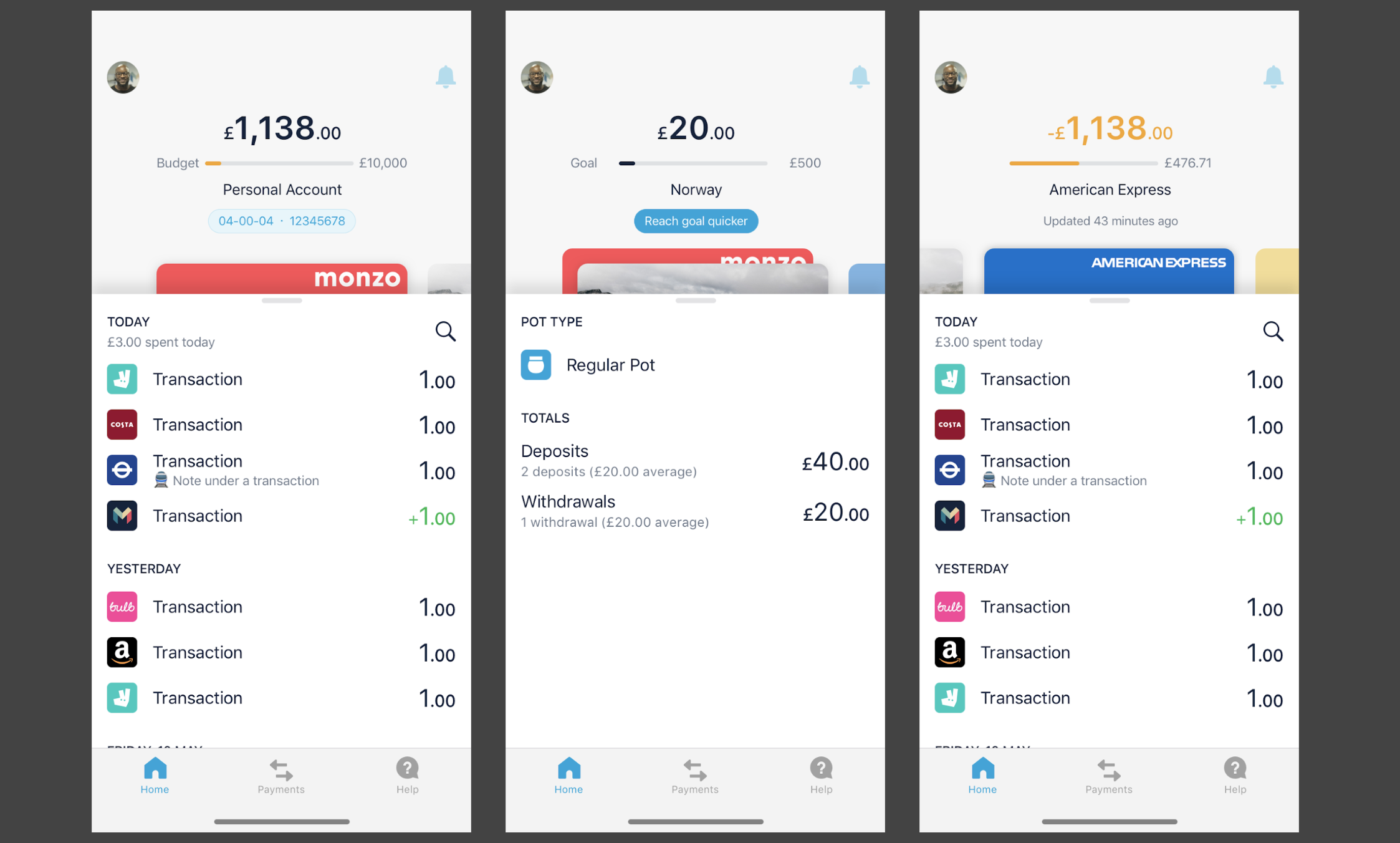
This is roughly where we were the last time we checked in here.
https://www.youtube.com/watch?v=DQ5p1VGSJLY
MVP Learnings
View All
There’s been hundreds of pieces of feedback left here, and a common theme is how the View All button is not a good solution. These are some of the most common problems:
- It’s difficult to reach View All
- Pots are very hidden for folks that like to check their savings regularly
- The label itself doesn’t really say much about what’s inside of that screen
Joint Accounts
Another big piece of feedback is on finding/switching between Personal and Joint Accounts. “How do I switch to my Joint Account” has been the biggest driver for new customer support conversations compared to the standard navigation (just looking at new customers).
It’s not surprising considering there’s zero indication in the app on how this should work (spoiler long press your Home button in the bottom tab bar)! Android is slightly better as there’s a “switch account” button inside of the View All screen (but still really poor experience).
Core Monzo usage
Surprisingly behaviour in the new navigation vs standard nav is pretty similar! This has been a really positive piece of validation  The only thing that got worse was number of new customer support conversations.
Customer Support queries
This is a good indicator to how intuitive the app is for new customers, and for bugs that are breaking the experience. There’s one thing to consider in this: there’s a lot of help content in the Help screen that is surfaced as customers ask questions, but right now we have the same content across both versions of the app, so a lot of it won’t be useful as the instructions on how to find stuff are wrong in many cases. We’re planning on how to migrate all of this soon.
There has also been lots of additional micro-learnings specific to problems we’re aware and know exist and need to be addressed.
State of the world
The problems summarised above are the ones we’re most tuned in to right now and know need to be addressed urgently. Until we solve them, everything else becomes irrelevant as this can put the entire project at risk. If we can’t validate that our long term vision solves these issues we might need to change direction.
Now we’re ready to tackle these issues and have entered a new stage of development.
In the next few weeks we’ll be working to implement a few core interactions that we hope will address most of the above. But in the meantime…
Customer rollout
We’ve already paused our a/b test with new customers. All new customers are now receiving the standard navigation. The opt-in form that we shared in this thread (check the first post) is now closed, and we stopped enabling the feature flag to new submissions. We won’t learn anything new until we ship some of the new changes we’re working on internally.
App updates
You’ll obviously continue getting weekly app updates, but don’t expect big changes to the new navigation itself in the coming weeks. Product updates from other teams at Monzo carries on as usual and you’ll get those features, which are separate to the new navigation.
Feedback
We’re not actively seeking feedback on the app you already have for the reasons mentioned previously. First we want to solve the problems we already got your feedback on 
Work in Progress
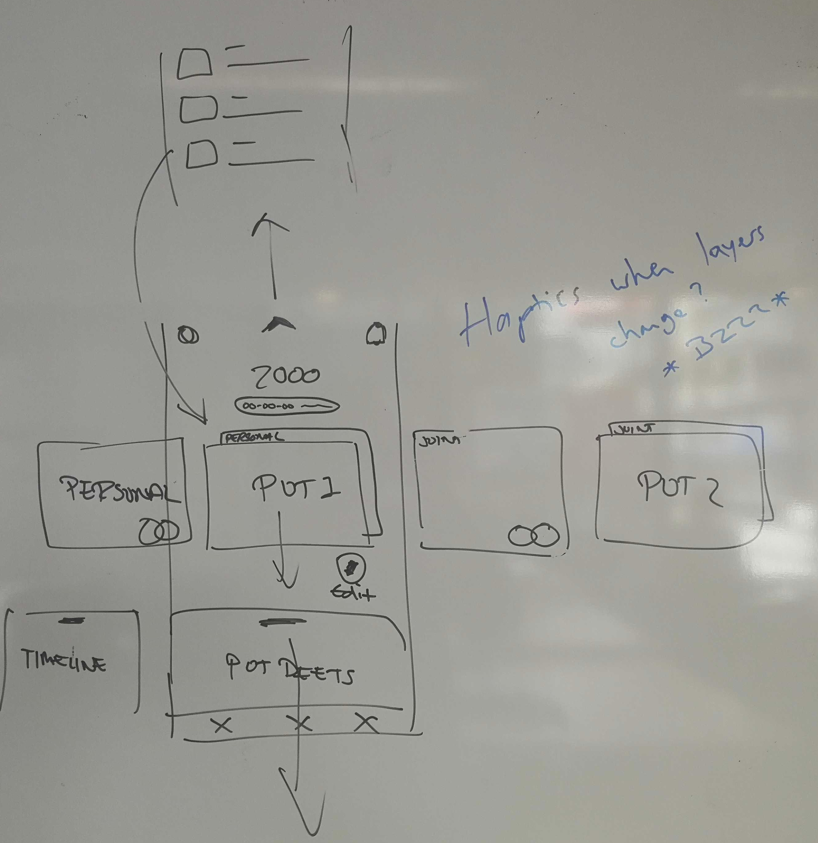
We want to solve the problem of accessing your All Accounts screen (“View All”) and the problem of switching between Personal and Joint Accounts with the same solution. It’s what we’re building now.
I’ve written here before about how we want to allow you to swipe your Monzo card in the Home screen and this can show you your Pots (most common use case for using View All) but also all the other new “account objects” that we’ve started adding to Monzo. Like external credit cards, loans, and in the future external bank accounts, mortgages, etc. We think of your Joint Account the same way: it’s just another account that fits if all of your financial life, so it should have a similar treatment.
Hierarchy of objects
So right now let’s talk about these things as “account objects”. Your Personal Account is an object, just like your Joint Account, or Mortgage. Account objects can have sub-items. Your pots will be sub-items of your Personal Account, and your Joint Account might have it’s own pots too.
We’ll show all of these objects and sub-objects in your Home screen as a horizontal swipe, and in your All Accounts screen as a vertical scroll. It’s the same list of things in both places. I’m sure at some point we’ll need to add some more customisation on how visible some of them are, or if some are hidden from your home screen etc (this bit is not relevant now).
This might not be the best hierarchy but for now the thing we’re trying to solve is the navigation from one to another. The actual hierarchy can change in the future.
Information architecture
Being able to swipe horizontally on the Home screen is fairly intuitive, as well as scrolling in your All Accounts screen. But the key thing is how these two screens interact with each other (without using a button at the top!).
We’ve been using the metaphor of how you navigate a Photos app. You can scroll your photo gallery and see an overview of all your photos. You can tap any of them and see it full screen. From that point you can keep on swiping them and you go through the same list of photos one by one. When you go back from a photo you can see it “minimise” to its place on your gallery view.
Think of the All Accounts screen as the gallery, and your Home screen showing just one account object as the photo.
Motion
For this to feel natural we’re working hard on creating the right motion mechanics to bring this concept to life. For example when you swipe horizontally on the Home screen we want to make it clear when you’re viewing a parent object like your Personal Account, and when you swipe to a Pot you should easily know which account it belongs to.
Another challenge is making it seamless to move from the Home screen to All Accounts. By dragging your Monzo card out of the Home screen you can see it move to its place in the All Accounts screen. This makes it easier to switch back and forth between “overview” and “detail” views.
Of course this doesn’t need to be the only way to move back and forth, but it’s a behaviour customers can learn over time. The same way that (on iOS) you always have the “Back” button top left when viewing a photo, you don’t need to pull the photo away to go back as the only route to that view.
Below you can see an example of the mechanic we’re trying to introduce. This is working code using basic blue (Parent Account) and green (Pot) blocks to figure out the right parameters for this. There’s a ton of work going into this right now and our mobile engineers are work really hard to get this right.

Next Steps
This is not going to the apps for a few weeks!
We’re building this with a strong focus on getting the mechanics of the navigation right. When we think it “feels right” we’ll apply it to the app and will ship to everyone already using the new navigation. It will take weeks before we get there.
In parallel we continue to explore alternative designs to all the other things we know are not yet solved and will need to be implemented at the next stage. Here’s the latest designs we’ve been playing with. As with everything it’s just a potential approach. This is just a design file, nothing of this has been built and might not even be built like this. It won’t even be a focus until we finish working on the key motion mechanics I described above. But I know y’all love a teaser