TestFlight when??
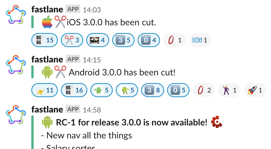
Ooh, what’s ‘salary sorter’ 
(Am hoping it’s a way to do all the transfers and pot movements I’ve got scheduled for pay day!!) 
3 Likes
Bingo - secret revealed
( only?)
More nervous to see if changes to the new UI were held back for release…
Nope. What you have is what everyone will get.
Of course there’s more changes to come, but they’re not about app structure / navigation.
5 Likes
Well I reported a bug 2 months ago that’s not been addressed so interested to see the wider customer feedback but also nervous they’ll find broken things and have a bad experience.
@anon38670904 what was the bug? Maybe it’s already been fixed/prioritised.
Oh, well I’ll be honest, considering the current state of the new UI that there’s no more work on it is troubling.
I posted a small handful of UI and layout issues a couple days ago, and I stopped only becuse I didn’t have the energy to go into other areas of the UI like the payments/transfer screens.
I guess I’ll just pray that the UI is overhauled before final release, I honestly assumed there was at least 6 months worth of work left on it ![]()
1 Like
@bruno it was regarding making payments and the fingerprint icon not letting you authenticate a payment, instead kicking you to use your card PIN. I assume given the icon is there it’s meant to let you use TouchID/FaceID but does nothing.
What’s the difference between an issue and a UI you don’t like?
2 Likes
Payments isn’t a new UI thing
1 Like
Find me an app/website where you agree with every single UI decision.
1 Like
I’m sure it changed earlier this year? Even so, it’s still a bug that’s been ignored.
Do you still have that problem? Can’t recall anyone else mentioning it
I do. Sent Bruno screenshots months back and got no reply. Just a ‘it’s not ours to fix but it’s been logged’ would have been fine.
No but at the very least when I click settings I expect to be sent to settings…
When I click the home button I expect it to take me home not sit there and do nothing.
When I want to back out of a decision I expect a cancel or back button. Not to be forced to go through with it.
Speaking of, I expect cancel buttons to be on the same side of each page that has one.
UI decisions can be universally bad for the user. An ugly UI is just an ugly UI, it can still be friendly and usable.
1 Like
Wonder what this feature could be?
Pretty sure the settings problems have been acknowledged and said to be looking to solve as a separate project as it’s only the screen before the settings that’s changed?
The back button is only on summary really isn’t it? Which is being changed as a separate upcoming project. It’s all basically still a work in progress but the new nav main bit is good enough to be worth shipping first. The inconsistencies were there in plenty in the old nav too so it’s still an improvement.
4 Likes
I am also having this problem! @bruno Will it be fixed in the next release? 