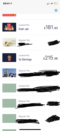
This is not great at all! I was just about to make a full switch over and now I doubt that I will! Not being to see all of your pots in a list is crazy!!! Visually it is so much easier to see all of your pot amounts together and helps organise your money better. The new scrolling feature is what most old banks like Halifax do - we don’t need that! Yes, I know there is a section that lets you view it as a list but it’s not the same as before. I thought that was the best feature of Monzo and really helped with money management. Back to the drawing board for me as I was so excited to make the full switch this monrning.
I assume you’re on iOS if so pull the tray down and click on your profile picture. There’ll you’ll see your pots in a list.
If on Android a swipe from top to bottom will do the same.
Since the update you can no longer see your pot goals whilst viewing them all in the summary. To view the goal you are now required to go into each pot. For me seeing each pot at a quick glance and where I was up to really helped me.
Is this feature going to come back?
Not for me  reminds me of an old WinForms datagrid.
That’s weird, he’s clearly signing for Spurs ![]()
Yes, but like the OP said - you can’t view them all together. You have to scroll through and check each one individually. You can’t look at your lost of pots and see progress bars/%’s on each one at a glance.
Apologies to poster above for my absolutely opposing view but…
iOS 2.58. The pots/accounts list is horrifying imo. I opened it and was genuinely shocked. The grey bars look very crude to me and not at all modern or Monzo.
I don’t think they’re very iOS-y. I don’t really mind them though. Would be better if the design of that page was more coherent though. Seems quite confused in its looks at the moment.
I agree. I was really happy with how it looked in the last version  looks really ugly now.
Agreed. Looks horrible and not at all iOS-like.
Discover Monzo still missing for me!
Settings within settings doesn’t feel quite right.
iOS. 2.58.
- Home screen
- click my profile picture
- click the cog (I assume to get to settings)
- then have to click Settings (to get to real settings)
In my mind, the cog = settings, so it’s weird to have them take you to different pages
Agree. Clicking the cog or your profile pic both take you to the same page, which feels wrong.
Oh my. Now I’ve seen this, I can’t unsee it. The shiny chip is really pants!
Out of curiosity, what’s the “July charges so far”? I’ve never seen that in mine.
Where are those hot chip pot pictures from? Would be cool I’d Monzo had a few more pictures available on Android.
Most are on this thread


