Yeah mine seems to work, but flashes up an error as it does it. Also 2.57.
Another Android user here reporting that all is good swiping between personal and joint 
Small niggle (I know) but “left for 1 days” is wrong! Perhaps something for the when a dev has a few minutes before a meeting or wants a calm Friday afternoon collection of fixes?
2 Likes
Would it be possible to choose the order of accounts? I have a joint account and a few pots, so to get from my main account to my joint account I have to do a lot of swipes.
I see my joint account a lot, but I don’t really go to my pots frequently, so I would like the option to hide them from the main UI or reorder the accounts, so I can swipe from my personal to my joint account. 
5 Likes
Let’s take a look at Monzo 2.58.0 ![]()
![]()
Chats will now have a handy separator so you know when one chat starts and another ends. There’s also some nicer bundling of chats sent in rapid succession - which makes it all look a bit more refined ![]()

![]() Check out this awesome white navigation bar - looking clean
Check out this awesome white navigation bar - looking clean ![]()
![]() Pots now have nicer shadows
Pots now have nicer shadows ![]()
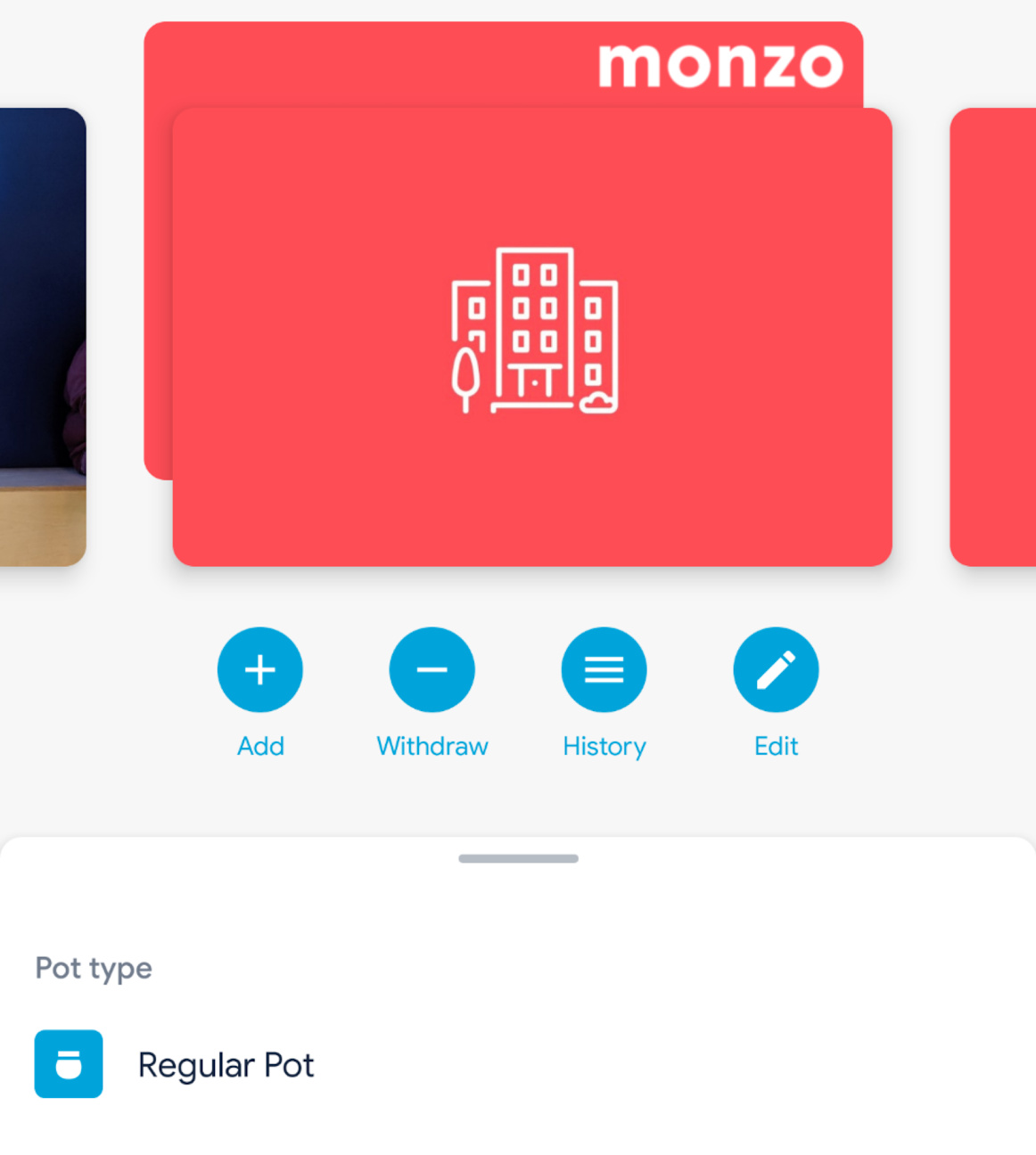
I find it especially noticeable when it’s a hot coral image on top of the Monzo card ![]()
Who wants to see something that’s currently a work in progress? ![]()
Quick disclaimer, this is something that will look a little bit different before its big debut ![]() but who doesn’t love a sneak peak
but who doesn’t love a sneak peak ![]()
Introducing… Discover Monzo ![]()
This will be nicely tucked away to the right of your Monzo card / Pots and the aim is to make things easy to find! ![]() Brand new customers won’t need to rifle through pages and pages to find the best Monzo-ey features.
Brand new customers won’t need to rifle through pages and pages to find the best Monzo-ey features.
But it doesn’t stop at new folks, just because my Mum has had a Monzo account for a year, doesn’t mean she knows about Monzo Points or Joint accounts ![]() the increased discover-ability of shiny new things will be awesome for everybody
the increased discover-ability of shiny new things will be awesome for everybody ![]()

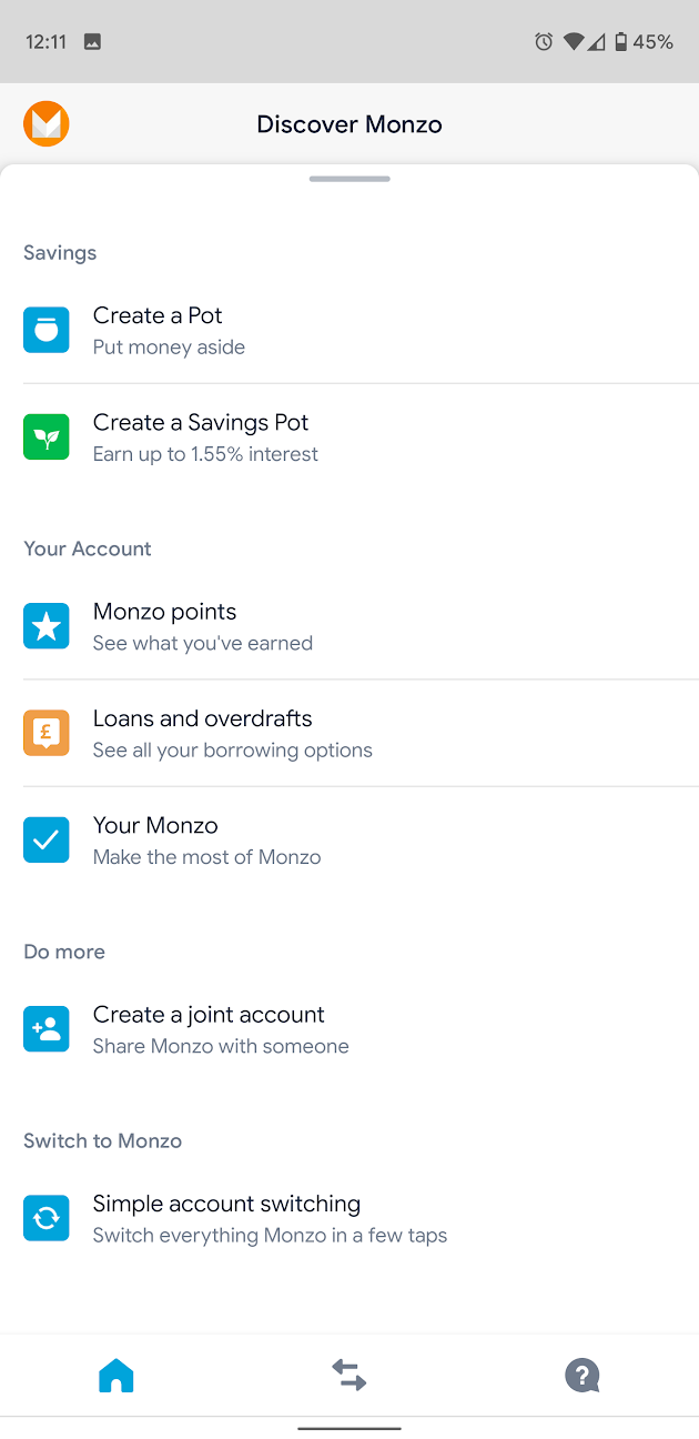
Like I said, though. This is still being worked on but I can’t wait for it to be ready for the masses ![]()
Who’s looking forward for the next release of the Monzo app? ![]() Any feedback for us?
Any feedback for us? ![]()
22 Likes
That clean nav bar 
Just one question, where is 2.58.00 ?

5 Likes
I’ve recently enabled the new navigation from Monzo labs and am liking it mostly. However, there are some issues and niggles that I’ve spotted on the iOS app version 2.57.0; several of which are likely to have been reported in the numerous responses on this thread.
(a) I struggle to remember how to get to the settings cog
(b) the ‘card functions’ such as PIN & Card number freeze etc are a little too prominent and take up valuable real estate when I suspect they aren’t used as often as looking through the transaction feed
© when you have a current and joint account and look click your picture in the top left hand corner, it opens a page where you see ‘get monzo plus’. However, it’s not clear whether this can be used with the joint account. Basically, it Monzo Plus associated with an individual or an account. Also, with Discover Monzo further down the page, Loans and Overdrafts is presented under the current and joint accounts which seems to imply that loans and overdrafts can be used with a joint account
(d) when swiping between cards and pots, it would be great to be able to easily create a new pot without having to hit your picture and scroll down the page
(e) On the ‘spending report’, ‘see full summary’ isn’t working at all.
(f) when using search for a joint account, it would be good to be able to filter by each joint account holder, e.g. search for transactions made by my wife
Generally, I find I get lots a little in the app; probably more so than with the old navigation.
I’m sure I’ll get used to it but I think the new app design seems a bit more fussy than before - I have a lot of pots so now to switch between accounts rather than pressing and holding a button I have to click on my icon (which I often have to press a few times before it registers - something which is already starting to grate as I often want to see an overview of how much is in my pots) and then scroll to my other account and click that.
Also when viewing individual pots the screen is quite busy and the actual amount in it can get a bit lost, took me a few seconds to find it when I first swiped onto them.
The graph was mainly pointless but I did use it to check my previous balance on different days - now I have to download a PDF of my transaction history which is much more effort.
On the whole great to see new ideas and development but so far I think it actually feels more cluttered/busy than before rather than streamlined! Probably just me
3 Likes
A slightly quicker way is to touch the currently displayed card, then swipe it down - this gets you to the ‘View All’ display where you can then tap on a different card/pot/connected credit card to get to it quickly.
Glad you’re looking forward to it ![]()
Is “on my phone” an acceptable answer? ![]()
I’m not sure exactly when it’ll drop but keep an eye out on the PlayStore beta channel for it ![]() I’ll try to give a heads up when it’s on the way
I’ll try to give a heads up when it’s on the way ![]()
3 Likes
Just had to reinstall as app wouldn’t open at all. Then home page got stuck behind a whirlygig, but works now…
@nexusmaniac I found a minor UI bug (the downsides of having a long name…)

Google pixel 3, app version 2.57.0 (new layout). Let me know if you need any more information!
1 Like
So I have a notification in my help menu
But I can’t figure out what the notification is for!
Nothing in that section has a dot next to it
I’ve viewed any chats I had opened as well so not that
Of course!
Good to know you have it and it is imminent - thanks for the advanced notice ![]()
1 Like
I will say the newest update to the new look, makes switching between pots tiresome. So much so that I actually turned of the experiment. I will also say that I understand the logic of having the corresponding card be in the background of the pot to tell us which account the pot is connected to, but it to much visual noise in my opinion. I get distracted by all the movement and I have a harder time keeping my eyes on the important stuff, actually finding the correct pot.
On a side note I wish I could access all pot from both accounts.
1 Like
I’ve mentioned this elsewhere but rather than swiping through pots you can click your profile photo and get a list view of your account/s and pot/s in one go, this might be simpler for you.
2 Likes
I think all these comments not realising that, is showing why Bruno has said in testing they’ve found the same thing and are developing a new way of going between the two views.
2 Likes
I have found that route as well but it still takes me more time than I would appreciate. So instead I turned the experiment off.
I’ve mendtioned this elsewhere but in my opinion switching to a second screen in order to ‘quickly’ scroll along the first screen as a really bad user experience. Aye it works, but it’s not simple or intuitive. It solves a problem which shouldn’t exist.
2 Likes
Observing a previous post;
You don’t need to tap on your Profile pic, simply swipe the in-focus card down to get to the ‘View All’ page. I personally like this dual display, scroll horizontally (Home feed) or scroll vertically (View All) - it adds more & quicker access to your cards/pots/ConnectedCC’s IMHO
1 Like