While I know about test flight for Apple, is there a way to get an invite to test new versions of Monzo?
Thanks
Aaron
While I know about test flight for Apple, is there a way to get an invite to test new versions of Monzo?
Thanks
Aaron
Hi,
Small cosmetic niggle that has been really buying me! Apologies if it’s already been flagged
Account number doesn’t fully cover the ‘pie chart’ icon for spending and therefore looks a bit strange. Could it be made to fully cover the icon or something.
This is on Android. P30 pro
Thanks and keep up the great work 
Testflight is the earliest builds you can get.
Some features are feature flagged, and some of them are available in Monzo Labs for early testing.
But generally speaking, the version currently in testflight was finished on Tuesday! So you’re getting things really fast already.
Only way to get more internal updates and unreleased features is joining Monzo 
Fixed in 2.57.0 (545)!
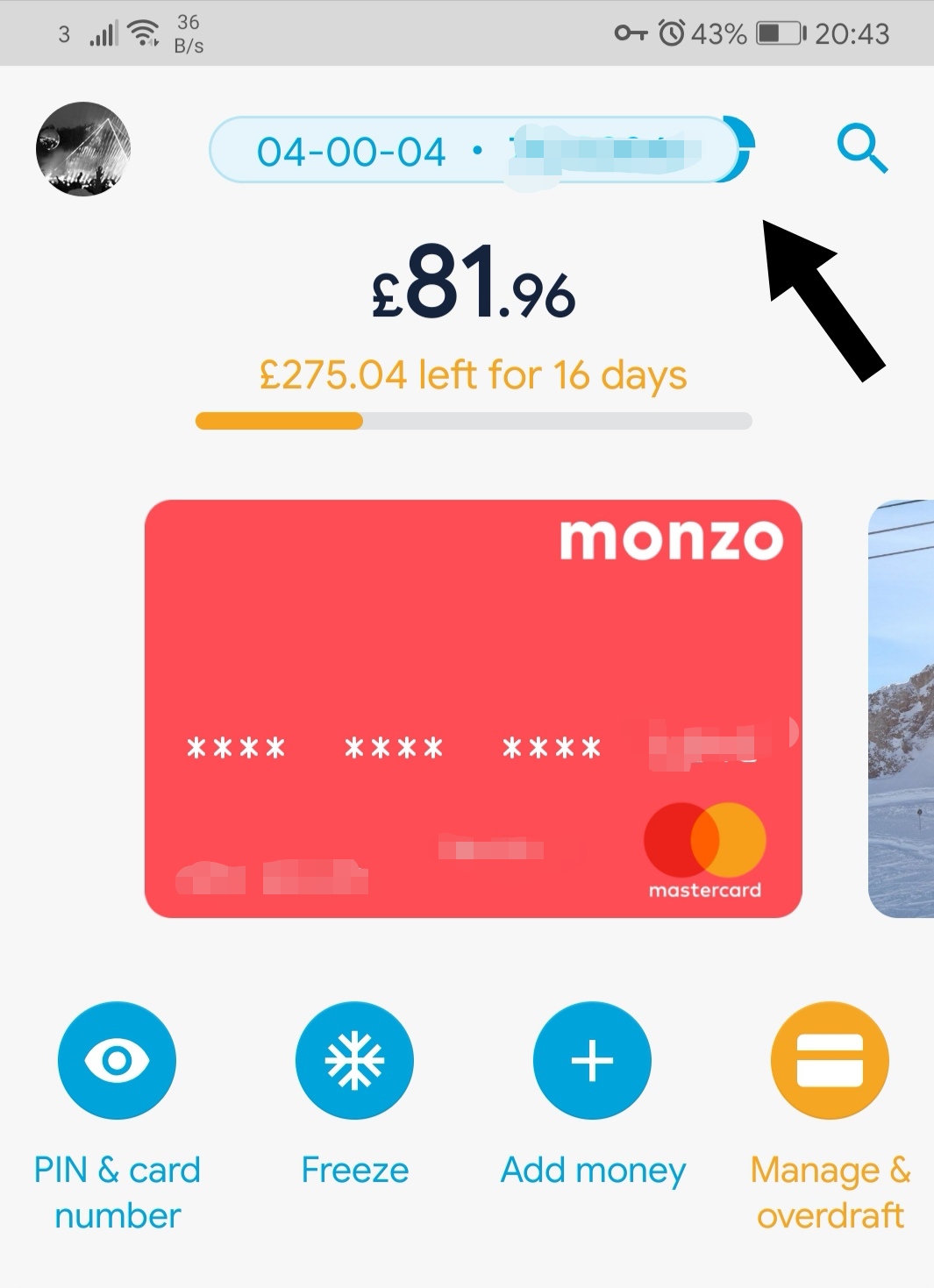
I absolutely love 2.57.0 - the micro-improvements are fantastic. Love the new placement of the “left to spend” bar, love the button for summary screen. Love the mini label next to the day in the feed that tells you how much you spent on that day, love the search button placement (compared to where it used to be!)
Still find it confusing when you tap on your profile pic, it brings up your cards, and then you instinctively go to tap a “back” button to take you back to your Home and it’s not there… you actually have to tap on the card to get you there? Feels a little unintuitive and confusing unless you know how? Just my 2c.
in 2.57.0, the option is back when you tap on the sort code/account number - it takes you back to the Account Details screen with all the account details and a share link that brings up the iOS share sheet. Pressing and holding on the sort code/account number on the home screen lets you copy either
Hi Bruno,
Yes I know test flight are the earlier builds and I’m fine with that and testing things out, developing software and testing is part of what I do for a living. However I was under the impression that you can’t just down load the test flight app, you need an invite?
If it’s not possible, no worries.
I do have the monzo app but sadly I’m not part of monzo.
If only I had a penny for every time I’ve tapped the card when the transaction feed is lowered and expected something to happen… 
Send a message in chat to COps and they can sign you up to testflight if theres space available
Be nice to see the list view return instead of horizontal swiping
It’s not Times New Roman for me, are you on Android or iOS? (iOS for me - Monzo 2.56)
Not sure if this was looked at in earlier testing, but I really would like to see the little “notch” you get indicating where in the month you are in Summary to show up on the left to spend bar. It would give a lot more context to how you’re doing without having to tap into summary.
I like the fact the app stays in the same place as I often jump out the app and back in to check something is correct. Loosing my place would be a bit irritating.
If you show the card number and expiry date for a card and then navigate by swiping to another account you hold, the details appear the same on the card. It does still toggle between normal and joint account in the top left of the card image but the details are the same. Same if you show details for personal and scroll over to joint or vice versa.
Is there a secret option to copy the card number? Swear it was there before. Maybe.
Only thing it’s missing (for me) is a button to quickly flick between personal and joint account on the transaction list screen, much like you now get in the Payments screen at the top left which is awesome. (Even more awesome if it just toggled between the two accounts without bringing up a list of just 2 accounts if you’re already in one of them.) Scrolling isnt so great when you have lots of pots. How about a long press on the profile icon top-left of the transactions page for a speedy account toggle?
This is good for jumping in and out, but it would be good if after a set amount of time e.g. 10 or 15 minutes, it could reset back to the default home screen view.
When is the cut off point for this?
From reading comments and suggestions it seems like it could go on forever 
Love the new design tbh it’s so simple and easy to use. Except for me I’ve reverted ( not my choice probably a bug) back to the old style and I don’t know why? It’s so cumbersome and clunky I love the new design so much more I just want it back!!!
Still no “left to spend bar” in 2.57.0  . I’m guessing the negative value discussed earlier may still be the reason but I’ll know for sure tomorrow when money gets deposited.
If that is the reason, I’d quite like like to see the value of the potential overspend in its place since that’s the key number I manage things by.
I think Bruno said once the metrics show the new nav isn’t having a negative impact on growth or customer support queries etc then it will fully replace the old nav.
(The new nav has to match or perform better on certain indicators)
From that point on I suspect changes will still come. Just maybe not as frequent and it will mostly be smaller changes.