I personally prefer to go via my View All/Accounts/Profile page
1 Like

Here’s where we are with app releases.
 2.57 is in Beta
 2.57 is in testflight
Its been difficult for us to rollout ios updates and we’re trying to keep on schedule as much as possible. There’s a crash in 2.56 (currently in App Store staggered rollout) and we disabled new nav for users on iOS 10.x. We’re keeping an eye on 2.57 and what that means for new nav. But now most customers can use new nav on the latest app version.
What are we learning
1.Accounts
Getting to/from the Accounts screen is not as easy as we’d like. We validated an improved version of the Accounts screen in user testing this week, it made it better, but didn’t solve the problem entirely.
![]() Next step: ship the improved version of Accounts. This is already built on iOS and will ship there first. Also build a better transition gesture. It’s an evolution of the card dragging gesture already on Android. We’ll scrap that interaction and build something more robust. Im confident that will massively improve our product.
Next step: ship the improved version of Accounts. This is already built on iOS and will ship there first. Also build a better transition gesture. It’s an evolution of the card dragging gesture already on Android. We’ll scrap that interaction and build something more robust. Im confident that will massively improve our product.
2. Creating Pots
Not very easy to create pots, and all the other things Monzo offer. Partly because it’s difficult to get to the Accounts screen, and partly because these actions are only available from that screen.
![]() Next step: build the interaction mentioned above, and add these actions in another section on the Home screen. It’s a new type of card, the Discovery card.
Next step: build the interaction mentioned above, and add these actions in another section on the Home screen. It’s a new type of card, the Discovery card.
This is half done on Android and will be released there first.
3. Micro improvements
Lots of feedback on micro sections of the app. Labels, spaces, margins, shadows, etc. These compound and make the app less intuitive.
![]() Next step: design snag list to improve on both clients. Literally designers sitting with engineers and going around the apps fixing all visual glitches.
Next step: design snag list to improve on both clients. Literally designers sitting with engineers and going around the apps fixing all visual glitches.
4.Bugs.
![]() Next step: continue fixing all the bugs.
Next step: continue fixing all the bugs.
5. Accessibility
App isn’t accessible for users with visual impairments.
![]() Next step: bring accessibility on par with old nav.
Next step: bring accessibility on par with old nav.
Feedback
Please keep it coming! Make sure to add or and the version you’re running when reporting bugs.
Let’s stay focused on feedback of the new nav. I know there’s a lot of things to improve around the app, but we’re only working on new nav improvements for now. If it’s a long standing pain from old nav we can tackle that separately.
22 Likes
All sounds really good Bruno and amazing how far this has come since it started!
2.57:
- Still waiting on total account figure showing up somewhere and hoping it does
- Daily spend is so nicely integrated

- Personally preferred the bar chart icon from 2.56 but appreciate the consistency with old nav of the pie chart. Still think the left to spend bar should be clickable also. Settings screen has two entry points - one clearly marked with cog, other not so much - so would use this as argument against only having one if that was stance taken.
- Definitely agree with others above that the account total should stay at the top even as you scroll through feed like it used to
1 Like
The Settings screen will be merged with Profile. So it’s a unified screen with no more nested settings. We have designs for this, it’s just a matter of prioritisation.
This won’t be built until we release new nav to everyone. It’s not perfect right now, but I’m sure we can agree that the current Profile/Settings sections of the app in the old nav are also not great.
12 Likes
Also something that’s good: customer support queries on iOS are now statistically the same as in the old nav 
Android still worse in new nav, but improving version after version.
This used to be 30% worse in the new nav once we first released!!
12 Likes
Fair enough! That all sounds good. And I can certainly agree with that aha.
1 Like
I love the new nav!
I personally think that the area above the cards is a little over crowded… it would look a lot cleaner if it just displayed the balance there & the left to spend was optional within the settings and the user could deactivate it.
Account number & sort code could sit nicely within the card picture real estate in a bubble or even hidden away in the pin & card numbers section 
The add money button under the card makes it feel like it’s still a pre paid card… could be changed to the summary button and have just the search icon on the top right.
8 Likes
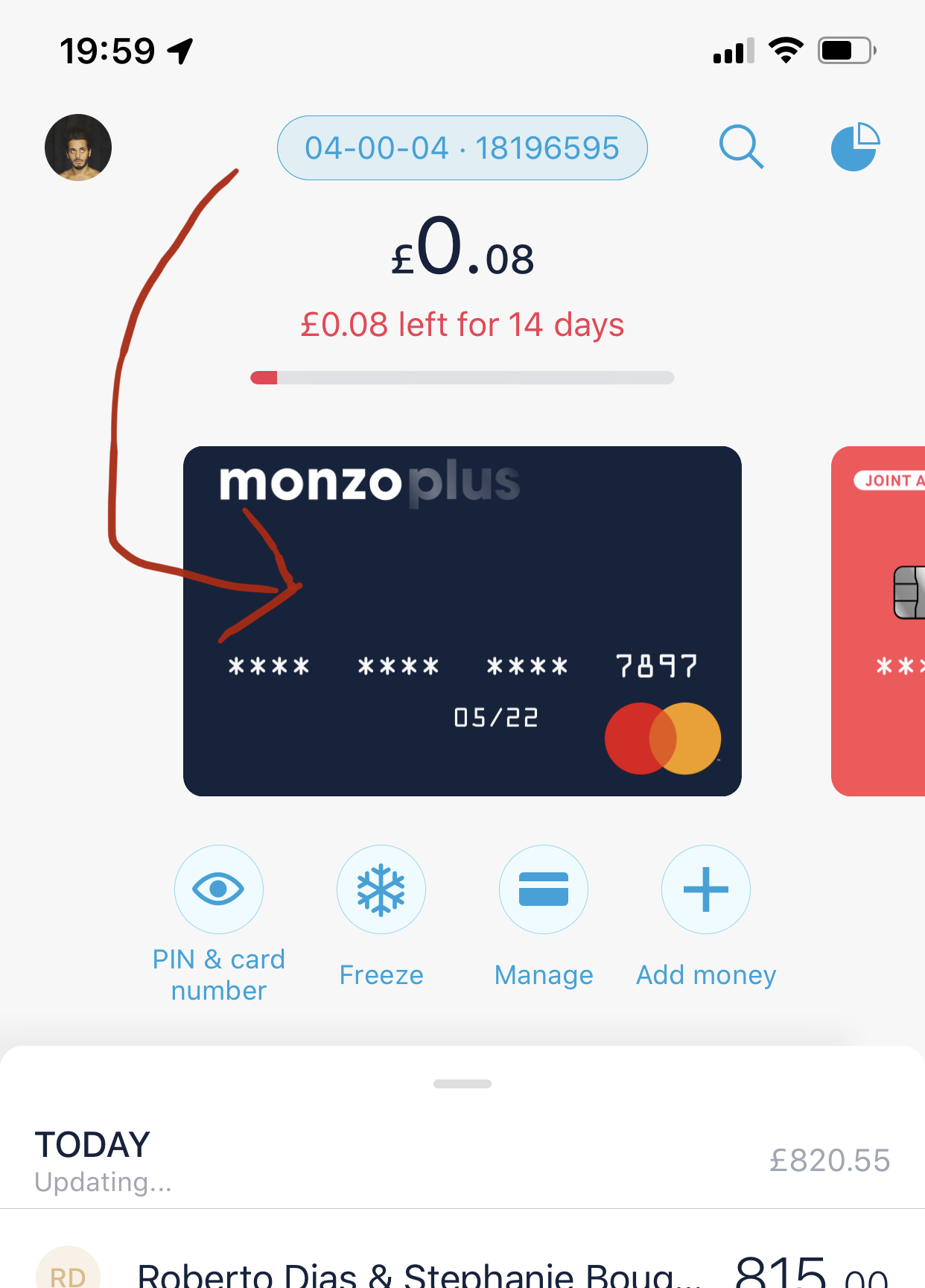
Can we please see a return of the little ticker which tracks the days remaining on the left to spend bar on the home screen?
12 Likes
We never had that on the Home screen, only in Summary, but it’s a good suggestion 
18 Likes
Great, I think it would complete the visual representation of the text above it 
2 Likes
I found it hard to find the settings I wanted in the new nav.
I clicked the profile picture expecting to go to my profile but got the accounts screen.
Then clicked on the cog expecting the app settings but got a more detailed profile view with some duplicated entry points for monzo points etc.
Then I clicked settings not knowing if I’d be able to edit my account settings (these can be accessed by scrolling down the current page) or app settings.
2 Likes
Could you Reintroduce the share account details feature, currently on the new design when you touch your account details it says “copy sort code” “copy account number” instead I think there should be the share account details option like before. In a pre formatted message that we can share via text or other media.
1 Like
Which platform, which version?
v2.57.0
One 
- With the Gambling Block now living in the Manage Card screen it seems like the block is per card but turning it on affects both cards. Feels like this should be moved to settings. (Can’t remember if this was the same in the old nav so sorry if this isn’t relevant here)
One 
- After turning on gambling block from Manage Card on JA and going back out to the carousel the pot image for my first CA pit disappeared.
2 Likes
2.57 @bruno app is looking good and better with every release, but the one thing that’s bugging me is the app doesn’t ‘reset to default’ when closed and re-opened
If im looking at one of my pots and close the app, when I re-open the app it’s showing where I left off in the pot, where in my opinion it should always start at the default of the main account (hot coral card) page, where I can then view my current account instead of having to flick back etc.
5 Likes
The reason why, is that some users only use JA. And they were constantly put back on their personal account after reopening.
Here’s some improvements long term
- Easier interaction to go to Accounts, so you can use it to jump between accounts.
- Make use of the Home button. It’s currently dead.
- Custom account ordering, so that if we reset your location after opening the app you’re taken to the first card, and that’s your preferred card.
11 Likes
That’s great and thanks for the reply.
Item 3 would work just fine or have an option to select which account is your default by maybe a long press on the card etc (i.e. Google Pay type selection) and it will always reset back to the selected default
1 Like
It would be great if pressing the Home button while already on the Home tab took you straight to your first card.
2 Likes
Yes!
Overall it’s a great design and looking forward to seeing the iterations.
One thing that’s bugging me a bit though is the font when you select to open a new savings pot. Is there any reason why it’s in some form of Times New Roman when all the other font on the app is an Calibri-type?