android 2.56.0
I think @bruno may have addressed this first point, but I’ll mention it anyway just in case…
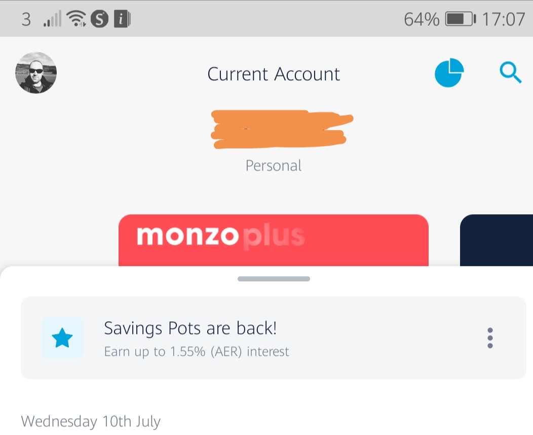
The account / pot name is now shown below balance in a small font, whereas the word “Pot” or “Current Account” appears above it bolded. In my opinion it should be the other way around so that precedence is given to the account or pot name rather than it’s type. My Credit Card currently shows the provider “Halifax” above and “Halifax Card” below. In line with the previous suggestion I’d much prefer it to show the Name (Halifax Card) at the top in bold, and object type (Credit Card) at the bottom in light font
The summary button looks strangely out of place at the top right and I don’t understand why its cannot be shown on the bottom nav bar for personal and joint accounts. It’s so central to the Monzo experience for many users.
I guess the summary bar will return when the “left to spend” calculations are ironed out … and I guess it will be clickable to get to summary, but that is not an obvious action, hence all the previous experimenting with blue pill boxes surrounding the balance. Just put the button on the bottom nav bar Bruno! 
The Home button remains unintelligible to me. It doesn’t take me “Home”, wherever that is… I would expect it to return to my personal current account when I am viewing viewing pots / joint account / credit cards and then to show the account overview page if pressed on personal account. Currently its sole purpose seems to be to switch back from payments screen and to lower the transaction feed if looking at an account/pot. It’s not expected behaviour to me…
Personally I don’t like the placement of the sort code and account number above the balance when the transaction feed is pulled down. It causes a visual spasm  and is not consistent with how other objects are shown. In addition I find that the blue pill spoils what is becoming a clean and classy interface.
The new profile/accounts page is looking very promising  . although I would appreciate a quick way back. When pressing profile pic, my thumb is then at at the top of the screen and the back button is at the bottom. It’s a lot of travel just to back out. I know I can select a card / object to exit from the screen, but that requires mental agility to recall which account I was looking at, find it in the list and select it. For some reason I keep pressing my profile pic expecting it to return to the account I was looking at; I may get used to it but it the navigation feels unnatural to me right now.
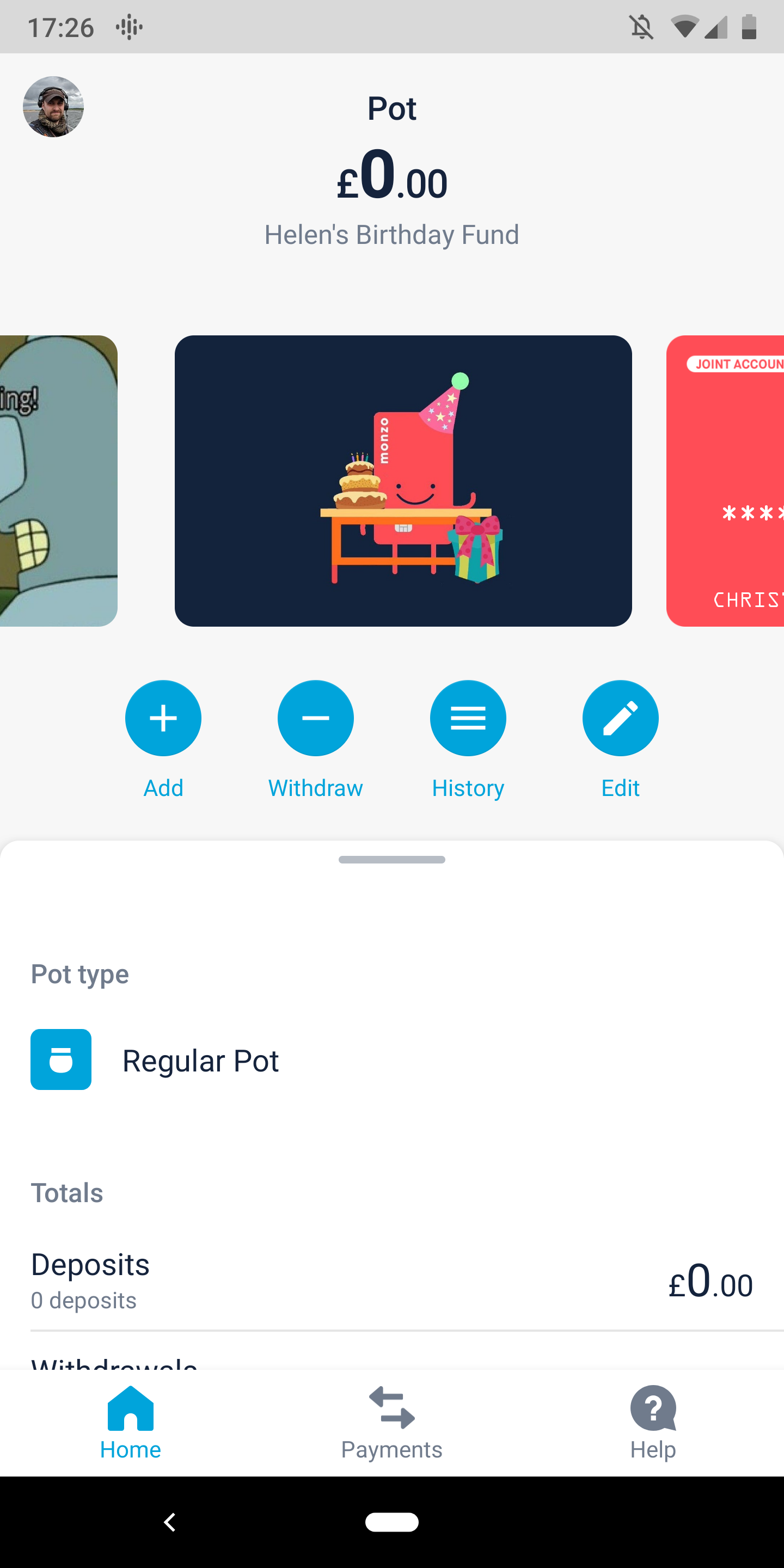
I’ve mentioned before but I don’t like pots appearing in the carousel as it causes me too much swiping to move around. Would much rather see this used for accounts only. I’d prefer my pots to be shown in tiled page accessed by a “pots” button on the bottom nav or a pots button accessible under the card.
Overall it’s great to see the design evolving, but still some way to go for me.
Cheers
 !
! Has anyone tried the latest Android Beta? Thoughts?


 I didn’t spot that when writing my feedback. For some reason I just read that this was for the left to spend