Thanks for your post @emmag. So interesting to hear what happened and lovely you shared with the community. I’m always up for seeing what might be on the horizon and share thoughts. Looking forward to post two ![]()
4 Likes
Now this is a bold opinion…
5 Likes
I like the merchant logos a lot. The only issue comes from the changing/adding of them. Whatever system they use on connected accounts needs to be brought over as it’s far superior and much, much faster to update. For some reason.
10 Likes
Oh I know.
I, initially liked them. But over time I’ve come to realise they probably cause more time spent trying to fix the right one than they are worth and can, in my opinion, look messy on the feed.
Imagine how much time could be spent fixing issues elsewhere if they didn’t have to respond to people complaining that the McDonald’s logo was slightly more red than it used to be……
I’m actually inclined to agree with you.
The logos were fine, but they’re just hell to keep right.
I’d rather they were removed and the list could be a bit more compact.
1 Like
As a joint account customer, it’s really good to hear these things are on your radar.
Multiple times I’ve paid someone and realised I’ve paid them from the wrong account.
So many times I’ll see a (1) on the app and I have no idea if that was something I just paid, an update from Monzo on one of the accounts or my girlfriend spending some money.
4 Likes
I don’t know if this was intentional but I’ve just recently bought a Landrover and turns out this was quite the saying for some years from them.
1 Like
While we’re waiting for some more from @emmag and co, I wonder what folks are hoping for?
To stimulate some thoughts here’s (you’ll never guess) a poll!
What would your focus be on?
- Improvements to existing features (like search, or the feed)
- A new home screen design
- Change navigation (maybe rethinking the bottom tabs to accommodate new products)
- A new design language / colour scheme
- Making the existing design language consistent throughout the app
- Something else (tell us below)
0 voters
1 Like
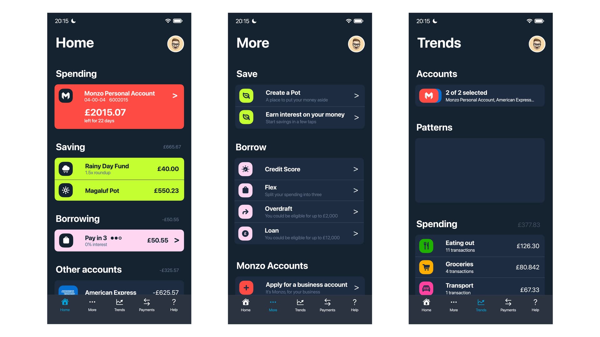
I think a new home screen design could be exciting ![]() but these are some of the individual things that irk me at the moment with the current UI. (iOS user, iPhone 12 Pro, latest App Store version of Monzo).
but these are some of the individual things that irk me at the moment with the current UI. (iOS user, iPhone 12 Pro, latest App Store version of Monzo).
-
The animation for pulling down the transaction feed to get to the pots overview screen is really janky and not fluid. It’s really one of my least favourite animations in any app/iOS navigation experience
 . I can’t decide whether I like this method of getting to the pots overview screen, but I really wish it had a completely reworked animation.
 -
Again on animation, swiping between pots can still be a jerky experience. I have 15 pots, and noticed at one point when I had to temporarily delete a bunch of pots (to get a better interest rate), that with less pots, it was a bit smoother.
-
I don’t like that the selection of “feed” or “manage” is dealt with on a per pot/account basis. If I’m swiping through multiple pots, all on the “manage” tab, then come across 1 random one that I’ve left on the “feed” tab, it feels weird.
-
The Summary icon and search icons on the home screen are too close for me. It feels like they’ve both shoved in a corner and getting in each other’s way. Maybe when Summary goes, this’ll not be an issue.
-
The info above a pot can get very cluttered and not visually appealing when it includes: the pot name, the type of interest bearing pot, the amount in the pot, and the percentage of the goal achieved. At the very least it seems like the most crammed in bit, which is the pot type (e.g. “easy access savings pot”), could just show on the manage tab instead.
-
Still hoping for the return of something more visual for pot goals progress (including on pots overview screen), instead of just a percentage being displayed.
-
UI inconsistencies, e.g. swipe to go back (iOS) not being built into all screens which have a back button at the top for navigation. There’s also a separate issue of a long standing bug with swipe to go back: [iOS] swipe to go back intermittently doesn’t work
-
The background colour when you are a Plus member - its like a green/blue mixture which just comes across as a “toxic waste” colour for some reason to me

 .
. -
feed/manage has 3 different positions - this is too many I think. Maximum 2 positions would be better and make navigation easier.
-
Final one… I know there are different trains of thought on this, but I really hate having to copy tags/notes/category choices on a E.g. withdrawal from a pot on the pot feed, to then have to do it all again on the same transaction on the home feed. I miss the days when I just had to do it once and it would be the same in both places

4 Likes
Exciting stuff!
My first thought is that it feels to me like Trends really needs to be ‘finished’ (by which I mean, all the Summary features - budgets, left to spend etc - need to have ported over to Trends and Summary needs to be gone) before any big redesign of the app as a whole.
Secondly, I don’t dislike the idea of having a home screen that’s a bit more like the current swipe down screen. That’s where I want to go most of the time anyway, and it feels more natural to me to load that and click current account if that’s the account I want. This part of the test design wasn’t bad to me, if it had been more useably laid out like the swipe down screen is - with the titled and current balance of each account/pot visible.
Plus tab as others have said is massively wasted space for me. I literally never go there. I understand having the Get Premium banner/button/ad thing on the home page, because you want to encourage sign ups, but having a tab at the bottom for plus seems completely useless to me. I believe I’ve already posted in the other thread specifically about this and where stuff from this tab could go instead.
I really like the easy access to see all my virtual cards on the current swipe down screen as well, and would love to see this as easily accessible on the new home screen.
With menu items that are currently further down on the ‘things to do’ page, I think part of what makes them less intuitive is the way they’re written. I understand the reasoning behind writing “Introducing Monzo Flex” or “Earn interest on your Money” as the titles, instead of “Pay Later” or “Open a Savings Pot” but it just ends up feeling inconsistent, when some of them are marketing like, whilst others are simple statements for what the button does. I feel like all the titles should be the simple what it does, and the subtitle can be a bit more interesting. The pot and overdraft ones are perfect.
The division into ‘Do more with Monzo’ and ‘Your account’ seems kind of arbitrary as well. I’d rather it be split into more intuitive/logical divides. For me personally I’d probably favour “Accounts” for Do More with Monzo stuff, “Borrowing” for loans, overdraft and flex, “Saving” for pots and savings pots. Add money seems odd to have to me, idk really what it’s there for. Donate to charity is nice but I’m not sure what I’d do with it lol. Maybe it could be it’s own thing on the new home page. And See allowances seems superfluous. I’ve never noticed it’s there before and if looking for it, I’d either search limits in help or go to the account and to ‘manage’, both of which it seems would work. So I’d probably ditch that on the home page.
Perhaps Manage could be renamed to Info & Manage? Then Card details, and freeze could both go under there. And get rid of Add Money again, on current account. I feel like ‘Edit’ on pots should come under Manage as well.
Lastly, I really am a fan of customisation where practical, so having an edit option for the new homescreen, just like we do on the current swipe down screen, where we can turn bits off would be lovely.
3 Likes
I think with so many customers now, it should be evolution, not revolution.
It’s mentioned above, but making the app a little less like a maze would really help. There’s a cog for settings when you’re on the “list view” but there’s also the “manage” section in my current account.
I use this forum everyday, the app most days and yet when someone says “where is X?” I’m never confident enough to say “It’s in the settings” or “Its in the manage section” without double checking myself first and this is from an “experienced” user so this might be quite confusing for a newbie.
4 Likes
Yes, I think that’s probably where I’m at with a Monzo.
Focusing on really nailing the who summary/trends thing and perhaps a slightly simpler UI in terms of click ability.
But nothing more than that, hopefully
3 Likes

- Plus/Premium for Joint accounts
- Pot-to-Pot Transfers
- Cheque Imaging
- Desktop/browser Monzo access
- Family/Kids accounts
…
3 Likes
Well yes, those things would be nice (especially pot to pot transfers and an iPad app).
For me though the UI is fine, and I’d rather they spent time polishing features like that
3 Likes
I watched with awe as the transition from ‘list’ to ‘carousel’ (with 100% respect for @bruno and team for steering that into release) happened. Outstanding development whilst welcoming external user feedback. It’s that passionate PUSH that we’d welcome to keep ![]() at the forefront of UK fintech
at the forefront of UK fintech
8 Likes


How did you leak this? ![]()
![]()
3 Likes
Nice but I wouldn’t have that for home - no transaction list, which has always been the first thing you see, and kind of assumes multiple accounts - which is the hard problem Monzo have to solve - a huge number of people only have their monzo account so aren’t going to be interested in extra accounts being front and centre, whilst there are other customers like you who have lots of linked accounts.
3 Likes
Nice design but not for me personally. Also looks like Revolt & Monzo did a thing ![]()
The thing I love about the UI currently, and hope to see in any iterations, is it’s simplicity. I can easily see at a glance where my money’s at in pots etc and click in for detail/transactions etc.
Things I would love to see in any revamp:
-
In Pot Feeds - One of the thing that really irks me about the feed is that everything is on it. Yes, I know that’s what a feeds supposed to do. But when you have transfers in from a pot to pay a bill I think it can look a little messy. So if you have a bills pot, all in’s and out’s remain within that feed.
-
£ marks I don’t know why but it really bothers me there’s no denomination mark
-
iPad/Web access - I really really really hope this becomes a thing. Its not great always having to do everything via the phone, especially if you WFH with ready access to a web/iPad.
-
Navigation - This is where I think any revamp would really add value. The whole summary/trends thing, the plus button, the “hidden features” which are hidden away in menu’s.
2 Likes
None of these are UI improvements though
4 Likes