Great Britain


https://www.ipsos.com/en-uk/personal-banking-service-quality-great-britain-february-2023
Northern Ireland


https://www.ipsos.com/en-uk/personal-banking-service-quality-northern-ireland-february-2023
Great Britain
https://www.ipsos.com/en-uk/personal-banking-service-quality-great-britain-february-2023
Northern Ireland
https://www.ipsos.com/en-uk/personal-banking-service-quality-northern-ireland-february-2023
I think I want to discuss apps with Northern Irish people ![]()
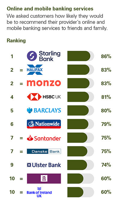
But good news. Nice to see Monzo at the top again.
I’m not sure, though, whether the lack of the ![]() logo makes Monzo stand out more or less though?
logo makes Monzo stand out more or less though?
I don’t think I like the logo like this as much. Just makes it blend in with everything else. Still not a bad logo though
I agree. I think it was possibly you, and apologies if it wasn’t, that 81% shouldn’t be celebrated too highly. Would be nice to see a 9 at the front for any of the banks and categories.
You do need to remember that there will be some people not answering surveys particularly honestly. I doubt this one will be any different so I assume some people will just go for the lowest score for absolutely no reason. It will probably be pretty difficult to get above a certain score because of this.
It wasn’t me (I don’t think) but that’s still a 19% dissatisfaction (I think) rating.
It would be good for the industry as a whole to get a bunch in the 90%s. But I do wonder if there’s a natural ceiling to these things?
At least Monzo should be consistent with their logo. Two years ago and First Direct was using that fingerprint logo on this, which they still use on their website, yet not on the survey anymore.

Because co-op is the greatest. That’s how.
But this sort of thing does show the limitations of surveys, especially when RBS and Natwest have quite different scores despite being identical for most things.
Paging @Rat_au_van
It is. Monzo redesigned the visuals for the logo and wordmarque recently, and what’s on this survey is in line with the current design language.
As for first direct, let’s hope it has ditched the thumbprint.
I wonder what the clincher is for being placed first on tied positions. Monzo is top on one graph, and Starling top on the other.
Likewise, why was Starling placed at the top last time?
Number of 10s perhaps?
Also (and final post!) doesn’t Starling provide overdrafts in Northern Ireland?!
My initial assumption was that they were doing it alphabetically.
Then I thought they were just giving each bank a turn at the top.
Now neither of those can be true. I’m assuming that both banks round up to the same position, but there’s a v slight variance that doesn’t justify a different position but means they can discriminate between them.
Either that, or like you say, another way of interpreting the results so they can be ranked.
I think that might have been me, or at least I was agreeing with a post along those lines last time!
Put another way, if you ask 10 people if a bank is good and only 8 say it is, you probably wouldn’t think that was a ringing endorsement? There is certainly room to do better for all the banks on the list, although looking at the NatWest and Ulster Bank scores when compared to RBS (plus my personal experience of RBS’s app, which seems quite good other than a few more “fintech” features missing), I tend to think that their score is artificially low again - due to historic brand perception, no doubt. It is a vindication of NatWest’s strategy to minimise the RBS brand outside of Scotland, I suppose. Then again, there will always be people who just, grumpily, say they “wouldn’t recommend” the bank when asked, so you would never get a 100% score.
The reverse of the RBS brand image? That Co-op is cuddly and nice people and “tries” whereas RBS is a “bad bank, needed a bailout, has a bad image of not looking out for customers”?
Haha, it’s probably a much smaller sample size in the Northern Ireland data - so one person’s slightly differing opinion can have more of an affect. Interestingly, it’s not that Monzo gets a worse percentage score over there - just that Halifax and Starling do better. Although they are not fintechs, the Lloyds apps are fairly solid and Starling is often a favourite in terms of app usability for many so it’s not that surprising.
I agree - there’s nothing wrong with the Monzo logo here, but it just seems a bit generic and ends up blending in despite the bright colouring. I miss the personality of the M device.
If that’s the case the immediate follow–up question is: Why are those respondents still banking with RBS?
Still using on their website as their main logo, so not ditched just yet
People still think moving banks is too difficult, even though it isn’t. Also, banking with them isn’t actually that bad so no real need to move - but people still give them low scores as an emotively-driven “revenge” for the financial crisis!
I know, but that’s probably what most of their customers think! I also doubt that they realise how much worse Co-op bank is when compared to other banks. They really do come up short.
That’s not true by any measure I’m aware of! Certainly not the official IPSOS Mori survey.
Also, they hardly have any branches left which is pretty useless if you want a branch-based bank account.
Just realised the table on Starling’s website using the fingerprint logo for First Direct
whilst Santander’s table doesn’t

What a messy brand identity.
I’ve switched off to what awards this and that get, all pointless at the end of the day.
Does my banking app do what I need, yes. That’s all I need.
