App is running super sluggish, I assume because people are hammering the pay early feature, but I’ve never seen it this bad
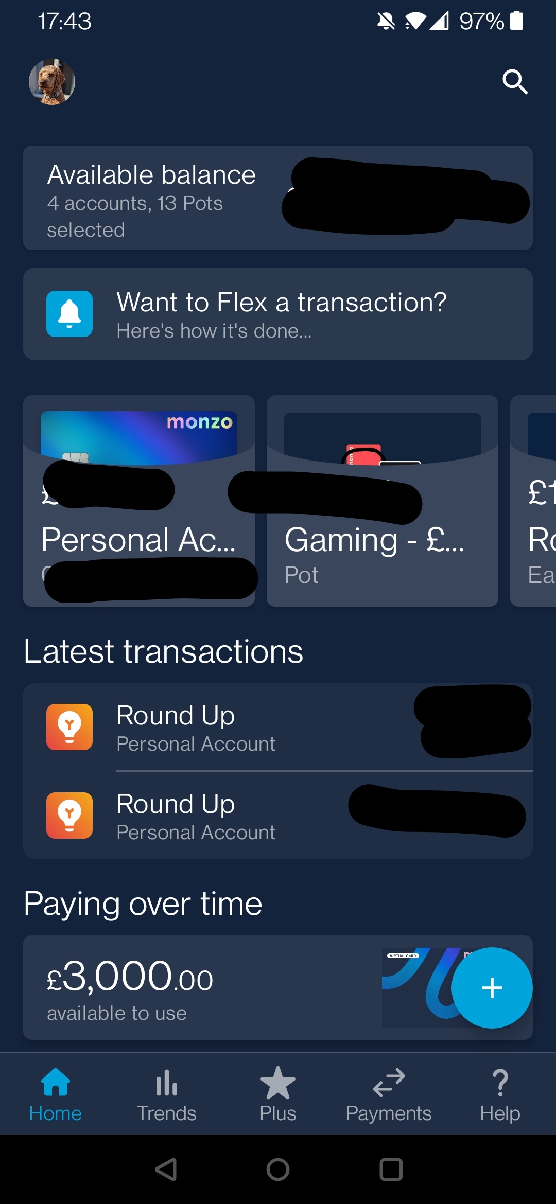
I can’t change the pots in the “Available Balance” bit at the top - it doesn’t scroll to let me select others
The way I use this app is I open it and click on my picture at the top to see a holistic view of each pot. I now have to go into my current account, and then do it. This is a genuinely worse CX than I had before.
What is the plan for this? It feels like you’re just trying to put flex in my face more to use, rather than actually solving for a user issue/improving the customer journey.
I agree in part. If there was a valid customer journey here (even if I’m not the target for it) I can see an end result that gives a holistic view with minimal effort. And happy for it to evolve into something - but the current bit I have feels very unfinished
And the fact no one else seems to have it makes me question if I even should? Or if I’m just missing something.
Hey folks, sorry about this! This was a test build with some extremely early work that shouldn’t have been available to anyone except some staff members. We’ve fixed it now