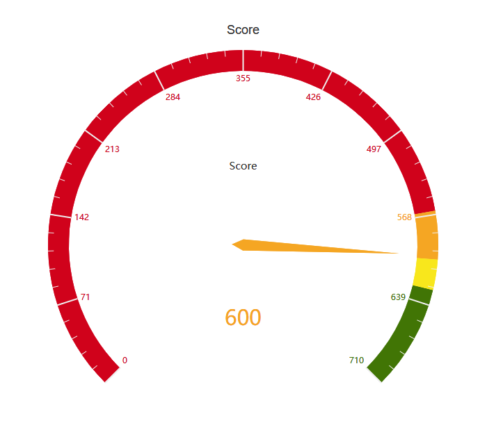
Issue: Credit score graph is not true to life. Although figure is correct (cross check with Credit Karma). My score is close to 710 but shows only as 1/4 on the graph.
Details to reproduce: Check credit score on Monzo Plus OS: iOS 13 Device: iPhone 11 App Version: 3.41.1
I’m really surprised there’s not been any further mention of fixing this bug, seeing as it was reported on the day of Plus launching and has been acknowledged in the main thread…
I think this is likely to be the expected behaviour. The segments on the dial each reflects one credit score band returned to us by Transunion, which are uneven. For example the smallest segment has a 14 score range, and the largest is in the multiple hundreds
We make them even in size so that most people aren’t all bundled in one tiny section of the dial ( and you won’t see if you move a few points), and so that when you improve your score and go up a score band you can really see that represented on your dial. Also, the vast majority of users are at the higher end of scores so using up half of the dial on lower scores that are basically never assigned is not a great use of space again
It sounds like we could make this clearer however, it might be a good candidate for a spot in the help section on the top right of the credit tracker page. I’m not sure I’ve elegantly explained this myself, but I felt you deserved and answer and I had one to give
What I am leaning on here is that close is a subjective word, and that sections in the middle are much smaller and so closely bundled together
They have (fairly) chosen not to share their score or screenshots, so it’s hard to know for sure but this sounds entirely plausible to me
@Ronandocherty if you think what I’ve said doesn’t line up with what you’ve experienced please feel free to DM me your score or a screenshot and I will double check
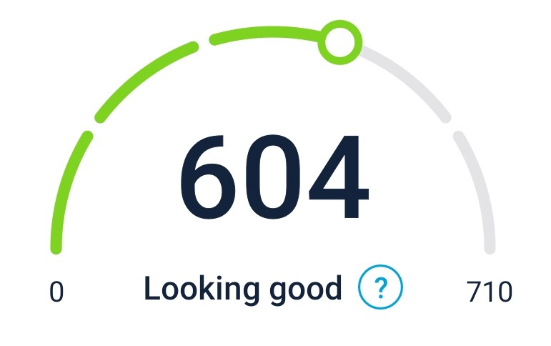
You can start to see from this why we went with the approach we did! Not that there is anything wrong with Credit Karma’s dial, but almost all of their customers will be in a small part of their dial and not see much movement when they improve their score
I agree that this is confusing… Came to the community to report it as a bug and found this thread!
I honestly don’t mind the Credit Karma one… Well I find it a lot clearer. Monzo’s looks much nicer aesthetically though.
Perhaps a dial isn’t the most appropriate way to display something which has uneven categories.
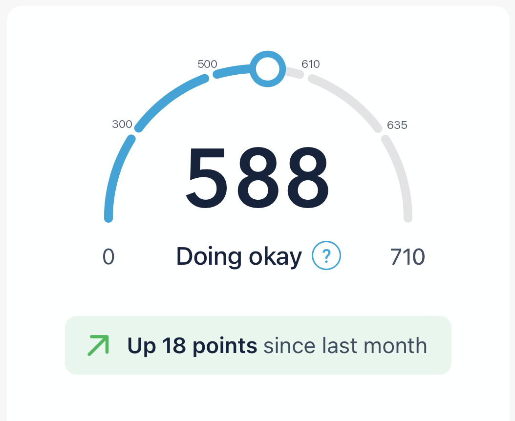
I’m also a little confused as credit karma seems to have four bands whilst monzo has five. Without any context anyway (is it actually five bands… Does the colour and description change with each segment?) it’s somewhat meaningless anyway to me.
At the moment, looking at others’ graphs Vs my own it reads to me like I have to do a lot more good stuff to increase my score up one point when it’s already high… If that makes sense? Like it’s harder to increase your score when it’s already high? Because the gap is presented as the same size as a much bigger numerical gap lower down. I’m not sure if this is the case (I get the impression it’s not) or if that description will even make sense to someone else, all I know is it’s confusing. Especially when comparing my result to say, Revels’ above - it makes me think I have a long long way to go before I can improve to that standard, as it’s a whole 1/5 of the possible score.
Similarly I found this confusing and came here to report a bug. Reading this thread has helped. Perhaps little indicators that show the value of each segment would help? I’ve no idea what the real values are so took guesses.