Reading back over my various posts, I think that three things would really make a huge difference:
a new screen for transactions (pinging @N26throwaway who’s been lobbying for this for a while)
the feed, and better search/filtering, and
a rethought Payments / social tab.
Transactions Screen
We’re talking about the screen that shows you the details of a transaction, with the map, logo and enriched name at the top.
I think the overall look is good, but I’d want to see a few tweaks:
Separate fields for faster payments references as received / sent and notes. It’s not right that canonical data appears to get overwritten.
The raw data for direct debits to be shown at the bottom of the transaction screen. (You get this on iOS but not Android).
More fields to be easily copyable to the clipboard. I’d like the ‘raw’ transaction data, the enriched name, address, logo etc to all be copyable. I come from a position that there has to be a user need not to do these things rather than do to them, but if you need one, when things go wrong, it’s useful to be able to send them to support. Not being able to copy the raw data in particular can be annoying.
Speaking of when things go wrong, it would be good to see the faster payments transaction reference (the one you need when things get lost). I’m sure that would help with support volumes too, if properly signposted in Help. I’m wondering if there’s a design tidy up where complex and rarely accessed info can be found in a sub-screen, from where they can be copied to the clipboard?
For card transactions, tapping the merchant logo opens the map; for pot transfers nothing happens; for direct debits, nothing happens. Instead, I’d love to see a merchant overview screen. That would have the full name, address and contact details for the merchant (pulled from Google), meaning you could call them, email or tweet them with one tap. I’d also love some rich information: a breakdown of number / value of transactions at this particular branch vs the brand as a whole, and a Trends-style breakdown graph of my spend at that merchant over time. Perhaps also a heat map (RIP Dozens) of transactions at that merchant?
Talking about tapping the merchant logo, I often want to go a pot’s feed from a transaction to/from that pot. I can’t do that. My thumb wants to tap the pot logo to do that. It’s open to be retrained to do it a different way, but it still wants to have a way to do it (it’s stubborn like that).
I’d like #tags to have a separate field, rather than being part of notes, and to autocomplete on Android (and the iOS version promoted out of Labs). It would be amazing to tap on a #tag and have a similar screen to the one I described for merchants - a Trends style graph of that tag over time, perhaps with the ability to combine with categories and / or other tags.
I want an option to easily send or pull the value of that transaction to/from a pot (or connected account). For example, if I receive £10.65 then I want to be able to tap into that transaction and send £10.65 directly to a pot of my choice. Conversely, if I spend £3.99, I want to tap into that transaction and pull £3.99 from a specified pot/connected account. I don’t want to type the value - I want it to just work.
I’d like the “Your [merchant] history” to be overhauled. Think of the wow factor if this became a Trends-like graph. Have it as a rolling monthly bar chart that, as you scroll, just goes back in time (infinite scroll rather than back to the beginning of the year)? Or perhaps keen the ‘number of payments’ number, but when you tap into it, give some richer stats: at the top show number of payments, average payments per month/year, average spend/payment, average spend/payment over the last 12 months, or a line graph showing how your spend with that merchant has changed over years - maybe even with a second graph showing inflation so you can see if you’re spending more/less…? Lots of imaginative possibilities here.
For faster payments, I really really need the “Number of payments” number to match the number of transactions you see when you tap the button. It searches on name, rather than sort code/account combo, which makes it pretty useless, especially when sending money to/from yourself (as you’ve the same name, obvs).
A new way to (manually) enter receipts. I’m not talking notes, I’m talking the receipts API (the thing that Flux used to feed). And being able to assign categories or splits to each line would be next level.
We desperately need a better way of updating names, locations and logos. The connected accounts version is better, but not perfect. At the top of the screen, we really need to see the current enriched data, the raw merchant name and other relevant info. And we really need a status! Tell us when it’s not been reviewed yet (in the queue), and when it’s either been accepted or rejected (if rejected reasons pls).
Show us how the transaction was made (Google/Apple Pay, card, virtual card etc) - and let us filter for that.
Finally, it would be excellent to be able to flag a transaction as either online or in person ourselves. Some online transactions show for me in weird places. I just want to flag to Monzo that it’s online and to Make it Stop.
I’m sure there’s much more, but I’m looking for creativity around data and pushing things to the next level. Some of this might be delivered a cleaner transaction screen but with pro features (receipts and FPN references etc) pushed to sub-screens. But a radical, imaginative rethink please. There’s such capacity for a wow factor and to improve usability here!
Feed / search / filters
I’d like to see either merchant logos or category logos in the feed. This isn’t cosmetic - it’s really helpful in making sure that I everything is in the right category.
Bulk editing. We definitely need this! If we can make search powerful, the ability to select all transactions then bulk change their categories (with an undo button!) or append something to their notes would be fab.
Saved filters. If the new home screen goes the way we all hope it’s going, then the master feed would be infinitely more powerful if you could create and save some filters. So I could create one for just my current accounts, one for everything with a certain tag, one for a particular location, one for online transactions etc.
A better way of scrubbing through the feed. If we get better search it’s ameliorated, but can we have a way that, when you’re scrolling down, it speeds up to allow us to go through years quickly? Or that it recognises a long scroll and gives you the option to pick from months/years? Or even just shows a scrollbar that you can use to jump down with?
The Payments tab deserves its own post. It might take some time
Another thing I don’t understand is why when I go to split a bill it isn’t easier to ask it to split in half. I’m not awful at maths but I find it annoying that I have to do the maths instead of the app doing it for me.
I’m not sure if these count as core experience, but I thought I’d ask here:
When adding connected accounts, it would be good to be able to have the option to add additional accounts from the same provider without removing the old accounts. Example: I have two Santander logins because they’re incompetent.
We really really need to be able to archive old accounts. I’m thinking of giving up a credit card, but really really need all my old transaction data in Trends. But I can’t have that if I close my account.
It would be Monzo Magical if the accounts and sort codes of connected accounts were recognised by Monzo. So we can make payments to/from those accounts easily and natively, without having to faff about looking them up on the connected account. And can we copy/paste connected account details (sort code, account number, limits etc).
I agree with your point on the archiving of old accounts. I tend to swap credit cards every few years so I can take up a new introductary offer but I don’t want to lose all the transactions in trends when I close my old credit card account.
This is going to be a bit of an inelegant info dump / list of wants, but for @Heldiney and @chloelawrence here are my views on how to improve the Payments tab.
The current tab cannot be the starting point. I’m sorry, but it’s that bad, both in terms of the visual design and functionality.
I’d boil it down to its essence - moving money. I’d define that as a) sending money between your own accounts and pots that are in Monzo (including connected accounts), b) making payments to third party accounts (e.g. paying a bill by faster payments), c) managing payments contacts and associated payment references, d) managing direct debits and standing orders (possibly - although there might be a different option - see below).
That means taking all the social features away from this tab. I think they probably work better on the Overview screen now, anyway. So if you have an outstanding bill split to pay, that should be on the main screen (but when it’s cleared you don’t see anything in its place).
For the main payments screen, do take inspiration from Starling. It’s probably the best instance of a payments screen out there.
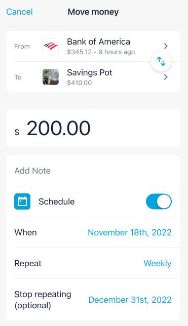
But I imagine it being something like this (liberally borrowed Monzo US):
Here, I envisage you being able to select the from a pre-defined list of all Monzo accounts and pots, and connected accounts, that are linked to your account. Or being able to tap again and select from your contacts list. Being able to tap to swap them around is v cool.
On the contacts list, I’d envisage a simpler set up than Recent/All/Monzo contacts. Perhaps you can manually pin contacts at the top? Or have Monzo do that automagically based on frequent use? If the latter, a way of removing them please. (A mate split up with his partner and wasn’t happy on seeing their face on the Recents tab for ages after - even when they weren’t recent any more). We don’t need any more than a list of all contacts and a regular payees section that Monzo can curate but that we can manually amend.
On contacts, it would be fab and a bit of gloss to be able to tap in and see some Trends-style graphs showing how much you’ve sent to that contact and when. Averages and insights would be excellent!
And, similarly, just being able to tap into contacts to see past (and upcoming) payments to/from that contact would also be fab. (Starling does this well).
When you actually send money, some AI smarts would be good. Look at my previous transactions and realise that when I spend at the work canteen at lunchtime I’m categorising that as “Lunch” and in the morning as “Breakfast”. Put the pre-filled category in the “send” screen rather than showing me another screen after the event - and let me change it if I don’t like it. Oh, and while we’re talking about categories, all in one list please, rather than me having to remember what’s a default category and what’s not.
Similarly, let me set default categories for contacts - or let me tell Monzo to ask me every time. Or if AI isn’t a go (why not, though?) let me set some rules - if I send money between X and Y time, then category A, else cat B).
And default categories for pots! Right now, savings pots are classed as savings (as are round-ups) but if I make a manual round-up to my (non-savings) round up pot, then it’s classified as Transfers. (Of course, you know, you could just let us have multiple savings pots…)
On the ‘scheduled’ tab be clearer about what are direct debits and what are standing orders - let us sort and filter for them so we can see what we want in the list. Add in the payment references underneath so my 20 payments to my savings accounts suddenly make sense - and the 2 SOs for bills to the same provider have more context. Also let us add a note to direct debit and standing orders so we know what’s what.
For the love of 'zo let us cancel recurring/variable card payments (“continuous payment authority”) in the app. If Halifax can do it, so can you!
Harmonise the scheduled tab with the look, feel and functionality of bills pots. Clarify the purpose of this tab - is it for all the scheduled transfers or just those that aren’t assigned to a pot. Make it powerful - give us calculations that show how much has gone out / is due out in the current period.
Bring those Trends smarts to direct debits, too. Let me tap into one and see a graph of spend over time.
Let us tap into standing orders to skip the next (or next few) payments.
Give us more complex (but designed elegantly so everyone just takes to them) options for sending money. Things like “on the last day of the month”, “when I get paid”, and “keep this pot topped up to £x on the 1st” are perfect.
Take inspiration from the powerful simplicity of calendar apps in setting up regular payments. And use something similar to define pay/budgeting periods, too.
Let us set up #tags and notes to be automatically added to payments out (e.g. bills) and payments in (e.g. salary).
Automatically keep bills pots funded to match the Left to Pay figure - moving money to/from the main account or between pots as necessary.
Let us merge or split contacts.
Phew. I’m sure there’s more. But please - fix the tab. I’m begging you!
I do have something else that I posted about years ago, which is being able to add a note to a bill split. It isn’t always obvious to the other person what they are actually being asked for. There is loads of space on the screen when I do a bill split so hoping that a notes box could be added!
Something minor but useful: can we have the option to hide/unhide a pot through the edit option on the pot? You can lock and archive from there, but hiding/unhiding would similarly be cool.
althoigh a better thing might be to completely reinvent this part of the app, given that the card metaphor should be going and the blue lozenges should disappear with it…
And another thing we perhaps take for granted: roundups.
It would be good to look again at whether the £1 minimum spend is sensible. Chase doesn’t have it and we’ve had a steady stream of folk on here over the years asking why their £0.34 purchase didn’t round up.
And then there are direct debits and standing orders. I’ve an IFTTT applet set up to keep my balance at a £n.00 value but it’d be good to be able to have everything rounded natively in the app.
And while we’re talking about roundups can we do something about “accelerated roundups” in Plus/Premium - which don’t actually round your balance.
Thank you so much @Peter_G, it is really helpful to see all your suggestions and I am making notes of everything. If anything else comes to mind, please do continue to share! As @AlanDoe said, we’re definitely keen to collect as much feedback on this as possible so I’ve launched a post specifically for this to understand everything that’s working and not working as much as possible
My dream would be that, during the onboarding process, Monzo ask a few simple questions that allow it to determine what you care about and what you want to see in the app. Then it can switch different widgets/sections on/off based on this. You can still go in and tweak afterwards, you just don’t get everything thrown at you at once (but you do get to see what you want to see broadly).
There’s definitely lots more crap on screens that I don’t need or use lately.
Even the plus trial thing just rubs me the wrong way.
I get advertising features, but advertise once and then let me remove it (even if it’s just a month or so).
One example for me is the “Getting started” section on the premium tab. I have no interest in using round-ups or virtual cards, and I have had Monzo Premium before so I know that these exist. There is no way that I can see to dismiss this section (which takes up most of the screen on my phone).