This is going to be a bit of an inelegant info dump / list of wants, but for @Heldiney and @chloelawrence here are my views on how to improve the Payments tab.
- The current tab cannot be the starting point. I’m sorry, but it’s that bad, both in terms of the visual design and functionality.
- I’d boil it down to its essence - moving money. I’d define that as a) sending money between your own accounts and pots that are in Monzo (including connected accounts), b) making payments to third party accounts (e.g. paying a bill by faster payments), c) managing payments contacts and associated payment references, d) managing direct debits and standing orders (possibly - although there might be a different option - see below).
- That means taking all the social features away from this tab. I think they probably work better on the Overview screen now, anyway. So if you have an outstanding bill split to pay, that should be on the main screen (but when it’s cleared you don’t see anything in its place).
- For the main payments screen, do take inspiration from Starling. It’s probably the best instance of a payments screen out there.
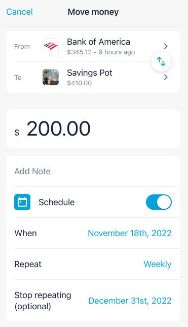
- But I imagine it being something like this (liberally borrowed Monzo US):
-
Here, I envisage you being able to select the from a pre-defined list of all Monzo accounts and pots, and connected accounts, that are linked to your account. Or being able to tap again and select from your contacts list. Being able to tap to swap them around is v cool.
-
On the contacts list, I’d envisage a simpler set up than Recent/All/Monzo contacts. Perhaps you can manually pin contacts at the top? Or have Monzo do that automagically based on frequent use? If the latter, a way of removing them please. (A mate split up with his partner and wasn’t happy on seeing their face on the Recents tab for ages after - even when they weren’t recent any more). We don’t need any more than a list of all contacts and a regular payees section that Monzo can curate but that we can manually amend.
-
On contacts, it would be fab and a bit of gloss to be able to tap in and see some Trends-style graphs showing how much you’ve sent to that contact and when. Averages and insights would be excellent!
-
And, similarly, just being able to tap into contacts to see past (and upcoming) payments to/from that contact would also be fab. (Starling does this well).
-
When you actually send money, some AI smarts would be good. Look at my previous transactions and realise that when I spend at the work canteen at lunchtime I’m categorising that as “Lunch” and in the morning as “Breakfast”. Put the pre-filled category in the “send” screen rather than showing me another screen after the event - and let me change it if I don’t like it. Oh, and while we’re talking about categories, all in one list please, rather than me having to remember what’s a default category and what’s not.
-
Similarly, let me set default categories for contacts - or let me tell Monzo to ask me every time. Or if AI isn’t a go (why not, though?) let me set some rules - if I send money between X and Y time, then category A, else cat B).
-
And default categories for pots! Right now, savings pots are classed as savings (as are round-ups) but if I make a manual round-up to my (non-savings) round up pot, then it’s classified as Transfers.
 (Of course, you know, you could just let us have multiple savings pots…)
 -
On the ‘scheduled’ tab be clearer about what are direct debits and what are standing orders - let us sort and filter for them so we can see what we want in the list. Add in the payment references underneath so my 20 payments to my savings accounts suddenly make sense - and the 2 SOs for bills to the same provider have more context. Also let us add a note to direct debit and standing orders so we know what’s what.
-
For the love of 'zo let us cancel recurring/variable card payments (“continuous payment authority”) in the app. If Halifax can do it, so can you!
-
Harmonise the scheduled tab with the look, feel and functionality of bills pots. Clarify the purpose of this tab - is it for all the scheduled transfers or just those that aren’t assigned to a pot. Make it powerful - give us calculations that show how much has gone out / is due out in the current period.
-
Bring those Trends smarts to direct debits, too. Let me tap into one and see a graph of spend over time.
-
Let us tap into standing orders to skip the next (or next few) payments.
-
Give us more complex (but designed elegantly so everyone just takes to them) options for sending money. Things like “on the last day of the month”, “when I get paid”, and “keep this pot topped up to £x on the 1st” are perfect.
-
Take inspiration from the powerful simplicity of calendar apps in setting up regular payments. And use something similar to define pay/budgeting periods, too.
-
Let us set up #tags and notes to be automatically added to payments out (e.g. bills) and payments in (e.g. salary).
-
Automatically keep bills pots funded to match the Left to Pay figure - moving money to/from the main account or between pots as necessary.
-
Let us merge or split contacts.
Phew. I’m sure there’s more. But please - fix the tab. I’m begging you!
