Update just hit on Android:
My initial impression is…
…for the love of Tom make it go away.
(I reserve the right to sleep on it though).
Update just hit on Android:
My initial impression is…
…for the love of Tom make it go away.
(I reserve the right to sleep on it though).
This was my first impression as well, I feel like just keeping it grey like it was before works well for that card, the Plus card is fine because the holographic colours doesn’t blend into the blue of the card
Ugh…
I need left to spend, balance, and my recent transactions. I don’t want a combined feed - the joint account transactions are entirely separate - and everything else is noise I’ll tune out.
That mockup has basically none of the features I want.
That’s why we was saying it needs to be heavily customisable, not one layout will suit all
I don’t think they will… customisation itself introduces loads of UI issues and I’m sure they don’t want to be supporting that. There’s been no sign of customisation so far.
to suit everyone it needs to be more than just choosing what cards show in the overview, it needs to be the ability to move the modules entirely
There are signs now ![]()
Has it always said this?
I believe it has. The ‘Edit’ pencil icon on the new Home/Overview has been at the top-right since the new Home/Overview launched in Labs, and when tapped on, the display which @Peter_G posted above is shown. At least on Android!
If you send me an email to dylanlewis@monzo.com I’ll add you
8 weeks later and not a sniff of an update. What’s the point in labs if you don’t put things in there to test?
Rome wasn’t built in a day.
Hey everyone ![]() If you haven’t seen me pop up before, I’m one of the two product designers working on the new Home screen in the App Evolution team (nice to meet you!). Apologies if we’ve seemed a little quiet as of late; we’ve been busy soaking up all the feedback we’ve been receiving and iterating, iterating, iterating.
If you haven’t seen me pop up before, I’m one of the two product designers working on the new Home screen in the App Evolution team (nice to meet you!). Apologies if we’ve seemed a little quiet as of late; we’ve been busy soaking up all the feedback we’ve been receiving and iterating, iterating, iterating.
I wanted to take some time today to show you some of the user interface and experience changes that we’re making, exploring further, and maybe a couple of further sneak peaks.
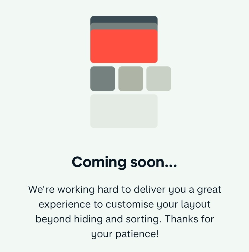
Customisation
We’re revamping how you sort your accounts and Pots. Each section will be customisable, and the ‘Edit’ screens will be available from both a core ‘Layout’ screen and their section menus on the Home screen. We’ve designed this so it’s extensible in the future to reorder the sections too (from the core ‘Layout’ screen); for example you may want to see Pots above latest activity.
Monzo accounts (personal, joint, Flex) will be able to be ‘unpinned’ so they’ll be seen with any accounts you’ve connected, and we’re working on allowing you to ‘pin’ connected accounts to the top too (this is a bit more complicated technically though!).
Pots
Talking of Pots, we understand if you’ve got quite a few of them, viewing them as a horizontal stack isn’t the optimum way of getting visibility of all your balances. Some folks really value that, so we’re gonna throw in an option to allow you to view them as a list. We’re also exploring how to split the Pot balances between personal and joint accounts.
Spotlights
In a previous post, @emmag mentioned something around ‘glanceable insights’. We call them ‘Spotlights’ and they surface key data from your Trends tab: total balances, upcoming payments, targets. Again, like accounts and Pots, these will be fully customisable (you’ll be able to turn them off altogether if you wish).
In the future we may look to extend to showing you even more here; for example, seeing helpful info when you’re abroad, like the exchange rate or your remaining ATM fee-free limit.
A couple of more things…
Hopefully you’ve noticed there’s a strong theme on personalisation – we want you to be able to configure the Home screen to be your Home screen. We’re actively working on a lot of this now, but it would be great to hear your thoughts and feedback on what I’ve shown so far! If there’s any follow up questions, I’ll do my best to answer ![]()
Before I go, I’ll leave you with a couple of extra early exploration teases (so take with a pinch of salt!): a gesture to reveal ‘Spotlights’, and a new Pot detail screen being worked on by @jayclark (he’ll follow up on this another day). In the gesture GIF, you may even spot some UI refinements we’ve been chiselling away at; there’s so much more to come!

Love love love this! Might have to turn it back on in Labs.
This all looks awesome!
I’d prefer spotlights not to be hidden behind a gesture as it’s very useful glanceable information that in your images only takes up a row.
With spotlights in play, I wouldn’t have to hop around different views in Trends as it’ll all be on my home screen to digest immediately.
Is there a timeline on this being live in the app?
All looking and sounding fantastic!
Especially the ability to pin connected accounts / unpin Monzo accounts. My joint is very unimportant for me day-to-day as it’s just a household bills account with various SOs set up to fund it, whereas my Amex is my main spending account, so this would be great.
Looking forward to the various bits appearing in-app ![]()
This looks great! When can we expect a sneak peak in Labs? ![]()
Looks cool. A few points from me:
Just my thoughts of course, others will definitely have differing ideas.
Thanks for the update. Looking forward to giving this a try.
One question that immediately comes to mind for me is if I choose to hide an element from the home screen, will I have to unhide it to access it, or will it be accessible from somewhere else? For example, I like that you are giving the ability to hide pots from the home screen. But if I can’t quickly get to another screen where I can see a full list of pots (a dedicated pots screen) I suspect the I’ll make much less use of the ability to configure the home screen.