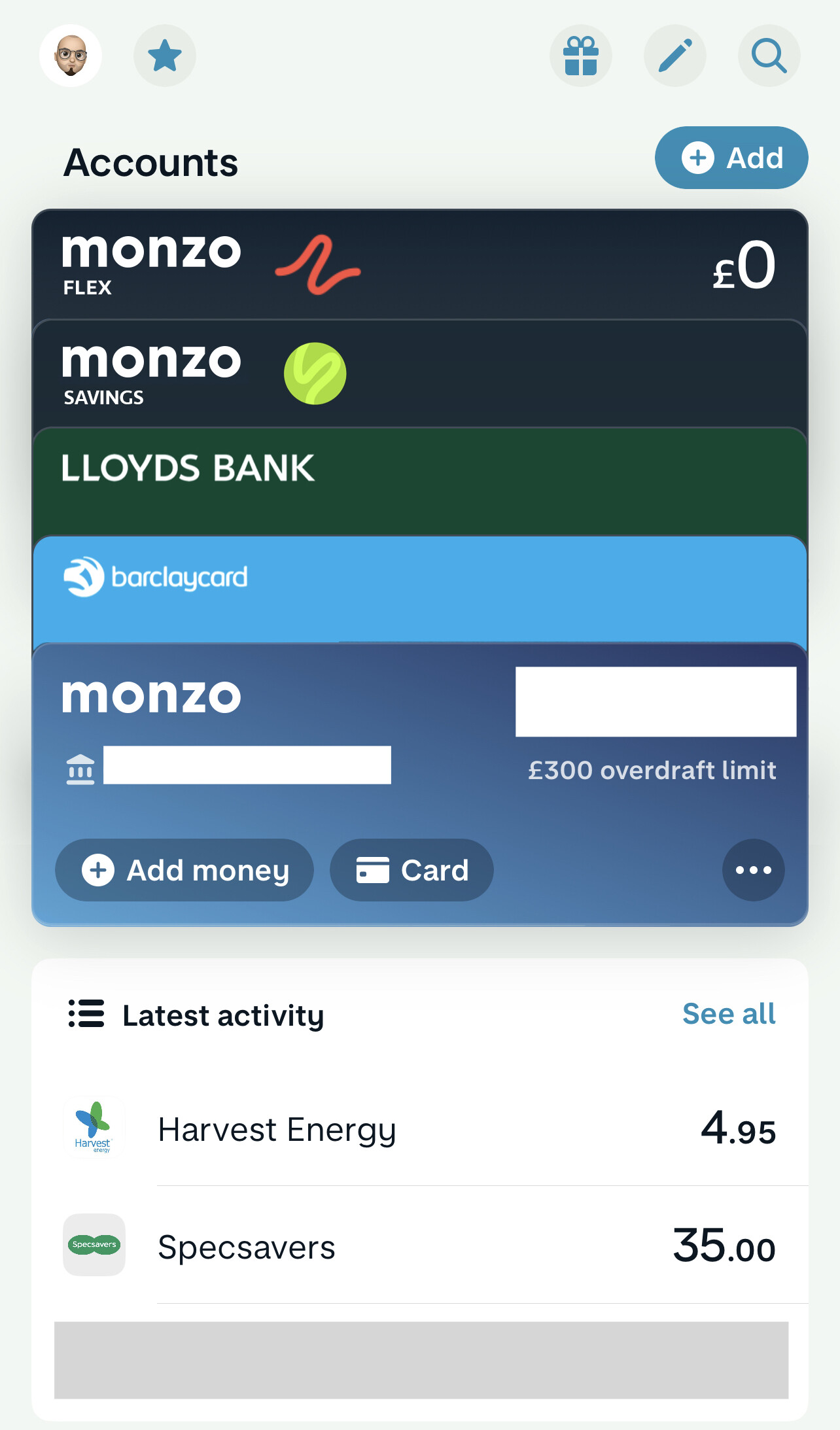
I’ve gone all in on savings pots (marketplace ones, not Monzo - they shot themselves in the foot when the One True Pot (except for a safety net) restrictions appeared).
Now my money in Monzo is spread across three banks, I find myself asking questions like:
How much do I have with each provider?
How much can I withdraw instantly versus with a delay?
What are I using each pot for?
I’m still the only person that likes the horizontal view, but I think it breaks when you can’t easily see the provider and a subtotal of how much you’ve got with them.
The more I think about this the more I wonder if the Overview screen is trying to either do too much or not enough. An idea that I mulled over was having less on the home screen, but then a new “net worth” type screen - think an evolved version of the old pull down to see all accounts gesture - as a separate tap-into thing.
I wouldn’t mind if they gave you one vertical list of accounts you could sort filter as you wish, I think most would be happy with that for home.
There is too much widget furniture and not enough information in the current draft design IMO. It needs to be pared down and made consistent rather than added to.
The speaking of the now-not-so-recent rebrand, the badges on payee contacts that have Monzo accounts still use the old logo. I think it has been forgotten about.
I think we could really do with a Notification Centre somewhere in Overview. Remember the ? I’ve just flexed something and accidentally cleared the Lock Screen notification and in the Monzo app there’s no where telling me I need to choose a plan. I appreciate I’ll get lots more notifications but I’d like a space somewhere to see this along with other notifications.
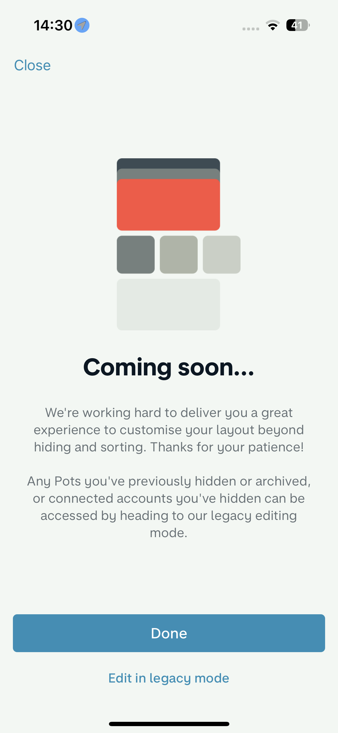
I sometimes want to edit which pots are visible/not, or maybe rearrange the order of accounts. It doesn’t matter to me whether it’s built on the new architecture or not, and given I’ve been seeing this screen for months already, I am well aware.
Would love to just click edit once and get to the edit screen.
my guess, and it is a guess, is that this is a feature fake - I’m guessing that someone in monzo is seeing how many people have clicked this to work out whether it’s worth building
Sorry in advance if that turns out to be true and the data gets skewed
We should have an update for you on customisation soon!
I can assure you it wasn’t a feature fake, we just felt that screen was necessary to explain why the order specified in the legacy screen didn’t directly map to what you see in Oveview
I think giving the option would be nice, maybe have some customization so you can choose which accounts you see at the top in the overview - to me connected accounts still feel a little disconnected from the whole user experience, they don’t feel… connected
Oh yeah deffo, opening the Monzo app and your entire screen space is taken up by all your connected accounts would be a nightmare hahaha
I mean I’ve technically added a Savings pot to it as well despite it being an area primarily for accounts, it would be nice to have those able to be displayed in the same way even tho they’re displayed literally below the activity model (which would be off screen dependent on how many overviews you set)