I’m sure this is old news, but I couldn’t find anything when I searched.
I was on the fence about whether or not to keep Plus due to limited benefit currently, but what actually tipped the balance to cancelling was that I just couldn’t stand the gross gradient they force onto the whole app when you are a Plus user.
Seems trivial but it ruined the look of dark mode for me. Is there any way to turn that off?
Purple? The gradient colour for Monzo Plus in both Light Mode and Dark Mode is a weird light blue/green colour on my iPhone? How are you getting purple?
Everything else is dark yes, but I think there is some confusion over which tier of Monzo I’m talking about. It’s the gradient for Premium that is a nice purple, not Plus.
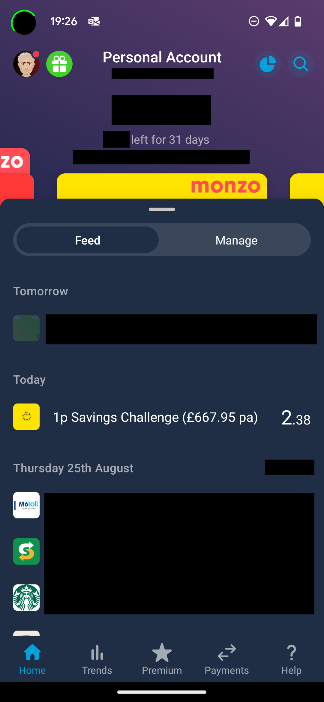
See screenshot from @davidwalton from another thread…
Unfortunately not, they give Plus tier a horrible colour to make you want to upgrade to Premium for the classy purple.
I can’t do a screenshot as I already cancelled the plan yesterday so I’m back to the plain dark blue (dark mode) now. And I cannot for the life of me find a screenshot from anyone else showing Plus and dark mode together…
That doesn’t look like Dark mode shown in the image. Are you saying that, with Plus, when Dark mode is active, the top section of the screen is still the wishy-washy colours as shown in this Monzo light-mode mock-up (and only the transactions in the lower section are shown as ‘Dark’)?:
The rest of the UI is fine, so all the bits you would expect to be dark, are dark.
But the upper section behind the card on Plus was mixed with that weird blue/green colour for me. Instead of the purple that Premium gets, and it just doesn’t look nice IMO that’s all.
I wish it was just the same… I also wish I’d taken a screenshot before I cancelled, but I didn’t think it would be so hard to find an example online! haha
There’s clearly something amiss in that screenshot. Be it app version or a mega old unsupported phone.
It’s not like that for me (and everyone else who has commented). There is no way it is intentional because you can barely see the ‘compare’ text and back arrow.
That looks great to me too. Not purple, but not because purple is any better - just that it’s more blue instead of purple. But looking great regardless.
Now I’m confused about the ‘light blue green colour’ reported by the OP - who can show that?
That’s only an example of what the OP was trying to show because they couldn’t show a screenshot of their actual Monzo Plus display (they’d cancelled Plus by then)