I personally would rather tap the card to get the card services (number and Pin reminder) and then drop the one of the (now) 4 buttons.
4 Likes
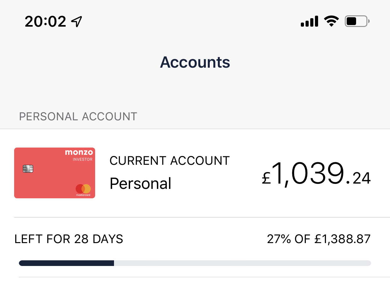
Secretly hoping this means we’re saying bye-bye to the blue pill (for account & sort code numbers). I think it’s a neat addition but should be somewhere a bit less prominent! ![]()
5 Likes
I don’t understand why that is there in the first place. It’s very 90’s ![]()
8 Likes
I hope so. It just doesn’t suit the UI.
4 Likes
Looking good. I can’t wait to try it once JAs are a go go!
1 Like
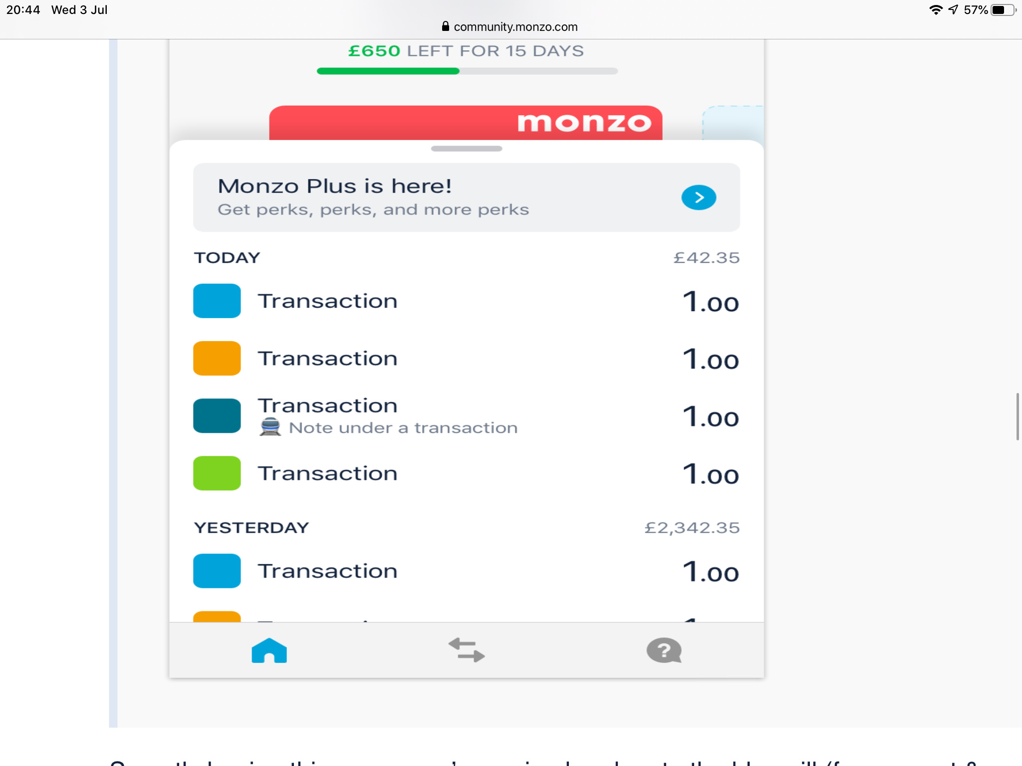
Hey, this is not a bug! We’re testing various ways of integrating budgeting with the home/accounts view; you’ll see this evolve over time but see below in this thread for a screenshot of how this will probably look soon with a colour & progress that reflects “Summary”. In general the numbers you are seeing there should match what you see in Summary

My number don’t add up to can’t work out where they come from lol
The graph is gone (that’s great!), but I really miss not being able to see my total spend for the day, this is a feature that got me to monzo and made me learn to budget.
I beg you please to add it to the new design
Maybe read a few posts up where they show off some upcoming designs 
6 Likes
Amazing. Thanks for sharing!
We seem to be looking at… an iPhone screen ![]() . Have you gone to the dark side since going full(ly employed at)Monzo?!
. Have you gone to the dark side since going full(ly employed at)Monzo?!
![]()
2 Likes
Yes! Thanks man, I love this forum so much!
1 Like
I can’t figure it out either. 🤷
1 Like
Notice the WIP in top corner… these are just screenshots 
Iosmaniac as a ring to it though
1 Like
Bugs:
- Moving money between pots, the main account balance doesn’t update until reopening the app.
Feedback:
-
When clicking the home button I’d want it to always take me back to my monzo card. Then if I’m viewing a pot or attached credit card I have a short cut home.
-
I’d also like it if when viewing other pots or attached credit cards, tapping the main monzo card takes you back to the main monzo account view.
-
The monthly wheel budget wheel is extremely useful for me but I feel it’s now hidden away. I’d like to see some of it’s information included in the home view.
General thought’s, I love the new look. It will definitely help Monzo’s goal of being a financial hub by the simplifications made. While I wasn’t a huge fan of the original graph I’d still like to see something similar and more graphs for different metrics in the future included else where.
2 Likes
I’m glad it’s not just me then 
1 Like
Hi,
Liking the new navigation, although when you click on your sort code / account number and it gives you the option to copy one or the other, a third option of ‘Copy Both’ would be beneficial.
3 Likes
Im fairly sure thats just a mockup rather than an actual UI 
is there gonna be new display for android aswell