Looks like I’m going to have to update my forum profile pic
5 Likes
The new logo looks really smart ![]() ! Love the updated branding. Well done guys, fantastic work.
! Love the updated branding. Well done guys, fantastic work.
4 Likes
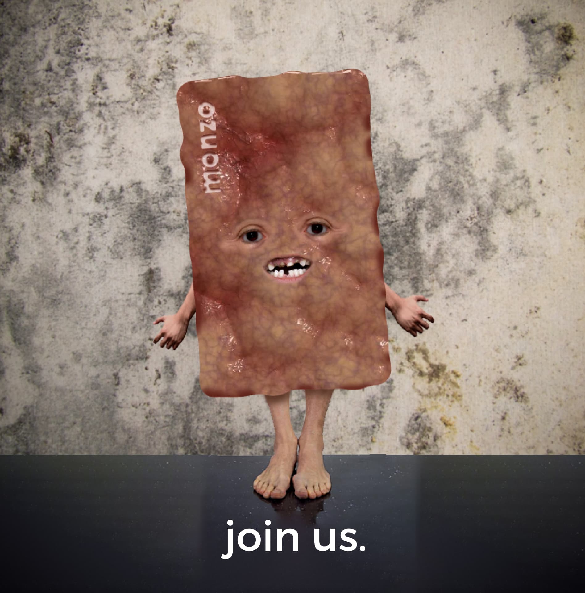
why did I just spend time exploring what a “realistic” hot chip might look like… warning this is gross and potentially inappropriate for this forum. Mods please just delete if necessary!
14 Likes
And I thought my photoshops were inappropriate! ![]()
5 Likes
Lewis, this is beautiful and don’t let anyone tell you different.
3 Likes
I can clearly see fame went to his head, poor chip is just a crackhead now
6 Likes
Some things cannot be unseen…
3 Likes
Looks like that piece of skin Zoë Wanamaker played in Doctor Who!
5 Likes
The most disturbing thing is its hands are facing the wrong way! ![]()
6 Likes
I love the rebrand, I think the pop of colour in the logo really works. When can we expect to see this go live in-app?
Be good to see how this evolves. At the moment you’ve gone back to the M on your main Twitter account, but with the wordmark on Making Monzo and the US account.
I’m still not quite bought on the distinction between the two, but keen to see the results!
4 Likes
@AlanDoe are there two templates on the forum?
There main screen looks okay now:

But tapping into individual topics still has the uncropped logo:

Question: should we update all the trust level circles to match the new colours? ![]()
Edit: while I’m on logo watch, when you go from the main Monzo website to the blog, the wordmark shifts to the right in an unelegant way. ![]()
6 Likes
I see what you mean ![]()
I’m going to see if I can bring things into alignment so it looks a lot smarter - watch this space ![]()
7 Likes
You need to look at dark mode for mobile, it’s way out an all is the logo on the main page
1 Like
Love the rebranding. The website section headings are sooooooo Fortnite-Font™ ![]()
![]()
![]()
![]()
![]()
But pleeez reduce the width of the logo .png file used for the discourse branding. Here’s one you can use (120 x 120 px):

EDIT: Just realised (thanks to an unrefreshed forum tab) that it wasn’t just the logo that formed the top-left logo image, it also included the word ‘monzo’ as part of the image. So here are the 2 identically-sized versions using the new ‘M’ logo with the word ‘monzo’ needed for both light & dark themes:


4 Likes
Apparently the M logo and the Monzo wordmarque are no longer used together.
1 Like
If that’s the case, here’s a correctly-sized new ‘M’ logo, based on the sizing of the old ‘M + monzo’ logo:

2 Likes
Is the background navy the right shade?
(I think we’re gonna need a full copy of the brand guidelines).
1 Like
It’s a PNG file with a transparent background (only ‘M’ logo shows)
But a background may show dependent on what app/browser you view it with.
(I’m in agreement though - future mock-ups require those brand guidelines sharpish)
1 Like
Ah I meant the blue banner that the transparent PNG sits on top of. I think that’s specifiable in Discourse.
Actually, here’s a whole plan of action:
- Change the navy blue banner to match whatever the current brand colour is.
- Change the four trust levels to match the shards of the Monzo logo.
- If possible, change the category colours to the colours of the Monzo shards, the sub categories to the extra brand colours.
- Introduce :monzo2022: so we can use the new logo on here.
- Explain why we’re using the logotype on the forum and the wordmark on the main website to my satisfaction

Jobs a good’un and my invoice will be in the post. ![]()
4 Likes