Genuinely interested to understand how the colours support accessibility. Could you go into more detail how?
2 Likes
Thanks @Lewis_P ![]()
We have an enormous library of illustrations that we’ve populated over the years that get used in the app experience, on emails and on the website. We’re in the process of updating everything to the bright and bouncy new style. We’re shaking off the debris of the ‘Corporate Memphis’ illustration era and being more direct, more fun and bringing more energy into everything. Ola, the artist behind our new illustrations has given us something pretty unique to work with.
Here’s one of my faves so far which represents ‘something’s gone wrong’

7 Likes
For some reason, all I can think of is First Direct whenever I see these. That’s the only other bank I’ve seen use graphics instead of pictures when I see this ![]()
Saying that, kudos. I love it, and hope more banks start to follow suit.
2 Likes
If anyone is interested, here’s a side-by-side of the old and the new icon.
- We’re saying goodbye to beige-yellow

- Each colour shard has been dialled up in vibrancy to reflect the new colour palette
- The navy background is our new, deeper navy

- We’ve added some subtle depth behind the top two shards
- We’ve corrected some of the geometry so that it’s more balanced (hard vs soft corners)
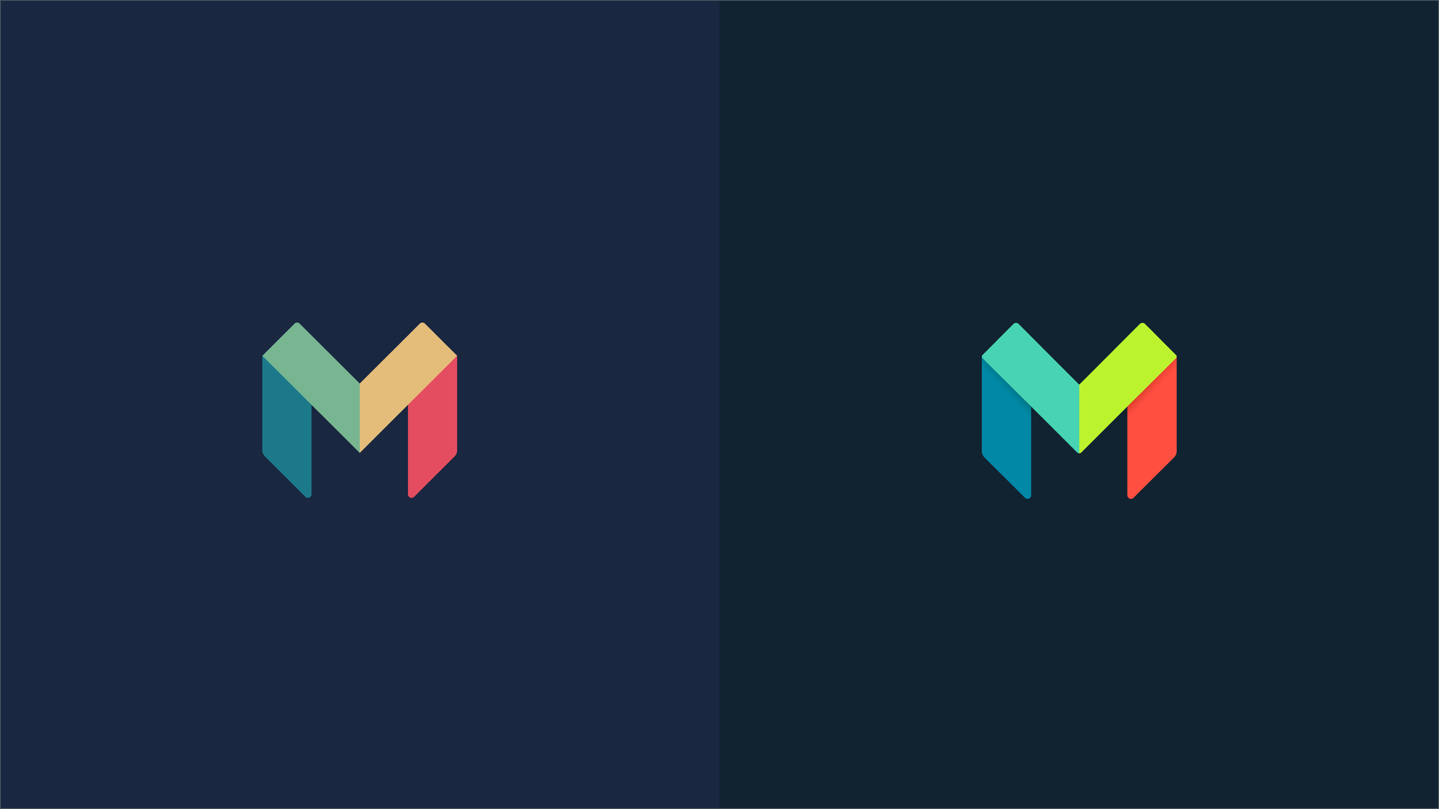
27 Likes
I totally agree with this view!
I do miss the yellow and am not so sure about green in the logo instead. It will probably grow on me over time though.
Edited to add:
As so often, @N26throwaway describes my attitude to it better than I can myself!
3 Likes
I like it except the green. Why was the orange colour changed? The green is just a smidge too bright.
4 Likes
yeah I stand by my original point that that neon yellow/green looks really out of place next to the other 3 colours. Eyes go straight to it, feels like it clashes with the colours on either side
3 Likes
For a while, it was actually going to be ![]() BRIGHTER
BRIGHTER ![]() – believe it or not – as our new colour code for Neon Yellow is #C3FF34 . We’ve since optimised each colour on the icon so it doesn’t feel too off-balance. What you see today might take some adjusting to get used to! But hopefully it will grow on you
– believe it or not – as our new colour code for Neon Yellow is #C3FF34 . We’ve since optimised each colour on the icon so it doesn’t feel too off-balance. What you see today might take some adjusting to get used to! But hopefully it will grow on you ![]()
The orange – do you mean hot coral? The digital representation of hot coral has been strengthened to be closer to our fluorescent hot coral cards, although, we can never have a complete match with the physical card. It’s impossibly bright ![]()
7 Likes
Yes it varies widely between dull salmon and neon orange, very rarely Hot Coral.
2 Likes
FWIW in my opinion, the beige yellow looks better than the bright green. The green is OK, it just appears so much brighter than the rest of the M.
3 Likes
![]() Interesting! Might be time to update your card? If anything our cards have gotten brighter (they used to be a slightly pinkier salmon tone, now super fluero). I’ve had recent feedback from our card manufacturers that they wear shades when they produce our cards, as the ink is the brightest tone they work with
Interesting! Might be time to update your card? If anything our cards have gotten brighter (they used to be a slightly pinkier salmon tone, now super fluero). I’ve had recent feedback from our card manufacturers that they wear shades when they produce our cards, as the ink is the brightest tone they work with ![]()
5 Likes
Awesome, I’m definitely not opposed to that style. That illustration is great, its playful and fun. In hindsight I probably shouldn’t have likened it to clipart as that does it a disservice; It more that it feels like it lives in a slightly different universe to the exaggerated bold UI illustrations. Perhaps in motion, or in other contexts it makes all fits together. Looking forward to seeing more ![]()

12 Likes
Brilliant ![]()
3 Likes
Hot Chip 4 eva!
5 Likes
Ready your protective eyewear with your next hot coral order ![]()
3 Likes
Was just about to post this, was looking thinking that’s driving me mad already
2 Likes
Love the colour and so cute !!!
1 Like
It’s half fixed now, not sure if it’s my cache or @AlanDoe on the wonk ![]()
4 Likes
It’s been fixed but there’s some mad caching going on and it jumps about.
2 Likes
Great question!
Our style guide provides options for pairings of colours with the best possible contrast to use. Not all of them look good or have high enough contrast, but the chosen combos test well for WCAG standards ![]()
5 Likes