
We worked with Ragged Edge, who helped shape the refresh into what you see today.
It all started with very thorough discovery and concept phases to draw out who we are and what we want our brand to convey.

Colour
We’re the bank with the hot coral card, that much is true – and it’s what helps keep us distinctive. But it’s more than that.
Hot coral represents our warmth, our empathy and our human quality. So we’ve made it the forefront of our brand, followed closely by deep navy and soft white. We now have a vibrant range of secondary colours to support our primaries, carefully selected to maximise accessibility and to provide extra bursts of energy when the feeling is right.
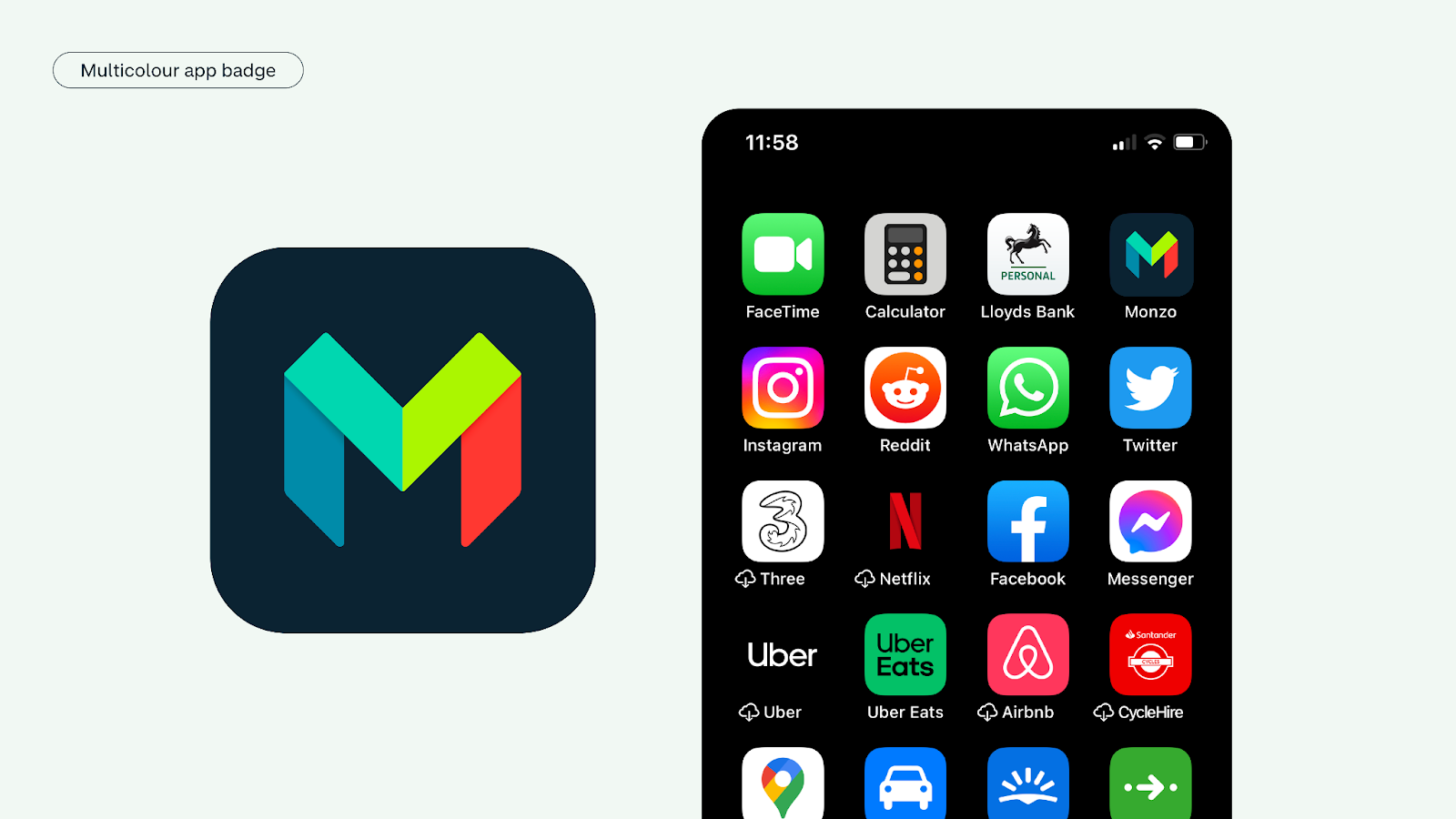
App icon
The Monzo M has always been the recognisable front door to our product, our website and our social channels. So we’re keeping it but giving it a glow-up to better reflect our vibrant new colours.