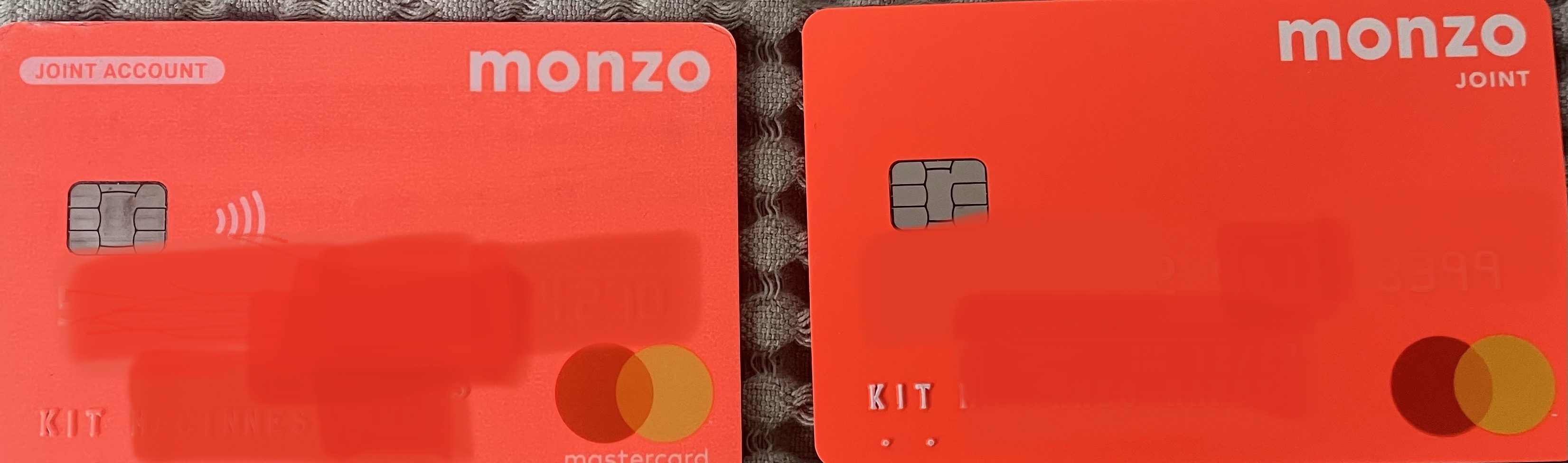
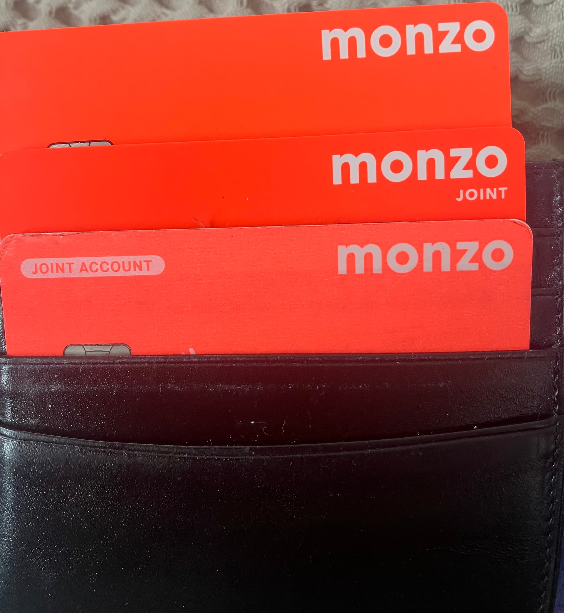
Feeding back that the new joint card design is a backwards step. Since both joint and normal accounts still have the same coloured cards, moving the “joint” wording from top left to under the Monzo header makes it even harder to differentiate, especially when stored in a wallet as the word joint will be blocked by most selves and therefore require removal to see what card is which. See photos.

11 Likes
This isn’t good at all!
Did this get zero UX testing?
5 Likes
Oh yeah that’s annoying, the box in the top left is handy for me looking at my wallet too
2 Likes
Hi Kit - welcome to the forum ![]()
Monzo is going with a new consistent design, with cards having their account type (excluding Personal accounts it seems) in capitals underneath the ‘monzo’ in the top-right. This has been seen in-app in the new home screen, although ‘monzo’ and account type are at the top-left in the new Home display and a reveal of the as-yet-unreleased physical Flex card shows an in-app card image which has ‘monzo’ & ‘FLEX’ in the top-right.
I agree that it’s bad for the physical wallet, thankfully my Personal account card is an entirely different colour.
Out of curiosity - if you’ve activated your new card, has the in-app image of the card updated to the ‘2022’ version? Like:

4 Likes
This looks pretty much like the design for the US joint account beta. I know that team is thinking about design and better ways of telling them apart - here’s one idea:
@AlanDoe is there anyone on the UK side who can tell us whether folk are also looking again at joint account designs this side of the Atlantic? (If it’s no, it’s probably still good to know!)
3 Likes
Not good, just more confusing than old design in my opinion.
The in app card has updated to the new physical design
1 Like
All in all, what a stupid decision. As @Revels says, it looks like this had zero thought put into practicality of the design.
1 Like
Looks good I hope it’s a permanent fixed in stone rollout for the design.
Agree. The new design isn’t the best!
“Well if you sign up for Plus you can get a new different card colour!” – Some Product Manager out there, possibly.
Agree this is annoying - I had a similar problem with the old design actually - my wallet is vertically oriented, so I can just see “ZO” on the top of each card.
I used to just put the joint card in upside down so at least there was a visible difference in the two.
2 Likes
I really like that inverse design
1 Like
Nice, isn’t it?! And very congruent with the new branding, too.
1 Like
I think its spot on for what they need, you could argue they could use the navy from their updated colour palette for the card along with the white text, but I think keeping that coral colour in is important
2 Likes
I like it.
It will work better in card holders/wallets with vertical card slots.
Recently received a new joint account card and the design has changed. It’s now exactly the same colour as the personal account card. It used to be a shade different. And the ‘joint account’ wording has moved sides and is not in such a prominent font.
This makes it super difficult to differentiate between the two cards when in a hurry! Any chance you can change it back?
1 Like
I agree there was no problem with the joint account label/pill in the top left that needed solving. I found it extremely useful knowing at a glance which card was which.
I have an almost identical photo of my wallet with the same issue! Same colour, same labelling peeking out.
Ignore the tatty state of my wallet!
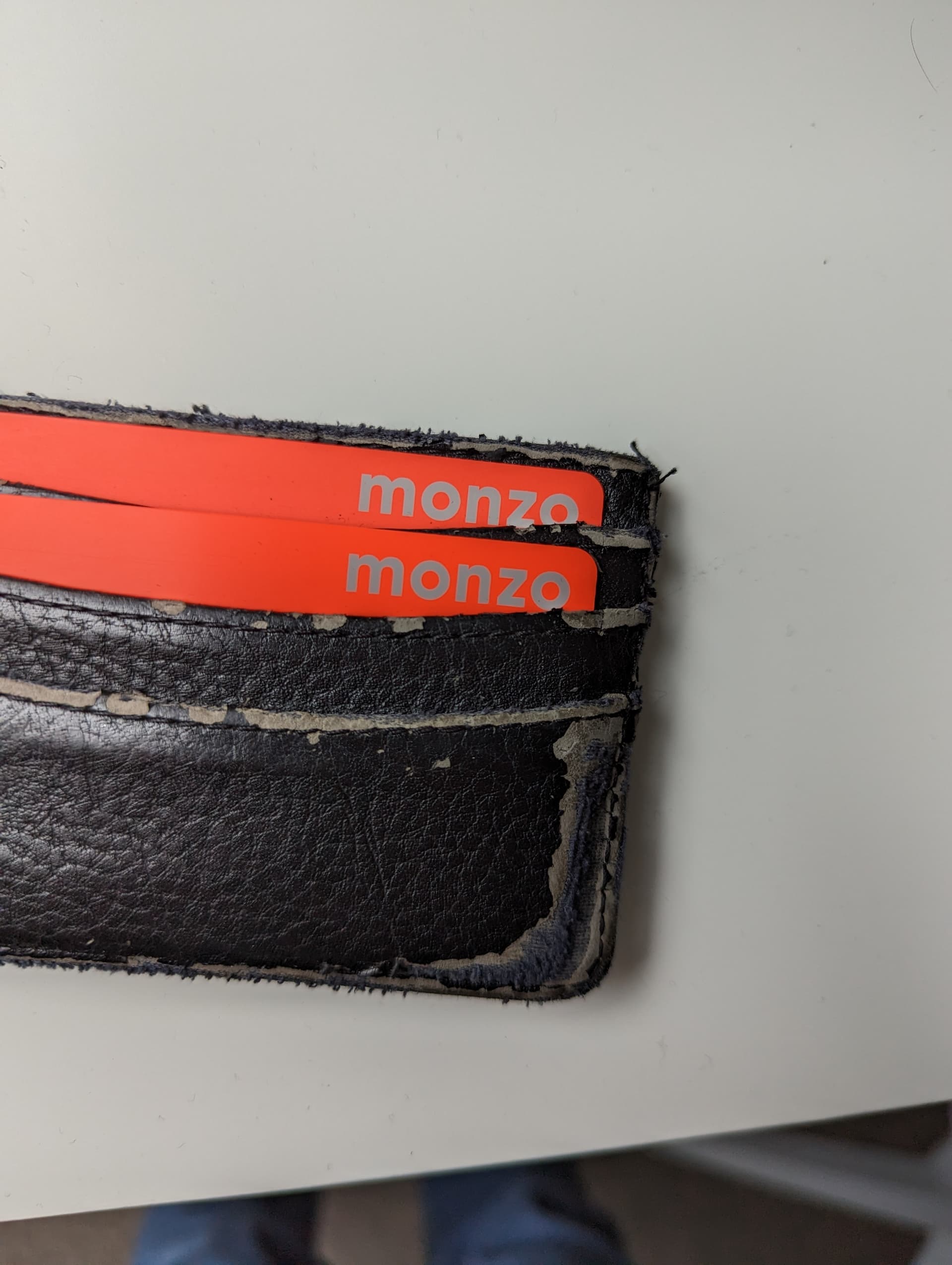
Time for a new vertical wallet then you’ll be able to see the differences ![]()