Exactly - there are some really awesome features, but what drew me to Monzo originally was how advanced it was as an app-only bank. Now legacy banks like RBS have caught up for the most part so Monzo feels like almost the same thing (apart from not having any physical banks you can use).
I was expecting them to be developing new features at a rate to outpace the old banks.
Also the icon thing isn’t just for the default icon - I normally use the plus icon so they really need to do it for all of the additional ones.
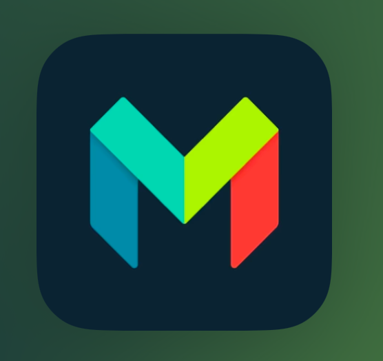
I know the Monzo dark icon is practically dark already. However, along side other dark icons it looks out of place. Tinted icons also look odd with the Monzo app. I understand this will be a low priority but the system does half of the leg work for you (working with some iOS apps myself). For instance:
I’m gonna keep posting here until Monzo does something - it’s not just the stock app icon, the plus icon looks awful as it’s a bright blue and doesn’t work on dark mode.
If I did that for all the apps I have that don’t have dark icons I would fairly thin out my first page. Then there are the icons that are sudo dark like google photos which does have a dark icon but it’s just basically a background that’s dark and the icons colours are just as bright. I won’t mention the discourse app which is white…. Even apples own settings app doesn’t have dark icons in it (18.2 it will) and their TestFlight app is the same icon.
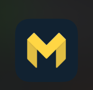
My monzo icon is the investor one and it’s darker than the google photos app icon which has a iOS 18 icon.
My kids haven’t even mentioned the fact rooster has no dark icon and they are of the age where I would expect it to be a big deal. For them it’s just an icon.
I guess you don’t use the discourse app then, it is by far the brightest icon in my first page.
The icons matters least for an app as it’s how the app is to use not the button I hit to run it that affects my choice as the icon won’t make the app any better to use but then again in iOS 17 there were people who would sit and redo all their icons using shortcuts app to launch to get a custom dashboard although I never met a single soul who did that.
Looking above monzo just needs to switch out the very dark blue with a gradient black and its done, just like the google photos icon. That’s all chase did although they would have stood out far more being a white background icon unlike the monzo dark blue.