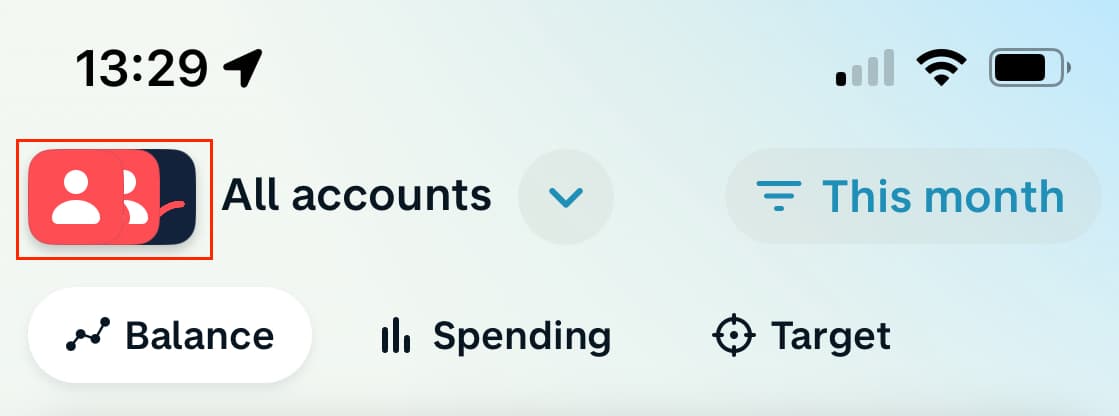
I’ve just started using a Joint account and have noticed that that icons used for Joint and Personal accounts are pretty inconsistent throughout the app, resulting in some confusion.
The Move money screen is what it probably should be, and has icons that match the cards (white on coral for Personal, and coral on white for Joint)
But in the Activity feed, white on coral icons are used for both:
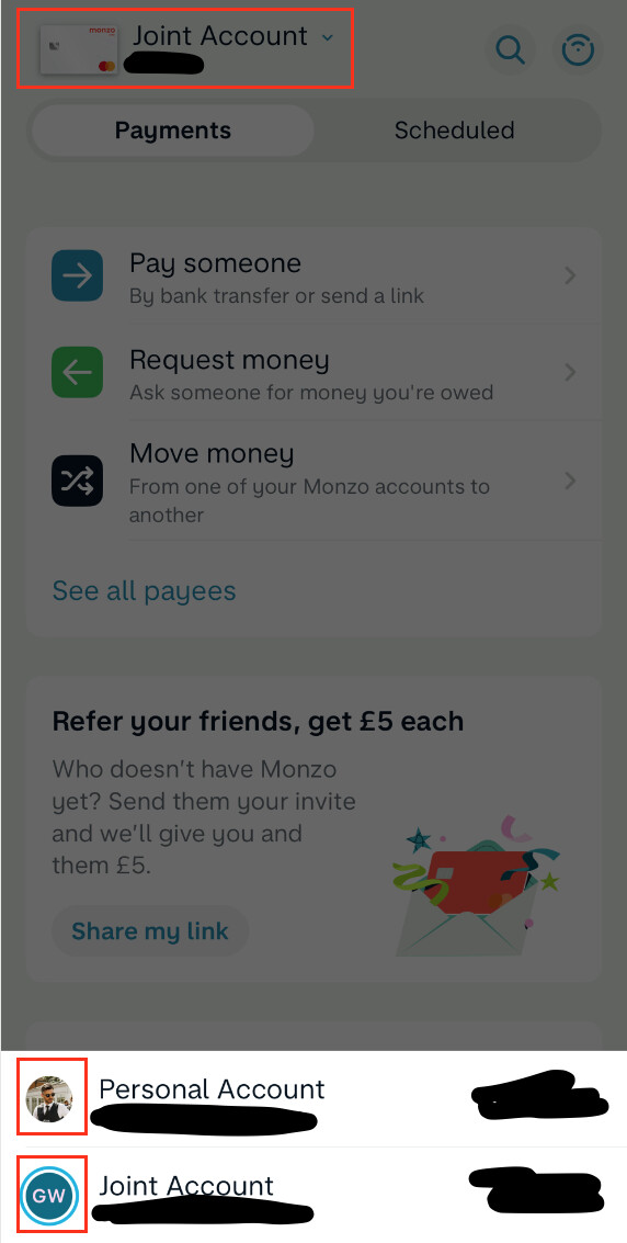
Then finally on the Payments screen, they use the card image at the top. But when you click on it to select an account, the drawer at the bottom then uses the user images
Looks like your on iOS. I’m on Android and the colouring appears to be consistant for me. Showing Coral on White for Joint, and Burnt Coral for Personal (as I have Max).
I wonder if this is an iOS app only issue, or a caching issue local to your device?
If you unstall the app, reboot, and then reinstall the app to fully clear the cache, do the same inconsistancies appear?
It’s as-expected on Android - correct colours/shading throughout, except for the Payments screen (which doesn’t follow the rest of the app design and needs updating anyway) - the cards are shown at the bottom instead of the user images.
I get the coral on white for Joint, and silver on white for Personal (as I have Premium). So perhaps the Premium icon has also fallen out of date given they no longer support it.
I’m not going to uninstall the app for an icon change in any case. Not important enough.