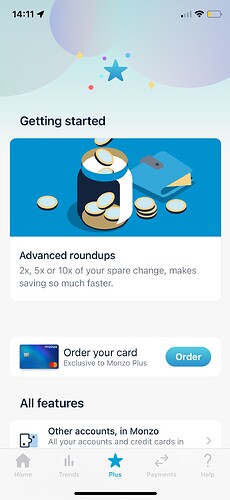
The whole tab needs an overhaul
Yep agreed. I am a bit disappointed that the tab hasn’t evolved at all yet (especially being a paid product). Things in general seem to be moving forward the last few months though so I have hope 

+1 for letting people disable this. Such a simple fix.
I misread that at first and thought you were saying it had been fixed 

Just because it’s a simple idea, doesn’t mean it’s simple to do.
I didn’t say “simple idea”, I said “simple fix”. And I would be absolutely astounded if it was more than:
- An if statement
- A flag in a datastore
I know what you said. I was pointing out that saying it’s a simple fix, doesn’t mean it’s true.
And then what? What replaces it? It’s not as simple as “Don’t show this”
This is a good read
As usual with Monzo nothing ever gets finished.
I preferred Plus version 1 to this Plus version 2 - as at least I had some more interest and a cool blue card.
Still no unique offers, advanced round ups make no sense, virtual cards still feel unfinished, nothing much else of value as
I don’t use categories at all.
I feel like I’m paying for Plus just to support Monzo - I’ll give it until the end of the year but it just seems a bit pointless.
You said the same thing almost a year ago… ![]()
Oh no it’s different this time, they’ve got until the end of the year to change things up now 
I think a bit of my frustration with the “getting started” screen is that I feel like it should have been designed from the start to either disappear after x amount of time or be dismissible (just like the custom pot image alignment tool for the iOS app which was built with a square shaped alignment tool even though pot images are rectangular).
I know it’s easy for me to say that, and there’s only x amount of hours in the day/only so much that can be done before you launch something. And the same constraints happen down the line for resources to tidying things up.
It just feels like it’s not working for it’s supposed function and so it should be fixed - no one could be defined as “getting started” a year after signing up to a (paid) product. As time goes on I get more annoyed each time I see it ![]() - which I know is unreasonable of me as in the grand scheme of things it’s obviously such a minor inconvenience. Also the fact that it truncates the explanation, but when you click on it expecting to find out more it doesn’t even show you more information, just makes it feel so pointless
- which I know is unreasonable of me as in the grand scheme of things it’s obviously such a minor inconvenience. Also the fact that it truncates the explanation, but when you click on it expecting to find out more it doesn’t even show you more information, just makes it feel so pointless ![]() .
.
It’s not exactly a power user feature to avoid having the same irrelevant dialogue shoved at you every time though is it?
I offered some thoughts on the Plus/Premium tab a year or so ago:
I can’t say that my thoughts have changed - because the tab hasn’t changed!
I can live with not liking consistent design choices, but the confused approach and different ways of working breaks it for me.
And, to the specific matter at hand, I’m never gonna go for advanced roundups (because they don’t round anything, they’re just a savings accelerator) so I’d quite like to stop being faced with them, please!
I guess the (obvious) utility is to constantly remind people what they’re paying for.
If we accept that as true, the question has to be utility to whom? The obvious answer is to Monzo, which means they’ve kinda got their priorities round the wrong way.
That doesn’t mean I don’t want them to make a profit, just that I want then to do it by aligning with the user…
Yes, I specifically meant that it was a bad trade-off. Better to make a better user interface; better to just have a button somewhere to remind people what they get with plus; the list is like part useful (details of virtual cards, …), part impotent reminders (“Remember we give you free withdrawals”, …), and part just annoying stuff (“Offers!!!11”).
Thought there would be a thread for this.
I’ve turned off my round ups as am having a bit of a lean month or two and wanted to save the hassle of repeatedly withdrawing from my coin jar.
I’ve also never ordered the holographic card simply because I like the coral.
The screen is incredibly annoying now. These should obviously be dismissible - it’s just bad design.
On the card point as well, I’ve had a new coral card (due to expiry) since getting plus. My card now doesn’t expire for years. I clearly have no interest in ordering a blue one.
At least you can see the end of the sentence on yours lol. I’d been wondering what it said! I’ve got a 12 Pro normal size, do you have a Max phone?
I don’t actually, I’m on a XS! So my screen’s smaller than yours lol…
Hmm that’s unexpected lol… wonder why that could be?

