First Direct’s latest design. This bank seems to be losing its way with its identity, slowly.
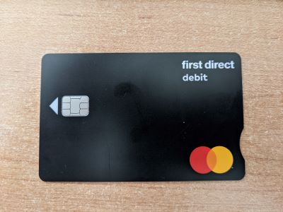
First Direct’s latest design. This bank seems to be losing its way with its identity, slowly.
Oh no! That couldn’t be more uninspiring if they tried! I don’t know if I’m in the majority, but I rather liked their brutalist card design.
They seem to be having a bit of an identity crisis at the moment to be honest. I’m not quite sure what’s going on with their new logo, but it seems like they’ve tried to soften the brutalist sans-serif text with a strange swirly thing and have ended up with this mishmash…

That card just really doesn’t like right. It looks too empty and the MasterCard logo is quite distracting with it being the only colour on it. I’m also confused with the arrow. No other card I’ve seen has an arrow and people have managed perfectly well so far.
Curious why the arrow now, surely people know the insert it chip side by now
Thought we’d moved away from these times
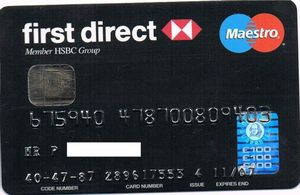
Remember cheque guarantee cards?!
They were used on cheque guarantee cards, for those of us who are old enough to remember them. If the shop wrote your card number on the back of the cheque it was a guarantee that the cheque wouldn’t bounce. Debit cards doubled as cheque guarantee cards. With some banks you only got a £50 guarantee, though, not £100. Back in the 70s it was only £30.
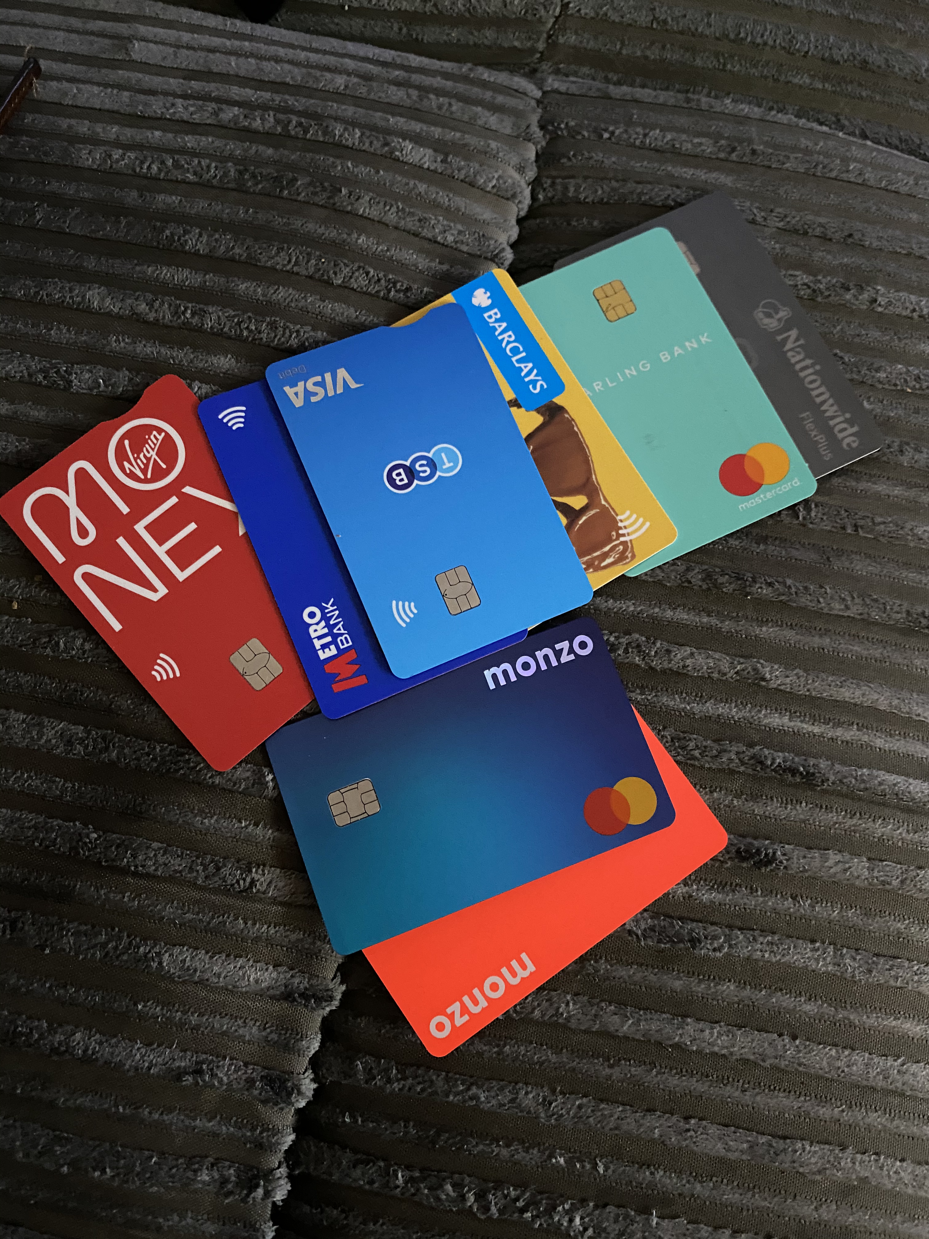
Anyone stumbled across this before, amazing collection of Cards, including my fav of a London 2012 Lloyds TSB debit card
I did put an answer further above, but for me personally I find my phone to be the most accessible way to pay. I don’t have to worry about cash, I don’t have to try and see PIN terminals and, with my fingerprint, it doesn’t have a limit.
However when I have used my cards the notch has helped. Not just the notch though, it’s more of an added benefit to an overall more accessible card. I would use the long sides to orient the card, then the notch to know which smaller side is the bottom. The raised numbers are also an easy way to locate the face of the card. A mixture of solutions is always the best, that way if one doesn’t work you have a backup 
I quite like the simplicity of it but I agree it’s odd that it lacks their new logo, and that their branding does seem pretty poor and inconsistent now
Ugh I hate the fingerprint logo. I think it’ll be gone in a year.
The card is very dull.
(A bit like first direct.)
I think I speak for everyone when I say that this doesn’t look pleasant at all  . I actually rate the old card with the sideways writing more
I hated the sideways writing; it always looked silly to me, so the new card is an improvement in that respect.
I quite like minimalist designs so I actually don’t think this is terrible. But it does look like little thought has gone into it. The placement of the logo seems to be too close to the right hand side. And why have the word debit on it? And if it has to be there, why’s it practically the same size as the logo?
Agreed (with the first paragraph, not necessarily the second which appeared later!)
Take Dozens Black for an example of how to do it properly.
It looks like one of the white bits out of the HBSC logo. Little nod to the connection?
Or maybe the designer (if you can call them that) thought the card was very lop-sided with the two logos on the right, and that a design element was needed on the left to balance them out.
Ahh the London 2012 Lloyds TSB debit card was the first bank card I properly used!
I did have an RBS revolve account before that though (but in those days the pocket money was spent and wasn’t put into my bank account  )
)
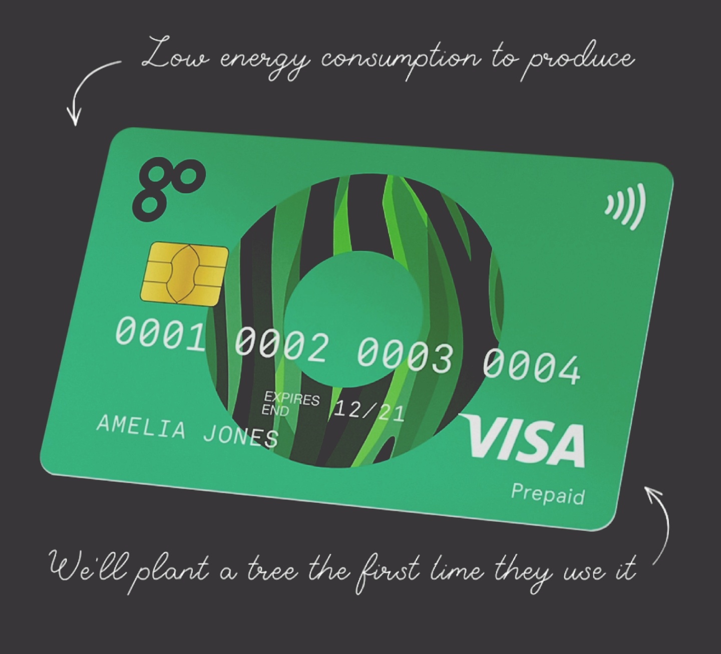
I’d never really looked before, but Go Henry have some beautiful cards. This one is excellent (and I’d be very happy with it):
That is actually a really good design. Less boring than many of the current debit cards are.