While this is true, as soon as you choose an account or a pot it will take you to that transaction list in the carousel. Once you are there, the same things that I’ve quoted above apply - you always return to your current account in the carousel when you press the Home button.
Also, if you’re on the Home Screen and kill the app, the next time you open it, it opens at your current account feed in the carousel and you stay there until you select your profile at the top left (which has a small Settings icon on it).
Reading this conversation go back and forth, it would be hilarious if Monzo were testing slightly different versions with customers without telling them
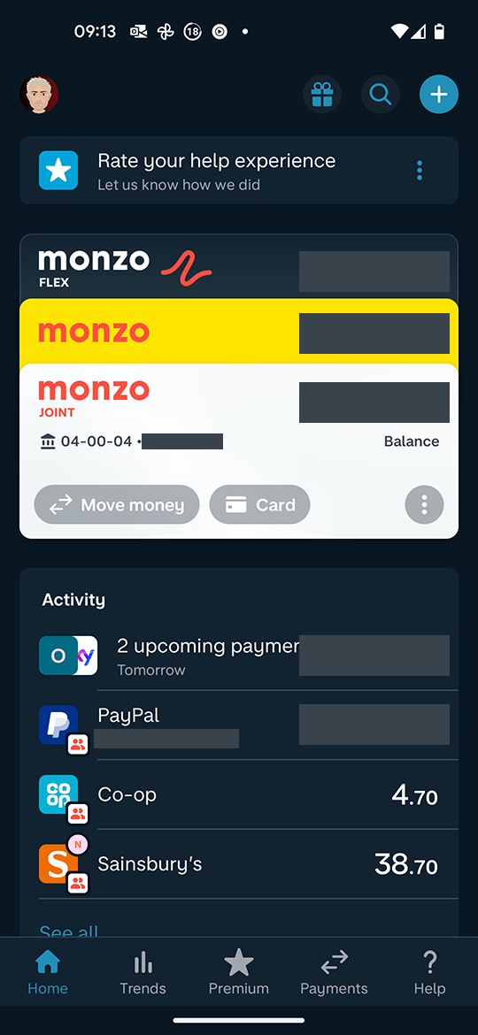
So, there is no homepage. There’s the screen the app loads onto (which you have screen captured) and where the “home” button will take you. Depending on where you are in the app. It mostly takes you to the accounts list, but occasionally the carousel.
This is moot anyway since this eventually will be retired and the new “landing page” with the account cards at the top and the customisable sections below will be what people see when opening the app.
Keep feeding ideas back but accept that there are alternative realities out there.
1 Like
davidwalton
(Award Winning Hot Coral Analyst)
1348
I really don’t think there’s a need for ad hominem comments here. Can we all just accept that different versions of what the home button do exist out there and eventually this will be not a thing anyway since the new layout will have rolled out?
EDIT: Not the post about what the plus/premium star does, that appeared while I was typing!
I didn’t see @SkyBlue 's last post because it has already been flagged and hidden, and you’re quite right - there’s no need for that. But what they’re saying is actually correct - you do always go back to the carousel unless you have explicitly opened the screen with the list of accounts and pots, then you always go back to that one. If you choose a pot or account from that screen, though, you’re taken back to the carousel (and will always return there when you press the Home button).
Anyway, I’ve switched back to the new layout now as I actually prefer it and, as we’ve said, the old one is not coming back.
This was my point all along, depending on where you are, what you’re doing and what you looked at last, the home button takes you somewhere else. Which is one of the things Monzo are striving to change.
1 Like
davidwalton
(Award Winning Hot Coral Analyst)
1355
I’ve read - and re-read - this thread and I’m genuinely lost at what the issue is.
I have access to 2 home screens - current and new. Access to the new screen to test it is via Monzo Labs. We all know the current (‘original v2’) Home screen will become the old screen and eventually be deprecated, in terms of how it is initially displayed.
If there’s this much discussion (which honestly is getting boring) over where the home page sits in terms of the old UI, maybe that’s exactly why it needed changing.
There’s no discussion of what the ‘home’ page is on the new UI, because it’s obvious and easy to understand.
Either and then add reddit on the end, so I get the result from a person and not some blog post where someone spends the first 300 words talking about their family!
There has been a significant amount of activity on this thread from people expressing preferences for
a) the old carousel layout and/or
b) the per-account focus of Summary over the more all-encompassing scope of Trends, as well as the way info from Summary is utilised in the UI.
Whilst I do think we have gone beyond the point where Monzo would consider ditching the new home feed layout or ditching the wider scope of Trends, I suspect they could still elect to retain the carousel view (in the way it is currently still available via tapping a card on the new home feed) and could potentially bring more of the features and UI elements of Summary across to Trends. So I think it is important that people who prefer those older features/layouts should be able to express those preferences without being made to feel there’s no point in doing so.