When I first turned on the ‘new personal accounts view’ in labs, it did as the video above does with one tap to get to each account. As of today, it’s gone back to two taps which is worse in my opinion.
There is a bug / glitch with the display of credit cards that have the credit limit is known. The cards show “£xxxxx available” under the balance on the home page, but that information is not shown after clicking on the card …
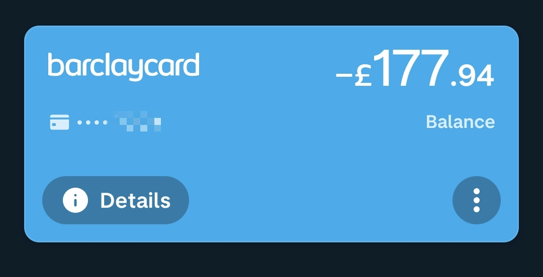
Home Page

Card Page
2 Likes
Same issue for me actually (Android)
(Natwest credit card)
Can confirm I get the same behaviour. Android with 5.50.0 and a Barclaycard too.
Good spot! We’ve added it to the list ![]()
2 Likes
I’ve had to go back to the old views as I’m fed up of the biometric unlock prompts… ![]()
Hopefully it’ll be sorted soon as I really like the new screens. The app is feeling a lot more cohesive with them.
The two things that stand out now IMO are the Plus Tab which has little purpose and the Payments tab which is a hot mess!
Updated to Android 5.51.1 beta. The animation to load up the external accounts is much quicker and smoother now which so great.
Still have the issue with asking for biometrics though.
I wish I could still swipe between accounts though. 2 taps to change accounts now.
2 Likes
Hmm… A carousel containing only accounts, like the pots carousel … That’s a thought…
Yeah, exactly like that
Hi, I’ve got a transaction on my Starling feed via connected accounts that shows as ‘Pending’ from August.
On the actual Starling app it shows as ‘Declined’.
Is this right, wrong, left?
Edit: a little bit of further information. It was never pending. It was a declined transaction due to insufficient funds.
The ‘Evolution’ of the layout is making the app progressively worse to use.
As an absolute minimum there should be a choice to keep the old layout for those that want to.
It reeks of change for the sake of change, it’s pointless. Particularly when you are removing choice from users.
This is never ever going to happen.
2 Likes
Not trying to inject any controversy, but I came to quite dislike the carousel, so not sad to see it go
Some way to move between those pages as a shortcut would be nice
I can’t say for certain but if you disconnect and reconnect the account and it is still there then I would expect that Starling is telling us that there is a pending item rather than it being a bug on our side. It’s unfortunate but the external account features depend mostly on the information that other banks provide which isn’t always the best!
Could anyone that was having the repeated biometric prompt issue when using the new account screens be able to try again and let me know if it still does it repeatedly? ![]()
5 Likes
I’ve tried reproducing it this morning and it seems to be fixed for me. I’ll keep trying throughout the day.
1 Like
Yep, seems to be fixed for me too ![]()
1 Like
First time opening the app this morning. Checked both connected accounts and no biometric prompt at all. ![]() Thanks for fixing so quickly as it was really starting to annoy me… haha
Thanks for fixing so quickly as it was really starting to annoy me… haha
Looks to be fixed for me now… not had a single prompt in the last hour or so. Cheers
Overall, I like the consistency. After using it for a week, there are two things that I’ve run into:
-
I scroll down looking for a historic transaction and hit the bottom of the list which is only just over a week ago. I have to tap
See allto bring up another sheet which puts me back at the top of my transaction list. I have to scroll back down to where I was and then continue on to find my transaction. And when I’m done I have to tap twoXbuttons to get home.I find the whole interaction a hassle – I loved how smooth getting to an old transaction was previously. Tap into my account, scroll until I get to me date I’m looking for. Is there a reason for this new behaviour? I find it ruins what was a key selling point from the beginning of Monzo – I open the app and can quickly scroll through my transactions. The awkwardness of this new behaviour has made me realise how often I’m using the app to look back at an old transaction!
-
I think the
Manage accountbutton should be promoted from the…menu to sit on the card itself alongsideMove moneyandCard. This one isn’t as big of an issue for me, but it does make me stop and think any time I need to access account details or do some other management activity. It’s just too important to bury in a submenu.
Thanks for engaging on here, and keep up the great work! I do like the design direction the app is taking, so I hope you can keep it quick and smooth. ![]()
6 Likes