You have a different idea of customer support to me, so I suspect that this could go on forever.
Over and out. ![]()
You have a different idea of customer support to me, so I suspect that this could go on forever.
Over and out. ![]()
Sooooo…
Thoughts on the version rolled out to Monzonauts? ![]()
I’m hoping that this gets perfected, then the card carousel nuked…
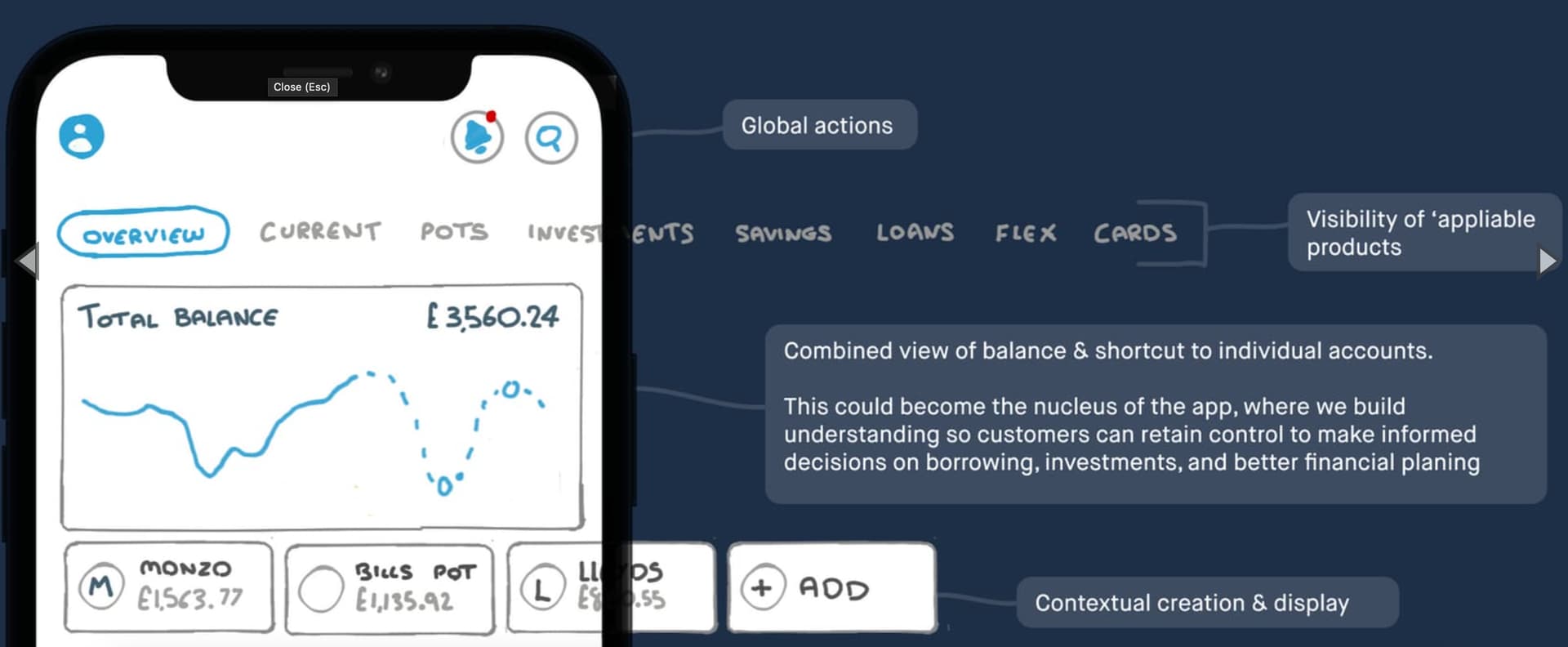
Actually, an idle thought: it would be cool if the account/pot selector was common and persisted across the top of all tabs:
Looks good. Overall judgement reserved for when I can experience the UI & UX for myself tho ![]()
Yeah pretty difficult to judge from a static picture.
Is @AlanDoe making a sneaky $8 on the side?!
How do you add money to the account?
Overall, I prefer it to the current version.
Wow!
I love prototype C. This would be amazing to see eventually rolled out to customers!
I’m coming back to this because I think I slightly love the original sketch:
What’s so good? I’m glad you asked:
How would I evolve it?
Basically, I prefer this to any of the subsequent designs!
![]()
![]()
Just replying to myself with two thoughts:
Graphs
The pulse graph as displayed only works for the current month and for discretionary / ‘safe to’ spend. So really belongs on the ‘current’
The overview tab could do with a graph, but that should really be over an extended time period, plotting debt and wealth (and potentially assets) to show how your net worth is changing over time (and, hopefully, improving).
The tab titles
So let’s bank that I’m a fan of the top tabs. But they’re not quite right. At the moment, they’re structured around financial products, rather than how people use them. For example, there needs (imo) to be a tab where people can track their monthly discretionary spend. That would mean combining credit cards (for day-to-day spend that is paid off monthly) and the Monzo current account excluding pots (that needs a better name btw). That’s logically separate from a 0% card I’m paying off over 24 months which really needs to go with loans.
So, more flexibility needed to work around the customer’s financial life, rather than a bank-view of the product set.
I’ve spent a while thinking about what would suit me personally, and it’s difficult …
I currently have personal, joint and flex accounts along with 9 connected accounts , 9 personal pots, 4 joint pots and 5 virtual cards , so using the carousel is a non-starter, and the current overview screen isn’t much better as I have to hunt for whatever it is I am looking for.
Trying to accommodate all of the above on a single overview screen is overwhelming.
In my mind the overview would be just that, an overview of my financial position showing a trend graph and latest transactions across all accounts, along with individual tiles for personal / joint / flex / connected accounts. Note that I see Flex as a separate account whereas I see pots as a feature of my Monzo account.
To keep things clean I think everything else under “Do more with Monzo” like creating pots, adding money, applying for loans and overdrafts culd be re-homed in the Monzo account view and/or the account shortcuts menu (as shown in v1 screenshots). An alternative here could be to drop the “Plus” tab and replacing it with an action tab as a home for all these additional options.
FWIW @26throwaway 's mock up is closest to my ideal overview
Yeah, it really should have this discretionary / mandatory spending split as a first-class aspect of the app. In fact, you could arguably split the entire app this way and have two quite different sets of tools for interacting with them; envelope budgeting for discretionary, and perhaps better deals suggestions for the mandatory. But, alas, the main way you interact with the app is… a rather useless feed of transactions. it’s the Wrong Abstraction.
As with @davidwalton I’d want to see and use it before passing judgement but initial thoughts are:
Nice Job Monzo, this UI might help tempt me back one day…
Totally agree on “add money”. As someone who has their salary paid in to Monzo, that action is completely useless for me ![]() . We’re thinking about this right now!
. We’re thinking about this right now!
Overall, pretty positive! It depends a quite bit on the customer and their expectations/how they think about money though.
For example, we tested with Monzo and non-Monzo customers. Something I found quite interesting in the prototype A testing was how folks who use more traditional banks reacted really strongly to anything ‘social’ in their app.
The prototype had something like this if you scrolled down to the bottom of the screen:
Whilst Monzo customers tended to react really well and think it seemed really convenient and useful, a couple of non-Monzo customers found it borderline offensive to see people there ![]() . Perhaps this is partly because it’s a prototype and therefore these aren’t people they know. A lot of it we thought though came down to their expectations - if they’re not used to paying people back from their banking app, it certainly feels foreign to have faces in there.
. Perhaps this is partly because it’s a prototype and therefore these aren’t people they know. A lot of it we thought though came down to their expectations - if they’re not used to paying people back from their banking app, it certainly feels foreign to have faces in there.
If I’ve learned anything in my 6 years at Monzo, it’s how personal and individual money is to people. It’s so interesting!
This is such a great topic. Personalisation and customisation in general has been a really consistent theme throughout the discovery and concept process. As mentioned by others in the community, there is a lot to balance and think about, so we certainly are not ruling anything out at this stage as we continue to learn through the iterations we release.
What I would say is that based on the insights @emmag has shared in this post, the design of the interface and engineering approach to the infrastructure of this screen is very intentional in terms of having super solid foundations that allow for better personalisation and enabling a far more personalised experience with Monzo.
Through future iterations (and by having both staff and the community use these builds on a daily basis), we’ll uncover more insight of and the foundations we’re putting in place now will enable us to do so.
For transparency, with hiding loans as an example, some questions on our mind include:
In summary… lots to think through, well defined defaults need to be put in place, and by engaging with customers I’m really confident we’re moving in a direction that means better visibility, control, and personalisation for all ![]()
This is important to me. I don’t need to see all my pots, savings, non-used accounts (but with a balance I want reflected in Trends), loans, Flex etc every time I log in. I log in frequently and usually it’s solely for my main account balance and transactions.
Almost everything else can be hidden but with easy access for the few times I am doing a full financial overview (which is generally once a month).
I think, for me, I’d prefer a level of abstraction away from products. I’m not so fussed with individual savings accounts, for example, as what I’m using them for.
To take an example:
Of course, lots of folk won’t work that way. But I think I’d want that later of abstraction on top of my accounts first, then fall back to an account view if I’ve not set up my goals, spending plans etc.
@Peter_G, this is great to hear and along the lines of something we’ve been concept testing too as v1 evolves.
Glanceable insights that make sense of all the things you have in Monzo (Pots, Accounts, Bills, Goals etc). Essentially, creating a financial picture and surfacing the information that you are potentially spending time manually working out currently.
Done well, at a glance you’d understand how things are going, and create clarity on what needs your attention / where you may need to dig deeper given a certain situation. And again, this would be tailored to whats important for you.
We’ll bring that as a topic for the community for sure!
Love the sound of this, and the engagement here on the forum.
Why stop at Monzo accounts?! I want my financial life there. So manual accounts please, as well as all the connected ones. (Then, because I’m greedy, mortgages, loans, investments elsewhere!)
Be still my beating (hot coral) heart! ![]()
Couldn’t agree more, Peter! Accounts outside of Monzo are very much part of this vision, you’ll see more on that soon! ![]()
A key thing will be enabling enough control over what feeds the data (without overcomplicating the experience). You could connect an account but not want it to feed in to combined balance for example, and thats fine. But control is key here to ensure the numbers and insights make sense for people individually!