Useful uses for Monzo Plus Live Data Export? Share your tips!

Hiya,

I’ve just signed up for Monzo plus and the auto data export to a Google Sheet function is really cool. I feel like there’s a really great opportunity to do some really visual graphs on spends each month, to make Monzo data even more useful - however, I completely lack the excel skills! Has anybody already looked into this and made a template? I’m going to start my own and see how I get on, but it would be interesting to know what others are doing with this live data and what formulas you’re using.

A bit nerdy, but it feels like an extremely powerful budgeting tool! (I’ve never understood why I can’t see weekly spending for example in Monzo in a pie chart, instead of just monthly spend totals).

I’ll let you know how I get on, but please share what you’re up to with it!

10 Likes

I really don’t understand Google Sheets. I’ve always used office in previous jobs and so I’d love any hints and tips!

7 Likes

My understanding is that reporting / budgeting is due to get an overhaul at some point. There was talk a while ago about it being a separate project with a team working on it but not sure if it is still going ahead or not.

2 Likes

Ok, so a bit of googling got me this first attempt, and it’s much better than I was expecting!

I added another sheet to the Google Sheet that Monzo creates for you and left the transaction list untouched. The transaction sheet updates around 10 seconds after an update in your Monzo app which is very cool. You can see the totals for each of my chosen categories (including some new Monzo Plus custom ones) which I got by using the formula below in Google Sheets:

=sumifs(‘Monzo Transactions’!H:H,‘Monzo Transactions’!G:G,“Entertainment”,‘Monzo Transactions’!B:B,“>=”&DATE(2020,6,29),‘Monzo Transactions’!B:B,“<=”&EOMONTH(TODAY(),0))

I’ve used the custom Date 2020,6,29 (29th June) as this was the last time I was paid. I haven’t worked out a way to not have to change this manually each month yet, any ideas? The formula automatically uses the end of the month date thanks to the final part of the formula, so there’s no issue there for now, but again, if you wanted it to be payday to payday you would need to change &EOMONTH(TODAY(),0 to the day before your next payday - so for me &DATE(2020,7,28)

I just copied this formula next to each of the category headings and changed ‘Entertainment’ in the formula, to ‘Bills’ or ‘Groceries’ depending what I needed the total for since 29 June. (I might try and work out my total ever spending percentages across all categories since 2017 to give myself a real scare!)

If anyone is interested in using this for a simple month to month graph (so 1st to end date of each month), then use this formula instead. It will then auto update as you get new transactions and reset every month automatically:

=sumifs(‘Monzo Transactions’!H:H,‘Monzo Transactions’!G:G,“Entertainment”,‘Monzo Transactions’!B:B,“>=”&EOMONTH(TODAY(),-1)+1,‘Monzo Transactions’!B:B,“<=”&EOMONTH(TODAY(),0))

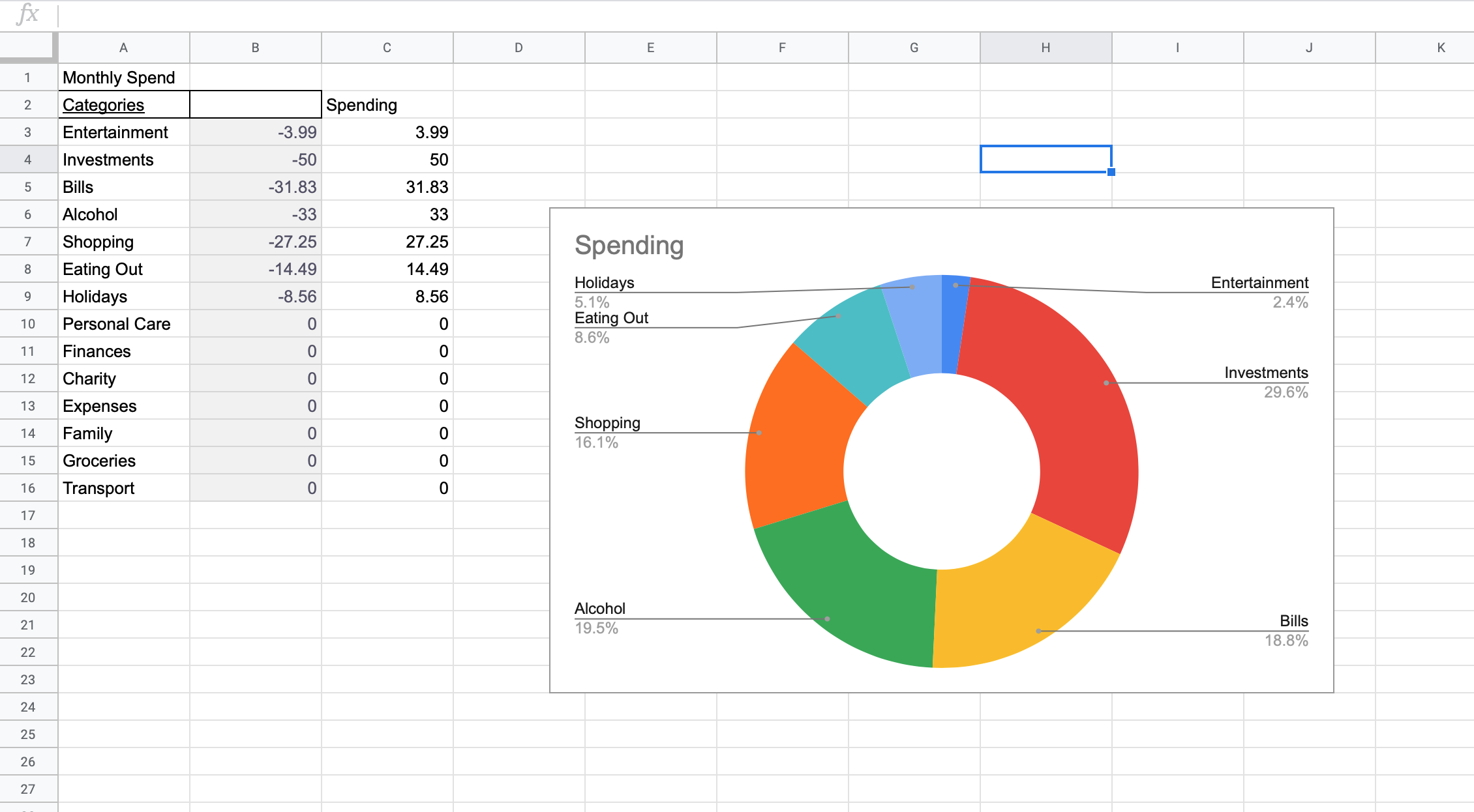
You have to convert your totals into a positive number if you want to make a graph. I used the formula =ABS(B3) etc, with B3 being the value of your spend for that category. I used column A and C to create the graph. If you have any positive numbers in your column (for example, that category actually PAID you), then it will probably mess it all ups a bit, so try and exclude them, or recategorise them into a category where you’ll still get a negative number. Or convert them to a negative number in column C somehow (maybe manually?) Mine is showing percentages, but I’m sure you could get it to show the actual values too, or any other bar, line charts etc etc.

Hopefully this is useful for someone using the new Monzo Plus feature and if you have any tips or improvements please let me know! I would love to make this fully automated and incredibly useful. I’m going to keep playing around anyway.

P.S. I get paid into Monzo, but use a Joint Account and a Credit card hence the very low values in the example screenshot! I also excluded all my general bank transfers out or into my Monzo account by not including the ‘General’ category.

9 Likes

You could have a table of your pay dates and then the last day and have your sumif look up the dates.

I also add an additional column in the input sheet that tells which pay period it is, so I can compare month to month.

1 Like

This would be great. It would be particularly cool if they could also allow you to categorise transactions from other connected accounts.

Also if instead of writing “entertainment” in your formula, just point it to that cell and drag it down. Not only will it be quicker, it makes it more future proof too if you add more.

2 Likes

Microsoft 365 subscription in the US effectively offers this feature (Yet to come to the UK).

This is interesting, I’m trying to work out how exactly that would work. Would there be a way to make it look at a certain set of pay dates depending on the month? In my mind this still involves updating the formula to look at different pay dates every month, but I’m not sure I’ve fully understood either

I’m going to have a proper look at this very soon, when I can actually work out how I want this data to be structured for me… But some initial use cases for me:

  • A set of category based searches that look at Category x Month in a table (INDEX/MATCH) to look at my monthly spending habits (and plotted).
  • Same, but for Merchant.
  • Integration with an IFTTT trigger - “When Cell is Updated do X”… With a few calculations to do things like… Sweep my leftover balance on PayDay, or top up a Pot when it runs low, etc.
  • Track my average balance similar to the Pulse graph, but including Pots too.
  • Calculate a “burn rate”, or, how long, my current balance could maintain my average spending for.

Etc.

2 Likes

I would set up a table

P1 - 1/1/20 - 27/1/20
P2 - 28/2/20 - 29/3/20
etc etc

Then where you have the categories, I’d have P1 P2 etc across the top.

Then you can sumif cat, your pay dates etc.

I’ll post some more with some formula screenshots of how I have mine in the morning if it will help.

That would be really helpful, thank you. I’ve already updated the categories in my formula to refer to a cell rather than typing out the category which makes a lot more sense

It all depends what you want to see really, but if the data is there, you can pick it out.

1 Like

For info;

On my Monzo Transactions Google Sheet, I have created two tabs:

  • Main (Regular monthly costs eg. direct debits): This is so I can look at a quarterly view and compare it annually to see what areas are getting too expensive
  • Spending (Budgeted spending each month eg. Eating Out): This is so I can see what I spend my money on each month and whether it returns the perceived value to me in whatever way.

With the custom categories I can now automatically pull these dashboards without having to input it manually, all I have to do is tag transactions in Monzo.

The ones which denote a Monzo category have the :label: emoji.

12 Likes

Really cool. Thanks for sharing.

I’ve created a template that will allow you to have the following graphs;
Balance comparisons for the past three months (including personal acc., joint acc. and combined):
image
Joint account balance comparisons for the past three years:
image
All time balance split by personal and joint (inc. pots):


Spending breakdown per month, split by category:
image

And a few others. More details including a tutorial on how to set it up can be found in my other post here:

2 Likes

I’ve had some success using the ‘workday’ formula. Which you can use to calculate the last working day of the previous month, then do a count to today’s date to see how many days its been since your last payday then sum the values for that many days back in time. It gets complicated if you want to factor in bank holidays but its doable with a separate lookup table of bank holiday dates. Also breaks for the days between pay day and the end of the month. Check out the template I mentioned in my comment above for an example of using this formula.

Just multiply the figure by -1 instead. So the formula would be;

=if(B3=0,0,B3*-1)

This checks whether the value in B3 is zero, if it is it remains zero, otherwise it multiplies B3 by -1
You really want to avoid having to manipulate the raw data to get the analysis you want.

You could streamline this by swapping ‘Entertainment’ to a cell reference that contains the word Entertainment e.g. A3 in your table. This is a more versatile approach that means that if you ever want to sum a new custom category, you can use the same formula and add a new row for that new category.

Do you always want your search to run Actual Pay Day to Actual Pay Day (vs, say, 29th of each month?)… And is your company name always consistent in your feed? If so…

You need a Helper column on a reference sheet, but if you use the Formula FILTER, you can search for “Company Name”, and return each date that you match it.

In cell M2 (or wherever, just adjust formula) enter:

=FILTER('Monzo Transactions'!B:B,'Monzo Transactions'!E:E=M1)

And enter your company name in cell M1, and this should return all the dates where Company Name appears.

You can then use that list to be your end of Month date in your other columns.

1 Like

Same here, and that would be my biggest advice for starting out

That way you can be sure that the source data is left intact, will not get broken by experimentation and will continue to update as expected

Having linked across the columns I need, in the order I want them, to another sheet I can then tinker to my heart’s content

Thus far I have been working on counting and sorting my merchants, which has dredged up a fair few historic merchant data sins to work on

1 Like