Just a heads up v2.53 has just come out this afternoon on Android at least and the feed seems to be broken, I’ve posted about it here V2.53 Feed issue
Latest update is broken home tab. I uninstalled and reinstalled app which has not fixed this but it was weird because App went to old layout and phone screen kept flashing. I had to kill the app from recent a few times and now it’s back on new layout but feed is still broken.
1 Like

https://unofficialmonzo.slack.com/archives/CFBTV6YBB/p1561049987198800
Looks like it’s on its way out to us 
How do you get access to the unofficial slack channel?
2 Likes
I’ve just gotten another update 
Ermmm…I think you just join it. I can’t remember 
See what happens following this link.
An update 2.53.1 has fixed the previously reported issue but feed pinned to bottom as posted above.
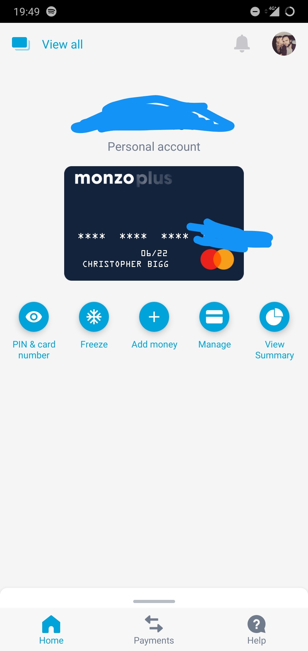
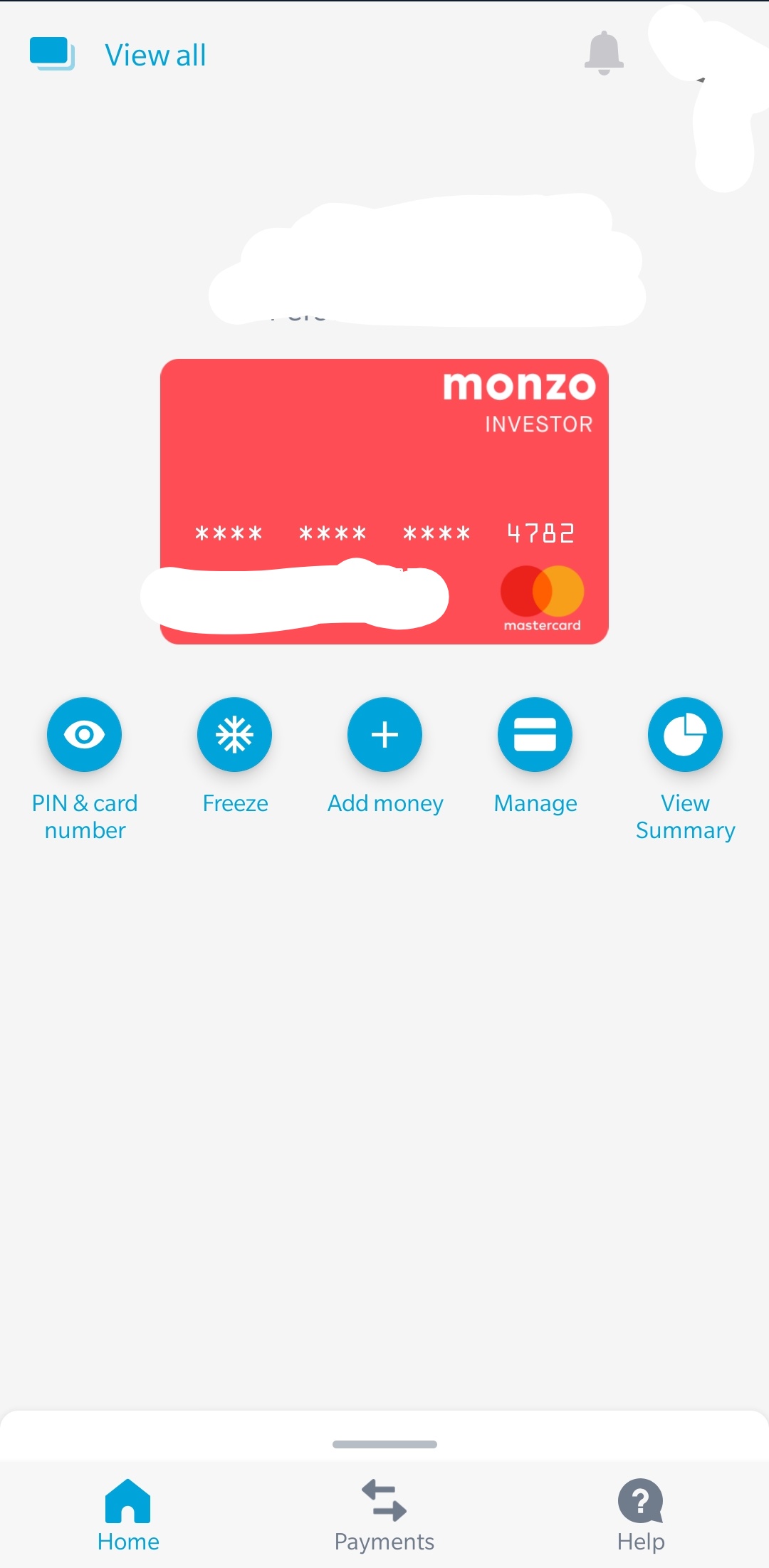
Summary has a new button and it’s becoming but silly IMO they have removed the tabs at the bottom and have created ‘tabs’ under the card 
Has the Summary bar now gone from the home tab now there’s that new blue Summary button?
Yes 

1 Like
Oh that’s a shame. I use Summary to budget and having the bar really helps visually see where you’re at. Feels like Monzo wants to get rid of it completely but for now they’re hiding it away
1 Like
Mine is the same, I can’t get back to the new layout 
Anyone got an explanation for why the summary has moved? Where are they heading with this?
I’m not a fan of this new layout. It’s like tab city.
I preferred the last iteration over this one. I didn’t even realise the feed was pinned at the bottom, I thought they’d disabled it due to it not working!
5 Likes
Left and righthand buttons partly off edge of screen. Spacing between all buttons needs reducing so all fully on screen. This update has the feeling of a very rushed job. Inquest needed.
Scrap the Add Money button, its pointless. At least put it somewhere else.
1 Like