I think the grey background on the icon is more appealing.
2 Likes
I must have missed the Investment Pot thread/info.  Or, is this the first sighting?
2 Likes
It’s still well hidden so not ready for launch yet
1 Like
As @Rat_au_van said, it’s the first sighting in the wild and it’s very well hidden ![]() (requiring access to the API to even begin accessing it)
(requiring access to the API to even begin accessing it) ![]()
As for investment pots, the hint has been in the code for a while now… But nothing is user-accessible (likely a feature flag controlled by Monzo ![]() )
)
8 Likes
If you’re on the beta channel… Tap on your pots! 
There’s a new feature 
10 Likes


1 Like
Means the rest of us plebs should see this next week if there are no hitches before then 
Still no sign of custom pot images though, honestly thought theyd be in place by now 
Yep  The feature flag has been switched
  So once you’re on the latest version it should just appear
Having played with this feature for a few days now, I don’t think they’ll find anything wrong with it  It seems solid to me
I’m fairly sure custom pot images have been unofficially confirmed  there have been mock-ups with custom image selection, etc. I think it requires a bit more work from Monzo than just an upload button though
  I’m sure plenty of thought needs to go into dealing with inappropriate images being uploaded, storage constraints, etc. It’ll be here before we know it - I’m sure
1 Like
I’m not seeing anything new and I’m definitely on the latest beta
Yeah seen the leaked images myself last month and thought they were maybe they were being held off to go live alongside the rest of these pots changes but like you say im sure they wont be long
In saying that just seen the other thread on this and it still uses the mockups with custom images so who knows lol
1 Like
Custom pot images definitely appear to be a thing in this newly created mockup : Pots Details
2 Likes
Definitely no change showing for me. Still nothing when you view any pots
Ah hang on I’ve just restarted the app and it’s now showing!
5 Likes
I like the new pots overview page! It’s just the right amount of detail.
There’s a few things that could be better - for example pressing on the scheduled payment could take you to it.
Also it now makes the Account page look a little clunky as the pots summary page has nice rounded borders around the image compared to how the pots look on Android.
Changes coming soon ![]()
![]()
3 Likes
Version 2.31.0  More details to come soon
  just driving back from lunch

3 Likes
I screenshotted the changelog before it had updated for me  (I had the new app but not the new changelog)
Good spot  I’ve fixed that now
2 Likes
The “refresh-circle” bug (on the Payments screen) has also been fixed apparently.
4 Likes
I knew I’d find it! There weren’t many user facing changes in this update 
But I’ve discovered one 
When you turn on fingerprint authentication there’s a built in keypad - no need for your built in keyboard
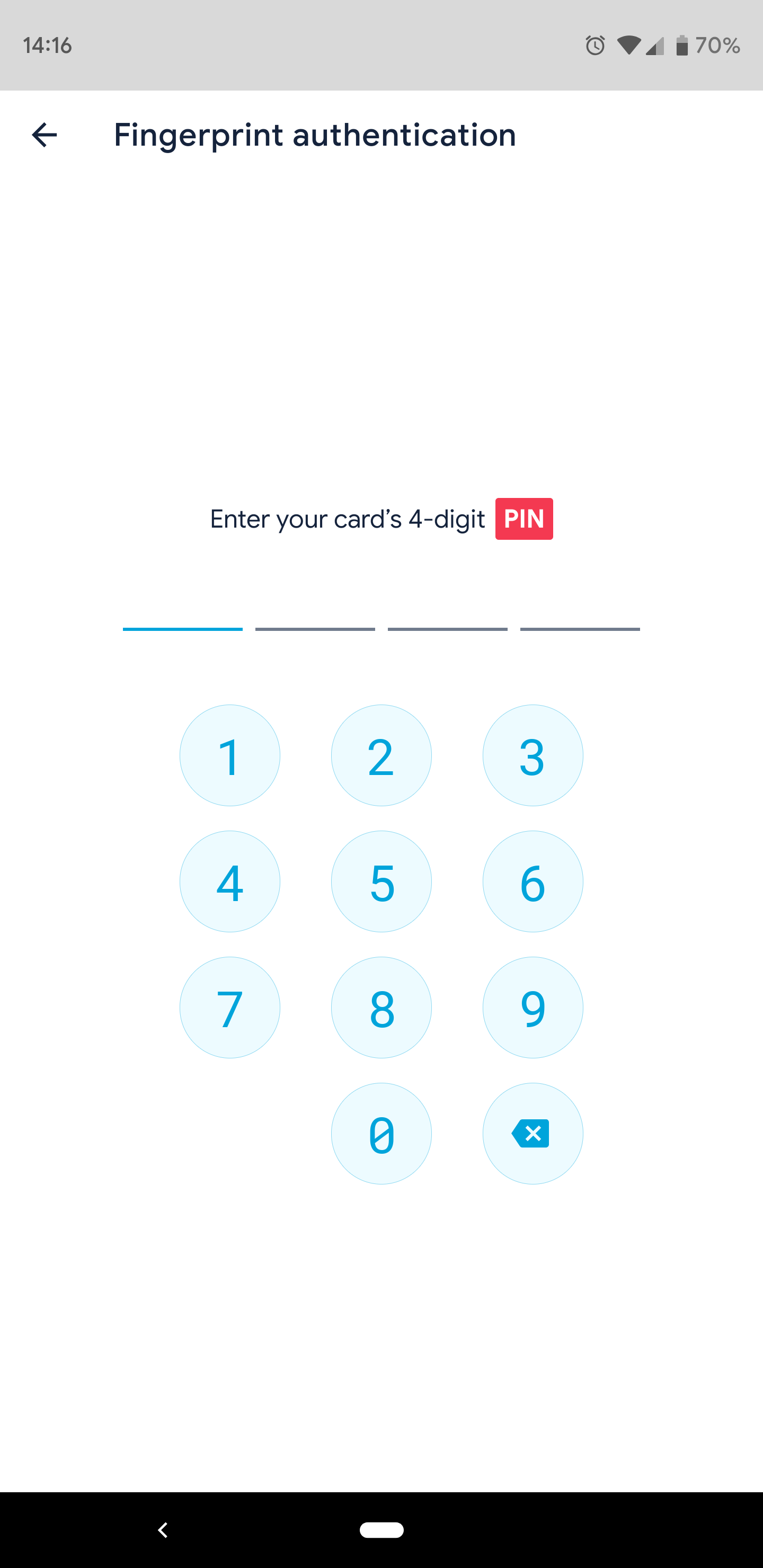
8 Likes
One small change I’ve noticed is there’s a mini golden ticket on the payments screen rather than a “1” in a yellow circle.
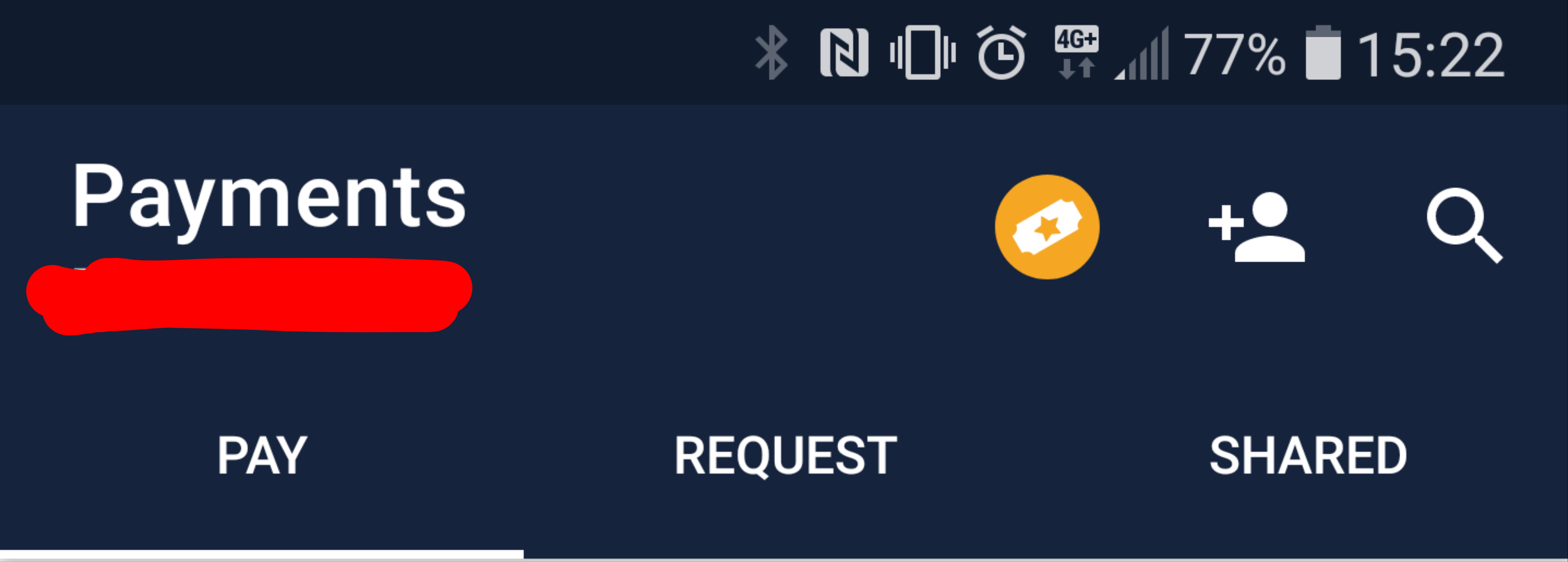
3 Likes