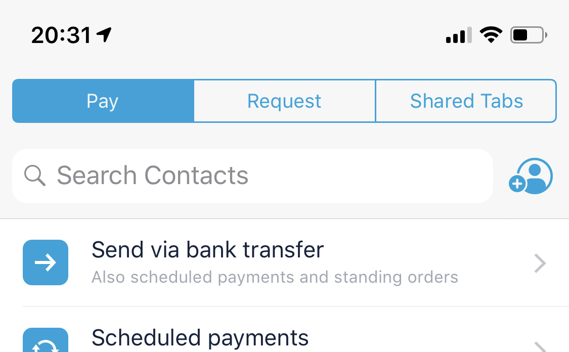
The tabs on the top of the payments screen seem to be slightly off centre — not hugely significant but thought it’s worth flagging from a design perspective! It looks worse when looking at the actual phone screen compared to the screenshot below.
• Begin off topic •
Android seem to be getting more love with little app tweaks over iOs currently, investor card inside the account window is something I want on iOS and also the correct app icons to pick from as they are different from Android and apparently the Android ones are the correct colours.
• End off topic •


 speak about doing some recently on new app features, including new pot layouts