Nicer than Santander ![]()
1 Like
Personally really like the Santander design. The red looks like, the dots are more interesting than a plain background, and the Mastercard logo looks correct.
1 Like
I’m a “minimal is better”.
2 Likes
I’m a “minimal can look nice but can also look really boring and dull”

I’ll take plain and boring over a picture bridge with a bad logo over it.
We’ll have to agree to disagree on this. As I’ve said many times, I think Santander is my favourite ![]()

I like Santander’s a lot. At least the few folk I’ve shown it to like it as well.
3 Likes
I also just applied for this card, excellent quality and a good one for my collection too!
2 Likes
I have the Platinum charge card (metal/plastic hybrid) and my companion credit card was recently replaced with this design. I actually think it’s probably the nicer of the two.
2 Likes

Hello, made an account just to be here lol.
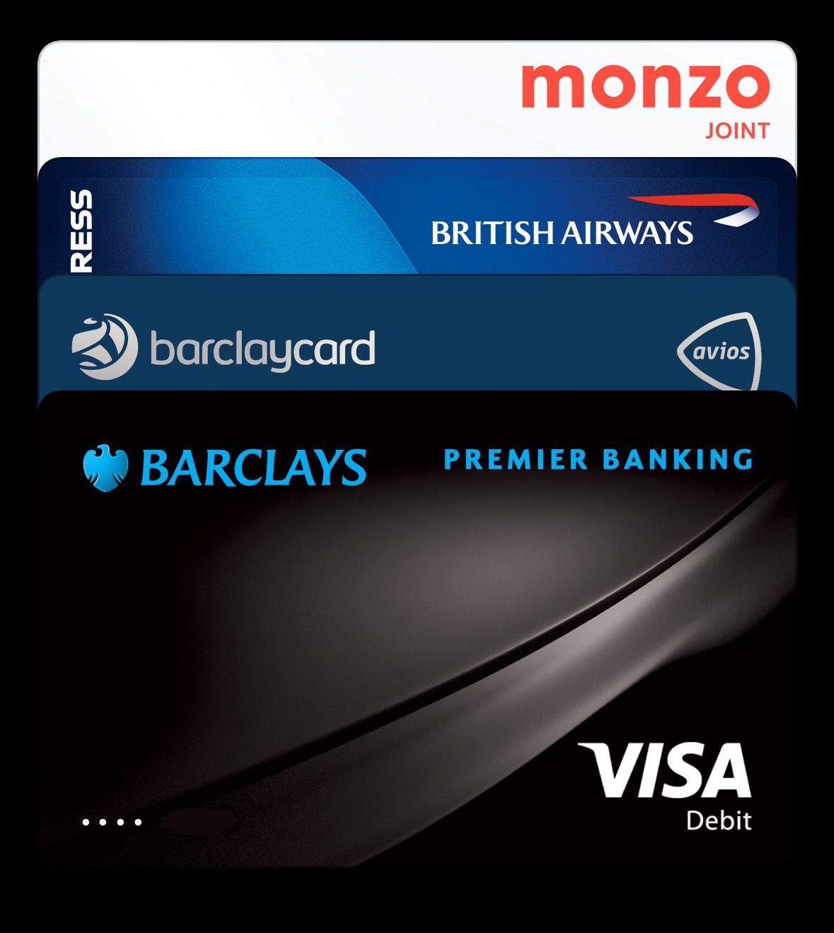
Pretend there is a monzo card here (in the post currently). Also, the skewing is due to me doing an odd crop. Trying to get saving account cards and monzo card.

P.S. Can you instantly cancel monzo plus or would you have to wait the 3 months to cancel? I really want the blue card but also don’t want to pay £15 for it. Also, same question for revolut premium.
Also, with HSBC HK, they don’t mention needing a reason?
5 Likes
The lloyds card doesn’t know if it wants to be portrait or landscape
Personally, I find the wise card a bit boring but it is very clean.
Chase is great though I do kindof wish the mastercard logo was on the front as the silver logo is nice.
My favourites I think are: Zing (the holotext and visa infinite look nice), Monzo Plus Blue (looks really nice irl and thus i want), HSBC HK (Though I am not sure I will ever be able to get it) and Mettle (the red core looks really nice)
Tempted to get a MagSafe wallet from Spigen. I’m not sure if I want to order a new Club Lloyds card that’s vertical, but more importantly, not embossed…
I personally like the new shiny flat vertical lloyds cards verses the old ones.
Might be worth a replace.
I screwed up. I didn’t know Monzo was going to roll out new monthly subs. I should have upgraded to plus while I still could ![]()
I guess no blue card for me…
1 Like
