Ooh that looks good
I’ve had a new one recently - however as it’s not going to cost me anything I’ll order another and I’ll report back….
2 Likes
I think that’s the point? Consolidating design and feel across the group.
1 Like
I wish the credit cards were a consistent aesthetic to the debit cards though. They’re the only bank I can think of that has a totally different design concept between them, most are the same but with different colours.
Oh I agree. I liked the RBS cards being different, and I do like that Natwest card. But variance is a good thing.
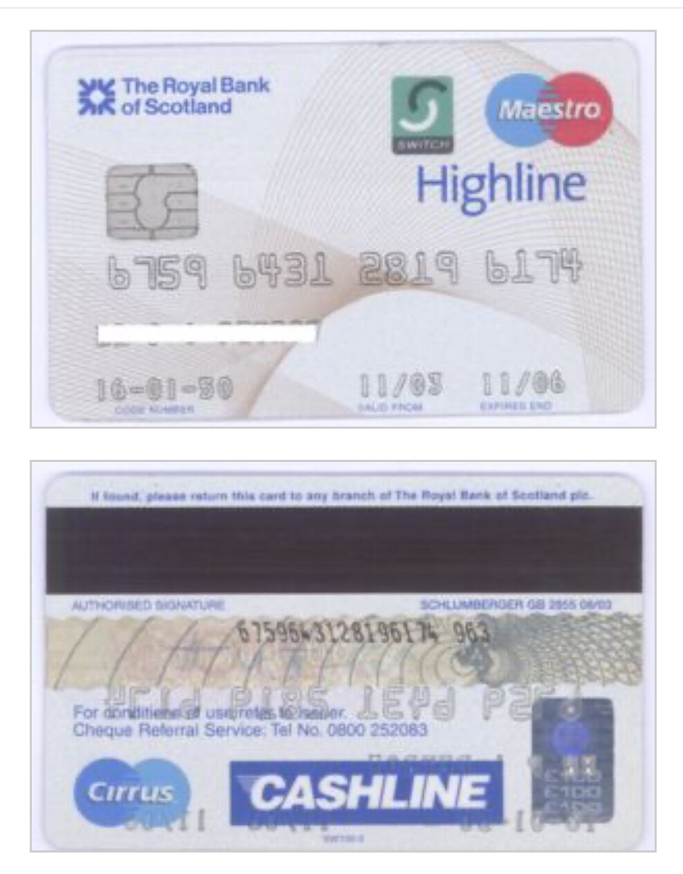
This was my favourite RBS debit card. I remember I used to have my photo on the back and my signature was scanned in.
2 Likes
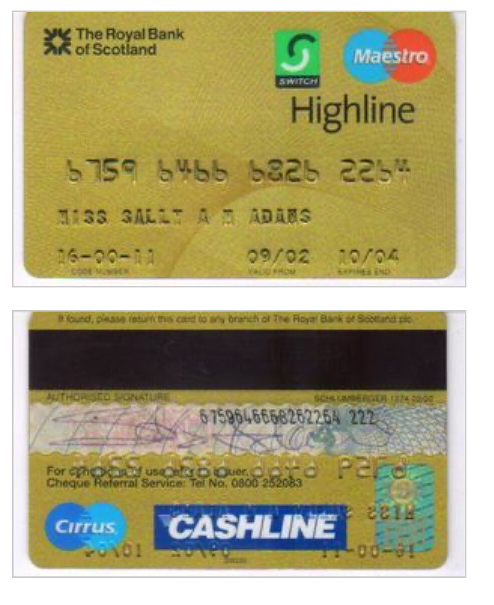
Oh yes and there was a gold version of that too I remember ![]()
Repeats and nothing standout worth showing off ![]()

I think its fine as it is personally
2 Likes
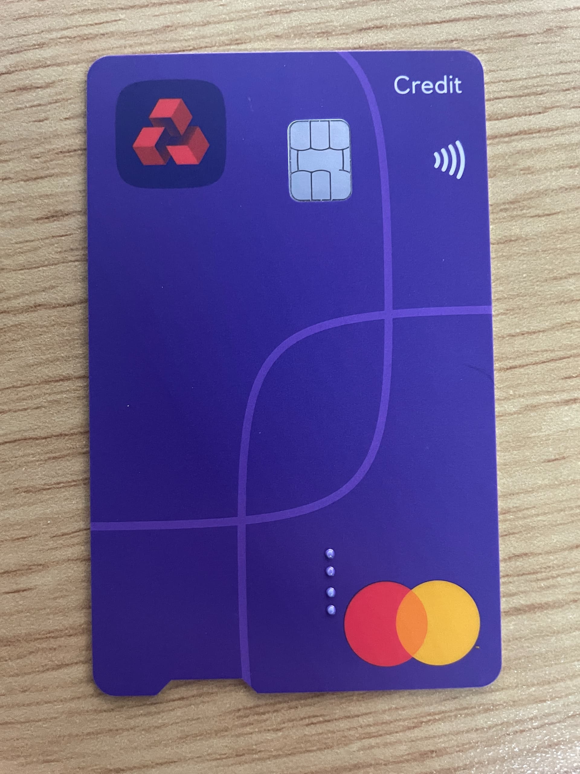
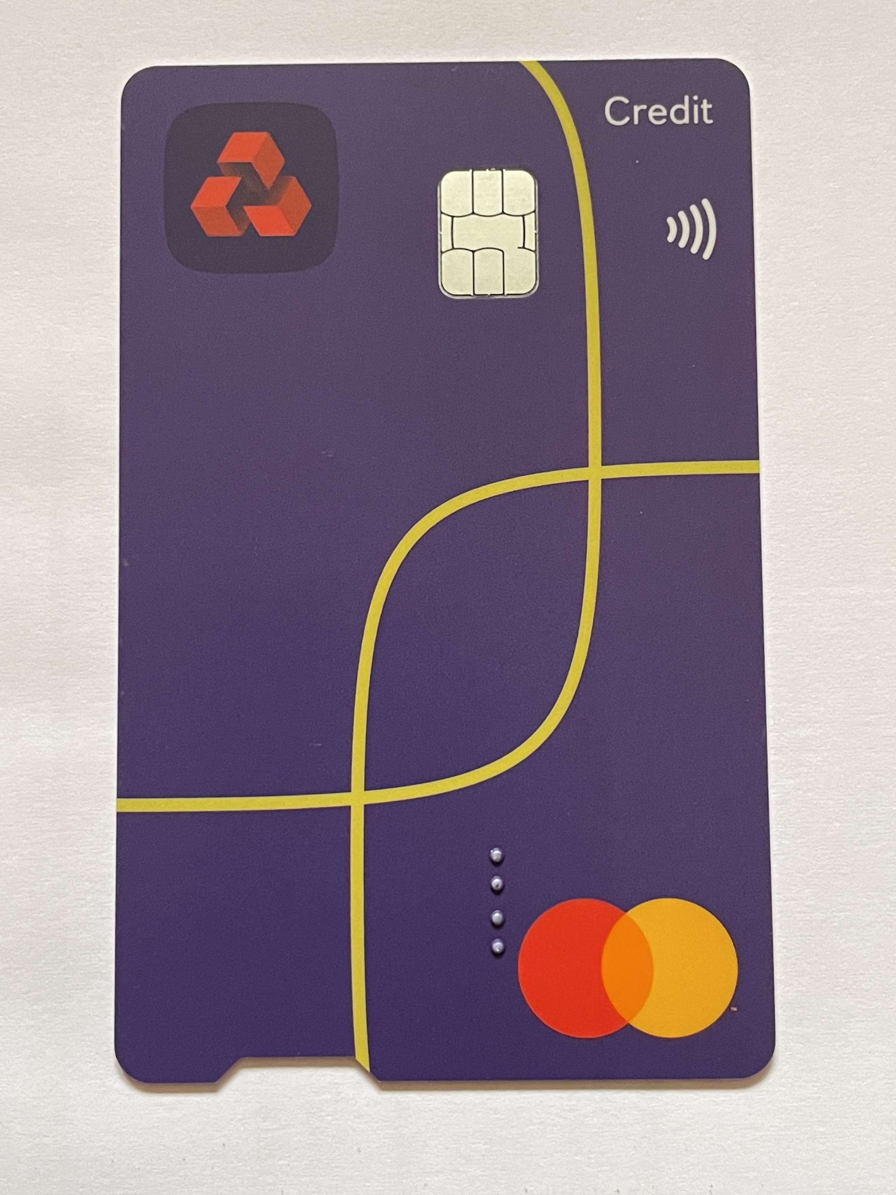
Arrived today. I don’t mind it actually, much nicer than the old one at least. It’s almost the same purple as the old Barclaycard Rewards card (which is better than the current one).
4 Likes
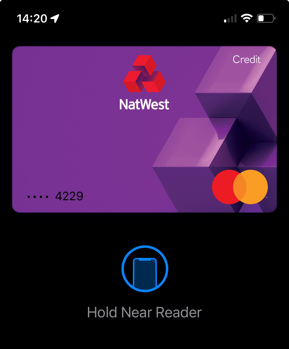
Is this updated on Apple Pay yet, or is it still showing the old design?
Surprisingly it’s still showing the old design, and I only just now added it to test so isn’t a case of a delayed update:
1 Like
At least it looks slightly like the card I guess. NatWest Rewards CC is a purple card with red band, and Apple Pay is still bright teal…
I’m sure this has come up before, that’s the old “NatWest Credit Card” design (the low interest 0% fx fee one), I still don’t know why that design would ever be showing up for the Rewards card as that was blue before.

Don’t mind that either tbh, though I wish they’d kept the blue branding and had a blue version of this. I think it looks better than the NatWest one as it’s all one colour.
I think instead of going purple across the entire group, they could have had a separate colour palette for each region, but unified design concepts. That would balance consistency within the group with distinctive regional branding. At this point they may as well just merge all 3 banks into one.
1 Like