Looks nice imo.
Though all these pieces should be both optional for the Home Screen and also movable.
Looks nice imo.
Though all these pieces should be both optional for the Home Screen and also movable.
Yes I have these also. Looks pretty but serves no functional purpose for me and the home page is now really really long to scroll to the bottom to find these given the activity feed, pots, savings, external accounts etc.
I have these too. Looks nice. There’s a slight snipping off of cards you’ve named that have a y, g, j in them.
Been there for months I think. Definitely not new.
Oops, my bad. Is this switch new on Investments? Unless I’m going insane I saw it appear when I changed pages and didn’t notice before
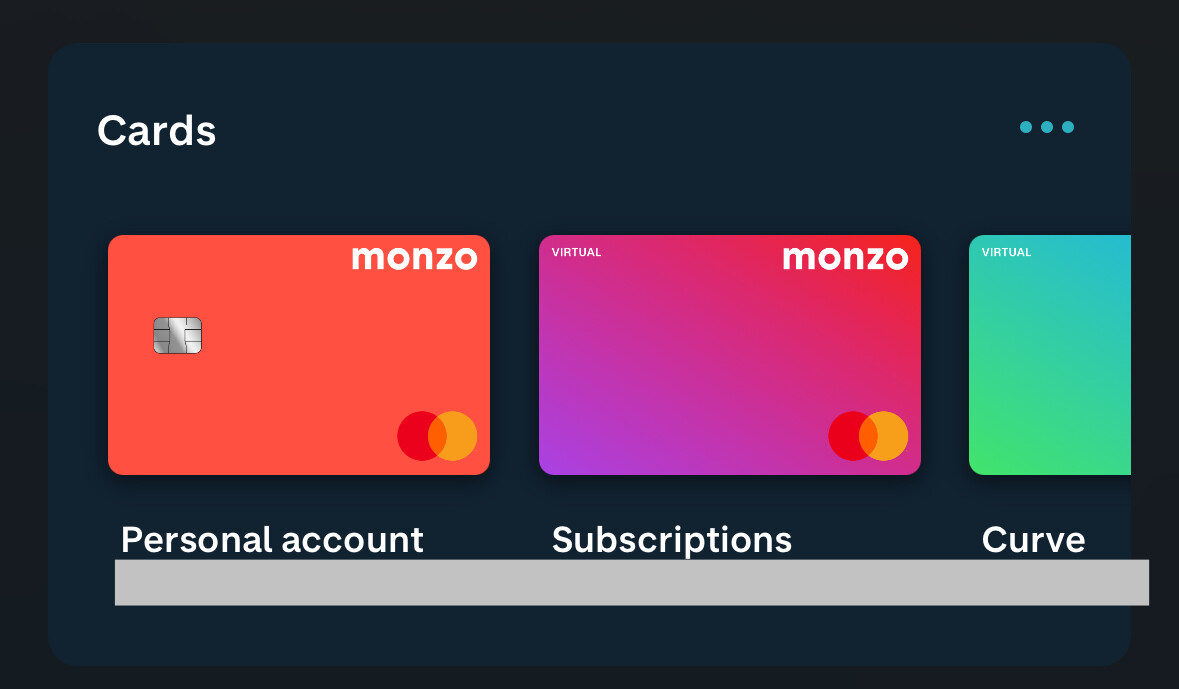
So this is the card wallet from the teardowns. Thought this must be coming soon. Looks good.
Also accessible as a card carousel by tapping card on your personal account etc. Long live the carousel ![]()
Also also, you can now freeze and defrost virtual cards. That’s new isn’t it, I’m sure?
Good spot! ![]()
Today we shipped a few changes to how your monzo cards are managed in the app;
Excited to hear what you all think!
I think I’ve found a bug for you @ConnorPB
When I tap limits on virtual cards that pay from a pot I’m getting this error message
However it works fine when I tap limits on my virtual card that’s paying from my bank account.
I’m on Android v5.80
I love all this though, thank you for making this change. It’ll be much easier to find my virtual card details when I need them for transactions.
How do you create new virtual cards? I’ve already got my five so I’m wondering if the option to create is hidden? Does it appear on the carousel? I’m still on Monzo Premium if that makes a difference. I can see there’s still an option for virtual cards in the Premium area and that takes to the old view.
Good catch, thanks!
Within the wallet view, there’s a “create” option in the top right, or on the widget there’s a “create virtual card” option at the end of the scroll.
The options to create are hidden when you’re at the maximum.
It’s only the cards not the accounts and transaction lists etc. Which for me is absolutely perfectly fine. It’s usually the card details I need quickly to make purchases
I really like this new change. Especially the ability to freeze virtual cards.
The carosel to manage your cards is a lovely touch, and a great homage to the old UI. I’ve got the same issue as Chris where tapping “limits” for a virtual card that is set to pay from a pot gives an error screen.
A couple of improvement suggestions from me:
Home screen is getting a little cluttered now though. Please hurry up with the enhanced customisation so I can rearrange/hide the elements… haha
Should be squashed ![]()
It is indeed. Thanks for the speedy fix ![]()
Fixed for me too
Agree on the reordering of cards feature. My personal preference is to have virtual cards towards the end of my carousel, as I use these the least.
Finally got the new cards view, this is an awesome touch, good job guys!
Any chance the virtual card features will come to Business accounts soon?
When I go into the card carousel, the x in the top left doesn’t work if I’ve swiped along the carousel. I have to swipe down to get out of it. It works if I’ve only looked at the card I opened it from, but not if I move along it in any way.
Anyone else getting this? Or is it just my clumsy thumbs?
I should have said - iOS, v5.82.0
Working fine here with latest TestFlight.
Hey everyone!
It’s been a while since we shared an update on upcoming improvements from the App Evolution squad, so I’m back to share what we’re working on…and ask for some volunteer testers ![]()
Right now, we’re working on ways to make it easier for customers to navigate the app and find all of the ways Monzo can help them manage their money, starting with;
A new Explore tab
This is the place to discover all the features and products available at Monzo. Over time, we’ll make this a more personalised experience to help customers discover what’s most relevant and helpful for them.
To make room, we’ve moved some other bits around
We’ve moved Help to the top right of the home screen, highly visible and easy to reach when needed, as well as moving the transaction search to the activity widget to make it clearer that it’s specifically for finding transactions.
What’s next?
We’re also working on improving search across the app, to make it easier to find transactions (including on connected accounts), payees and pretty much anything else.
Right now, we’re looking for some volunteers to take a look at an early version of the new Explore tab and provide feedback. Where better to start than the awesome folks who helped us build and ship our new home screen!
If you’d like to try, just fill in this form and we’ll get you set up. We’re only looking for a maximum of 50 testers right now, but we’ll also make this available in Labs in the not too distant future.


