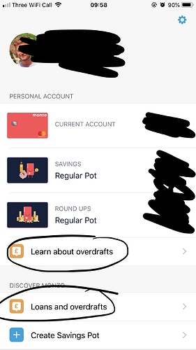
Bit of feedback - The overdraft option tabs create a bit of an untidy look here. Does it need to be shown twice? Since using the Monzo app it seems options to apply for overdrafts are everywhere I look. This section could be looked at to give a tidier look 
A post was merged into an existing topic: We’re working on a new look for the Monzo app
